
Lightrun Answers was designed to reduce the constant googling that comes with debugging 3rd party libraries. It collects links to all the places you might be looking at while hunting down a tough bug.
And, if you’re still stuck at the end, we’re happy to hop on a call to see how we can help out.
[Accessibility]MAS 1.4.11: The color contrast of the focus dot line on each selection items for LitView/CheckedListBox is below 3:1
See original GitHub issue.NET Core Version: .NET SDK 5.0.100-PREVIEW.4.20213.26 + Latest VS2019
Have you experienced this same bug with .NET Framework?: Yes
Problem description:
On navigating to each row using arrow keys (down/up) the focus has a color contrast below 3:1. The ratio is 2.4:1. Low vision users will face difficulty in knowing that there is focus on the rows.
ListView
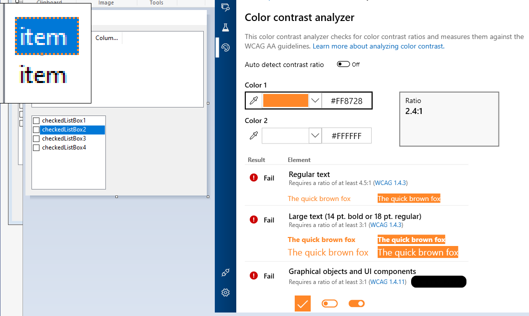
CheckedListBox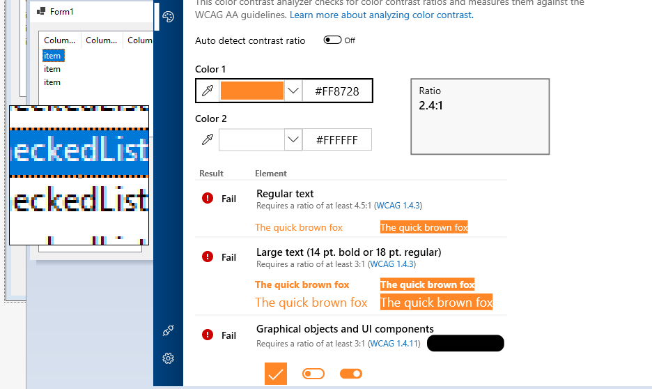
Expected behavior: When the tab navigation is moved to each row the focus on them should be at a ratio of 3:1 or greater than 3:1.
Minimal repro:
- Open the attached project, build and run it. Non_Text_Contrast_for_focus_dotline.zip
- Select one row of ListView or one item of checkedBoxList.
- Launch the Accessibility Insights for windows tool, and open the Color Contrast analyzer.
- Select the color of the focus dot line.
Issue Analytics
- State:

- Created 3 years ago
- Comments:10 (8 by maintainers)
 Top Related StackOverflow Question
 Troubleshoot Live Code
 Top Related Reddit Thread
 Top Related Hackernoon Post
 Top Related Tweet
 Top Related Dev.to Post
 Top Related Hashnode Post
I like that idea! Sounds like a plan to me.
Verified the issue with 6.0.100-rc.1.21424.1 build , the issue has been fixed that have the same results as above.