
Lightrun Answers was designed to reduce the constant googling that comes with debugging 3rd party libraries. It collects links to all the places you might be looking at while hunting down a tough bug.
And, if you’re still stuck at the end, we’re happy to hop on a call to see how we can help out.
[Feature] Support individual scalar reporting without plots
See original GitHub issueWhen using logger.report_scalar a plot is automatically generated to accommodate for a time-series axis.
There is no current way for the user to report a single scalar with a name (that is not a time-series) and have it both aesthetically pleasing and visible enough in the WebUI. Using iteration=0 just wastes space by creating a scatter plot with a single datum.
It would be great to have e.g. logger.report_scalar(name="MAE", value=mae), and have it visible as a table (or similar) with e.g.:
| Scalar name | value |
|---|---|
| MAE | 0.123 |
| NRMSE | 0.4 |
| My favorite scalar | and it’s actually a string |
Even better, once these are in place, they can automatically be aligned between multiple experiments for comparison.
Issue Analytics
- State:

- Created 2 years ago
- Reactions:1
- Comments:23 (17 by maintainers)
 Top Related StackOverflow Question
 Troubleshoot Live Code
 Top Related Reddit Thread
 Top Related Hackernoon Post
 Top Related Tweet
 Top Related Dev.to Post
 Top Related Hashnode Post
Hey, thanks for replying so quickly!
Adding it to the leaderboard is a good start (though requires some adjusting for column names). It’s also the single experiment look that just looks… bad. This is unhelpful and hard to read: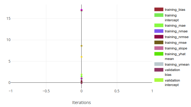 It would make sense to have these as a table instead, as some kind of “experiment final metric” or some metric that is not associated with a specific timepoint.
Hi @cpatrickalves @idantene @mmiller-max , while there isn’t a solution yet, it is in the making!
The plan is to have a logger interface in which you can do something like logger.report_single_metric(name=“my metric”,value=123). In the scalars tab, you’ll have a table with these reported metrics. This means there will be a single table per experiment with those values. The table will also appear in the comparison view, so you can compare values across experiments. As for coloring according to number, we’ll take a look but not sure it’ll be released in the first go (Let me know if this is critical and I can try and re-prioritize).
Anything I missed? I’ll update here once there’s something available