
Stuck on an issue?
Lightrun Answers was designed to reduce the constant googling that comes with debugging 3rd party libraries. It collects links to all the places you might be looking at while hunting down a tough bug.
And, if you’re still stuck at the end, we’re happy to hop on a call to see how we can help out.
Provide a different message when viewport is too small for amp-story on desktop
See original GitHub issueCurrently we show the same message on desktop and mobile when the viewport is too small:
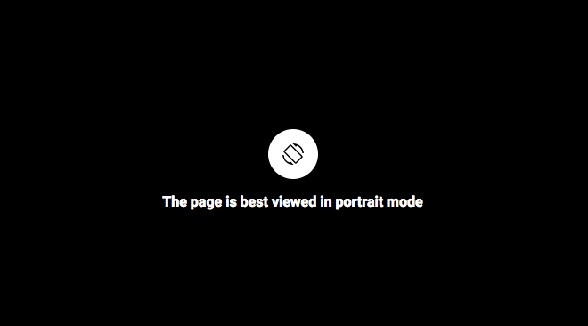
When the story is being viewed in “desktop” mode (indicated by the desktop attribute on the <amp-story> tag itself, or by the isDesktop_() function in the AmpStory class), we should change the icon and the message to convey “make your window larger” rather than “rotate your device to portrait orientation.”
Issue Analytics
- State:

- Created 6 years ago
- Comments:13 (12 by maintainers)
 Top Results From Across the Web
Create responsive AMP pages - amp.dev
Responsive web design is about building fluid web pages that respond to your user's needs—pages that fit their device's screen size and orientation....
Read more >Content does not size correctly to viewport - Sitebulb
This means that the URL in question is not responsive, and the page content does not size accordingly when the screen size is...
Read more >The Beginner's Guide to Responsive Web Design in 2022
This guide will give you everything you need to know about responsive website design, including definitions, a step-by-step walkthrough, examples, and more.
Read more >The Viewport Is the Window to Your Site - Digital.gov
Solution: Set the viewport! Pages optimized for a variety of device sizes should include a <meta> viewport tag in the head of the...
Read more >responsive images srcset not working - Stack Overflow
So if you want to test this, just make your window smaller and THEN load the page (after clearing the cache / or...
Read more > Top Related Medium Post
No results found
 Top Related StackOverflow Question
No results found
 Troubleshoot Live Code
Lightrun enables developers to add logs, metrics and snapshots to live code - no restarts or redeploys required.
Start Free Top Related Reddit Thread
No results found
 Top Related Hackernoon Post
No results found
 Top Related Tweet
No results found
 Top Related Dev.to Post
No results found
 Top Related Hashnode Post
No results found
Whoops, sorry! Missed that notification. I think there are two criteria that must both be met to trigger this:
I do agree; I think the warning is shown appropriately for those screen sizes, but you’re right that we may not be able to use
isDesktop_()to determine when to change the message. Maybe for now we can use isAndroid() and isIos() and only change the message when we’re not on Android or iOS? I suppose what we’re really trying to detect is devices where “rotate your device” doesn’t make sense. I don’t think there’s any way to really determine that through the Orientation API, so a proxy of Android and iOS may have to suffice.When you have time have a look pls @newmuis cheers!