
Lightrun Answers was designed to reduce the constant googling that comes with debugging 3rd party libraries. It collects links to all the places you might be looking at while hunting down a tough bug.
And, if you’re still stuck at the end, we’re happy to hop on a call to see how we can help out.
[Feature] Consistent cross-browser behavior of number input step buttons
See original GitHub issueBug, feature request, or proposal:
Feature request/proposal
What is the expected behavior?
All browsers handle <input type="number"> very inconsistently.
Firefox and Safari show a “step up” and “step down” button at all times.
Chrome shows the buttons only during hover or focus on the element.
Internet Explorer and Edge have no such buttons.
In addition, Firefox, Chrome, and Safari support .stepUp() and .stepDown() on HTMLInputElements while Internet Explorer and Edge do not.
The buttons provided by Firefox, Chrome, and Safari have a style that is very inconsistent with Material.
I suggest mimicing these buttons in a cross-browser compatible way but with a “Material” style.
What is the current behavior?
Currently, these buttons are handled by the browser and behave/look very inconsistent.
What are the steps to reproduce?
https://stackblitz.com/edit/angular-material2-issue-e9juzn This is my functional mock-up of the behavior I have in mind. My code is probably hackish but the end result is nice. HTML:
<mat-form-field>
  <mat-label>Some Quantity</mat-label>
  <input matInput #someQuantityInput [(ngModel)]="someQuantity" type="number"/>
  <div class="step-arrow-wrapper">
    <div (mousedown)="$event.preventDefault()" (click)="stepUp(someQuantityInput)" class="step-up-arrow"></div>
    <div (mousedown)="$event.preventDefault()" (click)="stepDown(someQuantityInput)" class="step-down-arrow"></div>
  </div>
</mat-form-field>
SCSS:
@import '~@angular/material/theming';

// use these to test with dark theme
@import '~@angular/material/prebuilt-themes/pink-bluegrey.css';
$primary: mat-palette($mat-pink, 700, 500, 900);
$accent:  mat-palette($mat-blue-grey, A200, A100, A400);
$default: rgba(255, 255, 255, 0.7);
$disabled: rgba(255, 255, 255, 0.5);

// use these to test with light theme
// @import '~@angular/material/prebuilt-themes/indigo-pink.css';
// $primary: mat-palette($mat-indigo);
// $accent:  mat-palette($mat-pink, A200, A100, A400);
// $default: rgba(0, 0, 0, 0.54);
// $disabled: rgba(0, 0, 0, 0.38);

$warn: mat-palette($mat-red);

// hide step buttons on Firefox
input[type=number] {
    -webkit-appearance: textfield;
    -moz-appearance: textfield;
    appearance: textfield;
}

// hide step buttons on Chrome/Safari
input[type=number]::-webkit-inner-spin-button,
input[type=number]::-webkit-outer-spin-button {
    -webkit-appearance: none;
    -moz-appearance: none;
    appearance: none;
}

// workaround for Firefox bug where disabled number input with textfield appearance is still clickable
.mat-form-field.mat-form-field-disabled {
    pointer-events: none;
}

// shorten the textbox to make room for step-arrow-wrapper
input[type=number] {
    width: calc(100% - 18px);
}

// shorten the mat-label to make room for step-arrow-wrapper
// (doesn't work inside stackblitz but does work otherwise)
::ng-deep .step-arrow-wrapper + .mat-form-field-label-wrapper {
    width: calc(100% - 18px);
}

// place step-arrow-wrapper to the right of textbox
.step-arrow-wrapper {
    float: right;
    width: 18px;
}

// step arrow style made to match mat-select arrow
.step-up-arrow,
.step-down-arrow {
    cursor: pointer;
    width: 0;
    height: 0;
    border-left: 5px solid transparent;
    border-right: 5px solid transparent;
    margin: 0 4px;
    color: $default;
}

.step-up-arrow {
    border-bottom: 5px solid;
    margin-bottom: 5px;
}

.step-down-arrow {
    border-top: 5px solid;
}

.mat-form-field.mat-focused.mat-primary .step-up-arrow,
.mat-form-field.mat-focused.mat-primary .step-down-arrow {
    color: mat-color($primary);
}

.mat-form-field.mat-focused.mat-accent .step-up-arrow,
.mat-form-field.mat-focused.mat-accent .step-down-arrow {
    color: mat-color($accent);
}

.mat-form-field.mat-form-field-invalid .step-up-arrow,
.mat-form-field.mat-form-field-invalid .step-down-arrow {
    color: mat-color($warn) !important;
}

.mat-form-field.mat-form-field-disabled .step-up-arrow,
.mat-form-field.mat-form-field-disabled .step-down-arrow {
    cursor: default;
    color: $disabled;
}
Typescript:
// try calling stepUp() on the input element (Chrome, Firefox, Safari)
// on failure, mimic the effect of stepUp() (Internet Explorer, Edge)
// return immediately if input is disabled
stepUp(input:HTMLInputElement) : void {
  if (input.disabled) {
    return;
  }
  try {
    input.stepUp();
  }
  catch (ex) {
    // increment `value` by `step` (default to '1' if `step` is absent)
    input.value = String(Number(input.value) + Number(input.step || '1'));
    // if `max` is present and `value` is greater than `max`, set `value` to `max`
    if (input.max && Number(input.value) > Number(input.max)) {
      input.value = input.max;
    }
  }
}

// try calling stepDown() on the input element (Chrome, Firefox, Safari)
// on failure, mimic the effect of stepDown() (Internet Explorer, Edge)
// return immediately if input is disabled
stepDown(input:HTMLInputElement) : void {
  if (input.disabled) {
    return;
  }
  try {
    input.stepDown();
  }
  catch (ex) {
    // decrement `value` by `step` (default to '1' if `step` is absent)
    input.value = String(Number(input.value) - Number(input.step || '1'));
    // if `min` is present and `value` is less than `min`, set `value` to `min`
    if (input.min && Number(input.value) < Number(input.min)) {
      input.value = input.min;
    }
  }
}
The result of this stackblitz:
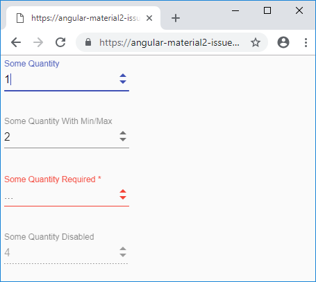

What is the use-case or motivation for changing an existing behavior?
The arrows for stepping up and stepping down should be styled consistently with the arrow used in mat-selects and should work on all major browsers.
Which versions of Angular, Material, OS, TypeScript, browsers are affected?
I tested this mock-up on Firefox, Chrome, IE 11, Edge, and Safari.
Is there anything else we should know?
This SCSS rule:
::ng-deep .step-arrow-wrapper + .mat-form-field-label-wrapper {
    width: calc(100% - 18px);
}
doesn’t work in the stackblitz, but it works otherwise. Its purpose is to reduce the width of the mat-label so that a long label doesn’t overlap the new step buttons.
Lastly, in Firefox, a “number” input with “textfield” appearance that is also disabled will allow you to click on the textbox or tab into it and edit it, even though it is disabled. This is a Firefox bug. To prevent clicking, set its pointer-events to none. To prevent tabbing, somewhat manually set the tabindex to -1:
[tabindex]="someQuantityInput.disabled ? -1 : 0"
Issue Analytics
- State:

- Created 5 years ago
- Reactions:4
- Comments:7 (4 by maintainers)
 Top Results From Across the Web
 Top Related Medium Post
 Top Related StackOverflow Question
 Troubleshoot Live Code
 Top Related Reddit Thread
 Top Related Hackernoon Post
 Top Related Tweet
 Top Related Dev.to Post
 Top Related Hashnode Post
I respect your philosophy towards the role/responsibility of Material, and I’ll be honest, I don’t really understand the relationship between Material Design and Material. However, given how bad the native number input handling is/how bad it looks, I think little intervention is a bad thing. From my point of view, this feels like a prime example of something Material should unify. Also, my point isn’t just that different browsers handle number input arrows differently, but also that a page that has a
mat-selectnext to amatInputwithtype="number"results in two inputs that are seemingly matching but have one big jarring difference, and I think this is kind of a big curve ball to the user.Feel free to close this issue. At the very least, hopefully other people who are dissatisfied with number inputs will stumble upon this issue and find my code helpful.
I updated my examples to color the arrows correctly whether the input is active, inactive, invalid, or disabled, as well as correctly disable the arrows while the input is disabled.