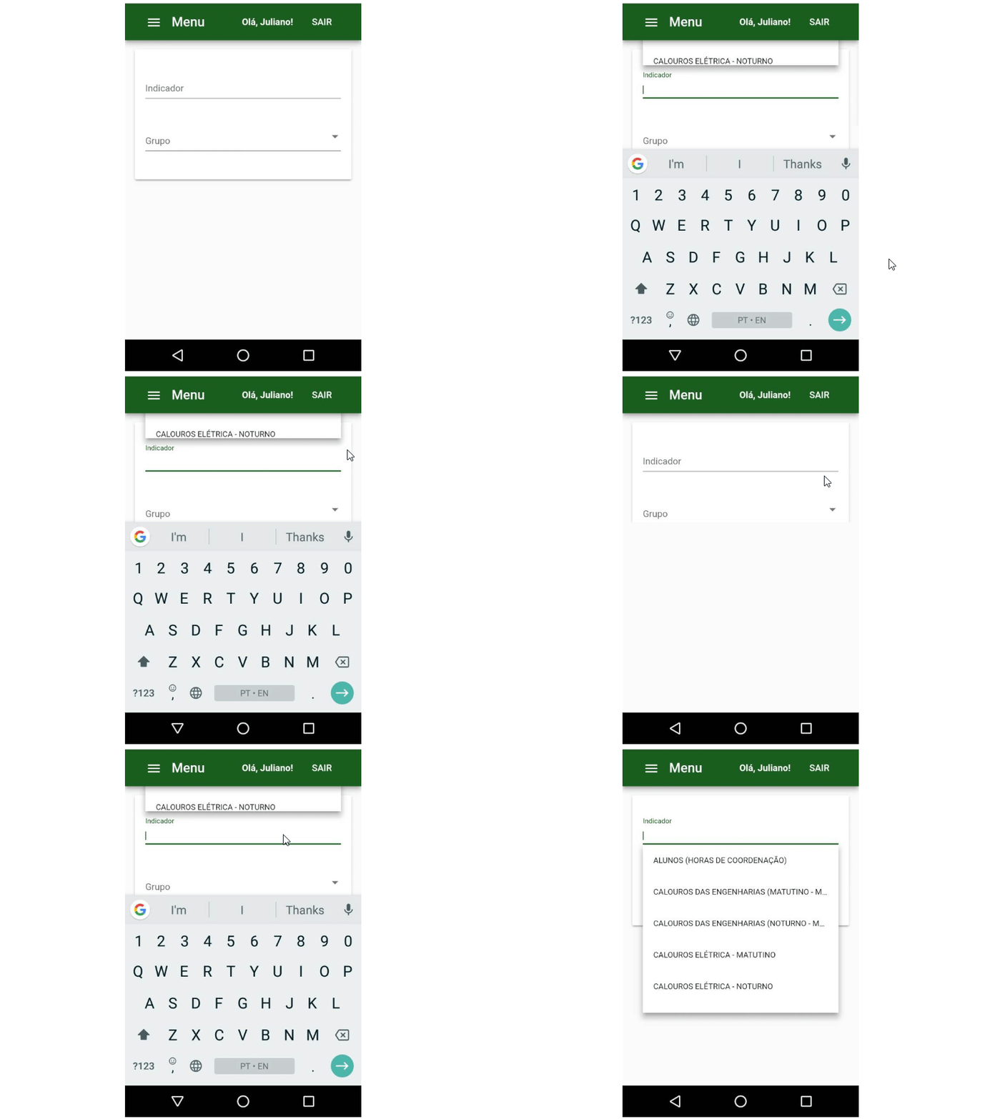
mat-autocomplete: panel is shifted way too high in small devices (mobile)
See original GitHub issueBug, feature request, or proposal:
Bug: the overlay panel position is bugged in small devices, when pushed up by the virtual keyboard on mobile devices.
What is the expected behavior?
If there’s no space to show the autocomplete neither above, nor bellow the associated input, maybe it’s better to do nothing, just leaving the panel where it was initially opened (or maybe it’s better to push it downwards).
What is the current behavior?
Notice how the panel just goes off the screen

What are the steps to reproduce?
There’s no special steps to reproduce it. Just open an autocomplete panel in a small screen.
What is the use-case or motivation for changing an existing behavior?
UX in small devices
Which versions of Angular, Material, OS, TypeScript, browsers are affected?
Angular CLI: 6.0.8
Node: 8.11.2
OS: win32 x64
Angular: 6.0.5
... animations, common, compiler, compiler-cli, core, forms
... http, platform-browser, platform-browser-dynamic
... platform-server, router

Package                            Version
------------------------------------------------------------
@angular-devkit/architect          0.6.8
@angular-devkit/build-angular      0.6.8
@angular-devkit/build-optimizer    0.6.8
@angular-devkit/core               0.6.8
@angular-devkit/schematics         0.6.8
@angular/cdk                       6.3.0
@angular/cli                       6.0.8
@angular/flex-layout               6.0.0-beta.16
@angular/material                  6.3.0
@angular/material-moment-adapter   6.3.0
@ngtools/webpack                   6.0.8
@schematics/angular                0.6.8
@schematics/update                 0.6.8
rxjs                               6.2.1
typescript                         2.7.2
webpack                            4.8.3
Is there anything else we should know?
Maybe related to #6965
cc: @crisbeto
Issue Analytics
- State:
- Created 5 years ago
- Comments:7 (5 by maintainers)
 Top Results From Across the Web
Change the mat-autocomplete width? - angular - Stack Overflow
Specify the width of the autocomplete panel. Can be any CSS sizing value, ... Just add the panelWidth property to the mat-autocomplete
Read more >Autocomplete | Angular Material
Takes classes set on the host mat-autocomplete element and applies them to the panel inside the overlay container to allow for easy styling....
Read more >angular/material/_theming.scss - UNPKG
5, // We want overlays to always appear over user content, so set a baseline. 6, // very high z-index for the overlay...
Read more >mat multi select with search | The AI Search Engine You Control
Otherwise you could just iterate over filteredList , but in that case old ... onChange to notify the parent component that the value...
Read more >demo/node_modules/@angular/material/@angular ... - GitLab
Use this to notify\n * components if the labels have changed after ... opposed to `focus`, in order to open the panel\n //...
Read more > Top Related Medium Post
No results found
 Top Related StackOverflow Question
No results found
 Troubleshoot Live Code
Lightrun enables developers to add logs, metrics and snapshots to live code - no restarts or redeploys required.
Start Free Top Related Reddit Thread
No results found
 Top Related Hackernoon Post
No results found
 Top Related Tweet
No results found
 Top Related Dev.to Post
No results found
 Top Related Hashnode Post
No results found

We should be able to resolve that case by enabling pushing for the autocomplete, however doing so is on hold until https://github.com/angular/material2/pull/11628 gets in.
@crisbeto wouldn’t that mean that in this event (an autocomplete near the top on mobile devices with the keyboard opened):
An alternative approach would be to add a class like mat-autocomplete-smallheight whenever the viewport height is <300 or so (256 + some the input + some margin) that overrides the max-height to 96 (2xAUTOCOMPLETE_OPTION_HEIGHT).
It’s not ideal, but it’s the only thing I could think of to address those two points too. Would you folks be open to this approach? If so, it might be something useful to more than just mat-autocomplete, so maybe instead of a state class, a class further up the dom tree would be better.