
Stuck on an issue?
Lightrun Answers was designed to reduce the constant googling that comes with debugging 3rd party libraries. It collects links to all the places you might be looking at while hunting down a tough bug.
And, if you’re still stuck at the end, we’re happy to hop on a call to see how we can help out.
Why is the basic button the same as accent button for fab and mini fab?
See original GitHub issueI was looking for a way to change the styles for the default mat-button. I see the example here has black text and white back for all the basic button variants except for mini-fab and fab buttons. Those have the same colors as the accent button.
- Is this on purpose?
- How do I modify the styles of base button?
- Same goes for Link buttons. How do I even style them differently?
https://material.angular.io/components/button/examples

Issue Analytics
- State:

- Created 6 years ago
- Reactions:1
- Comments:5 (1 by maintainers)
 Top Results From Across the Web
Buttons: floating action button - Material Design
A floating action button (FAB) represents the primary action of a screen. Updated FABs have a boxier style with smaller corner radius, new...
Read more >Button - Angular Material
Traditional fab buttons are circular and only have space for a single icon. However, you can add the extended attribute to allow the...
Read more >Angular Material 5 set fab button default color - Stack Overflow
In the docs, it says about theming: By default, only FABs (Floating Action Button) are colored; the default background color for mat-button ...
Read more >Floating Action Buttons | CodePath Android Cliffnotes
Floating action buttons (or FAB) are: “A special case of promoted actions. ... The floating action button uses the same menu icons used...
Read more >Angular Material Buttons : Mat-Button Example - Angular Wiki
It is a circular shape button with an icon in its center. We have three types of FABs regular, mini, and extended. mat-fab...
Read more > Top Related Medium Post
No results found
 Top Related StackOverflow Question
No results found
 Troubleshoot Live Code
Lightrun enables developers to add logs, metrics and snapshots to live code - no restarts or redeploys required.
Start Free Top Related Reddit Thread
No results found
 Top Related Hackernoon Post
No results found
 Top Related Tweet
No results found
 Top Related Dev.to Post
No results found
 Top Related Hashnode Post
No results found
It looks like an inconsistency, even though all the floating buttons variations are not really specified in the material design guildelines, we can clearly see an example of google map where both a basic floating button and a primary floation button exists in the same screen :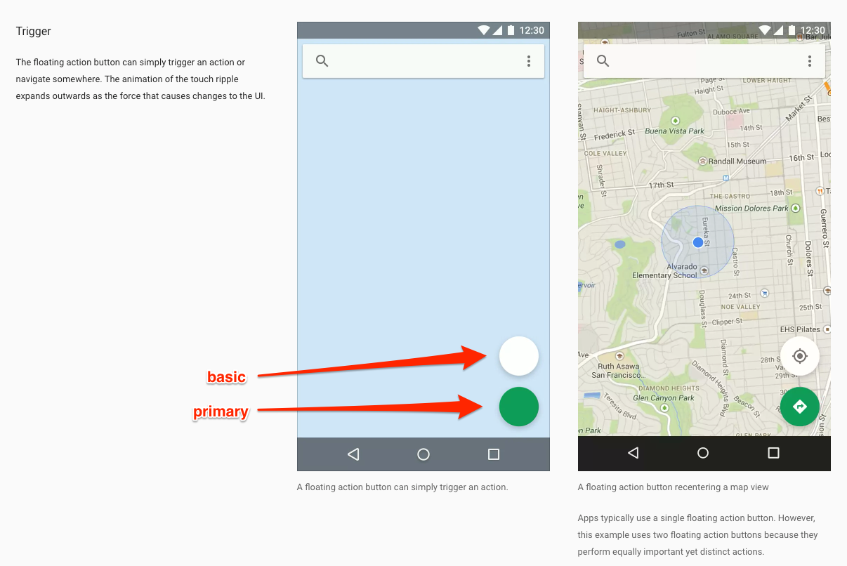
So I agree with @praveenpuglia, the default state of mat-fab button component should not apply mat-accent class when no color property is set.
This issue has been automatically locked due to inactivity. Please file a new issue if you are encountering a similar or related problem.
Read more about our automatic conversation locking policy.
This action has been performed automatically by a bot.