
Lightrun Answers was designed to reduce the constant googling that comes with debugging 3rd party libraries. It collects links to all the places you might be looking at while hunting down a tough bug.
And, if you’re still stuck at the end, we’re happy to hop on a call to see how we can help out.
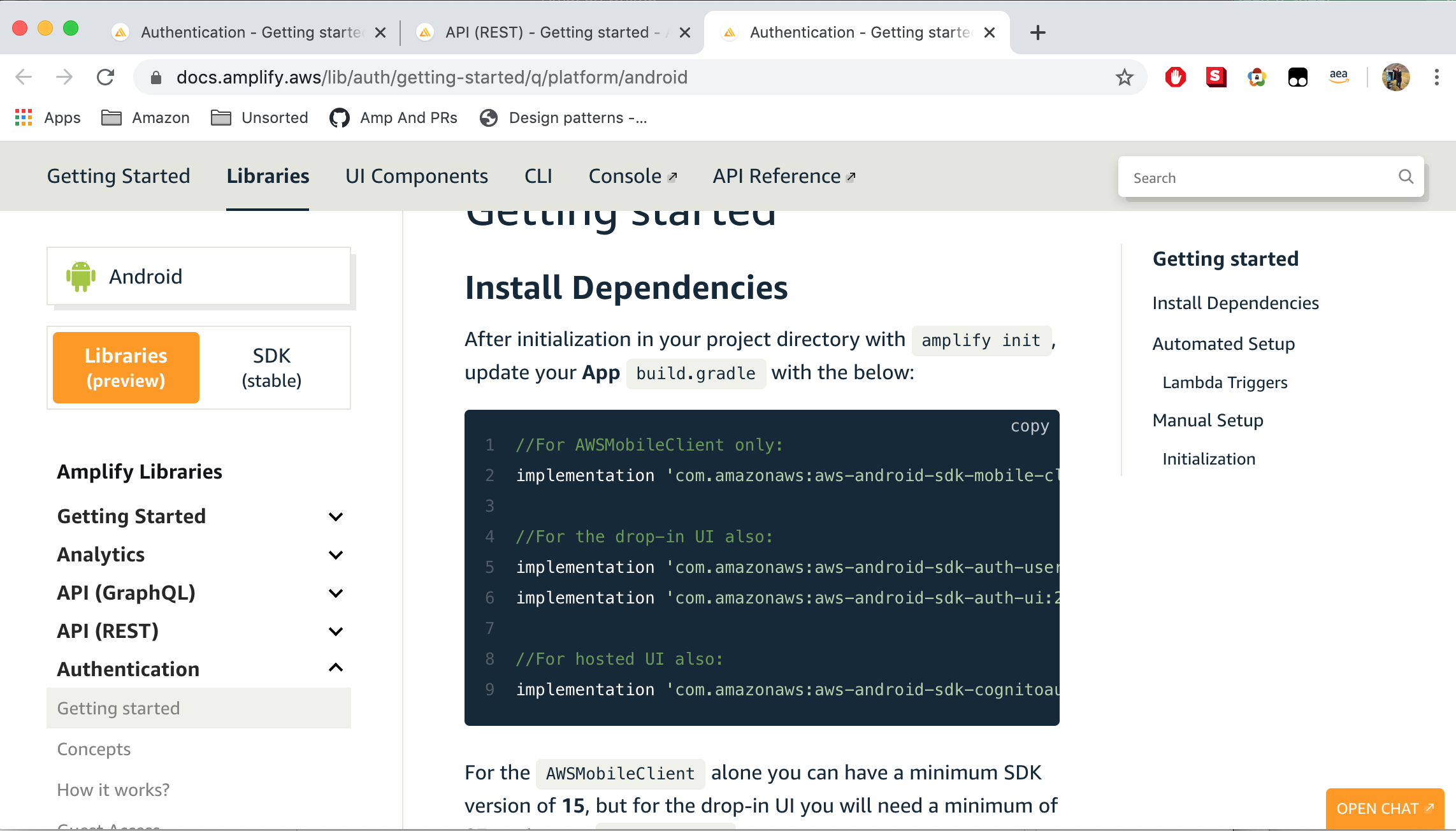
docs.amplify.aws content viewport is too constrained from 13" MacBook
See original GitHub issueDescribe the bug From a 13" MacBook, the main content of the docs site is too constrained, and it creates a usability issue.
The website includes a left nav-bar, and a right nav-bar, and a top nav-bar. The three bars constrain the main content view considerably. The purpose of the docs site is vend content. However, I need to scroll around to actually engage with the content.
To Reproduce Steps to reproduce the behavior:
- Go to https://docs.amplify.aws/lib/auth/getting-started/q/platform/android#initialization
- View any of the code snippets. Note that the content viewport displays a very small portion of them, since the left and right nav bars constrain the visible content considerably.
Expected behavior I expect to see documentation content to be more focused in the window.
The nav bars don’t just create too small of a space for the content, they also visually distract from the content.
One or more of the nav bars should disappear automatically, or possibly not even be part of the layout, for a screen of my size.
Screenshots
Desktop (please complete the following information):
- OS: Mac OS X Mojave 10.14.6
- Browser: Google Chrome Version 81.0.4044.129 (Official Build) (64-bit)
- User-Agent:
Mozilla/5.0 (Macintosh; Intel Mac OS X 10_14_6) AppleWebKit/537.36 (KHTML, like Gecko) Chrome/81.0.4044.129 Safari/537.36 - MacBook Pro, Retina, 13-inch, Early 2015
- Screen size: 13.3-inch (2560 x 1600)
Issue Analytics
- State:

- Created 3 years ago
- Comments:8 (8 by maintainers)
 Top Related StackOverflow Question
 Troubleshoot Live Code
 Top Related Reddit Thread
 Top Related Hackernoon Post
 Top Related Tweet
 Top Related Dev.to Post
 Top Related Hashnode Post
@swaminator Yea, that could work! I think there are potentially a number of different ways to deal with it. Here are a few that come to my mind:
@brene , this looks a lot better when mimicking a 13inch screen. Will close out. Thanks