
Lightrun Answers was designed to reduce the constant googling that comes with debugging 3rd party libraries. It collects links to all the places you might be looking at while hunting down a tough bug.
And, if you’re still stuck at the end, we’re happy to hop on a call to see how we can help out.
[BUG] bar charts scales are inconsistent when type: 'time' and unit: 'week' OR 'month'
See original GitHub issueExpected Behavior
I expected the graph chart to remain consistent, and for only the xAxis time format to change.
Current Behavior
The xAxis scale seems to increase too much, and data is lost in both the week and month (more than week) charts. Clumping the bars together as a week or month metric seems to be the root of the problem.
Possible Solution
I suggest that when bar charts (stacked, or not) have type: 'time' configured, display the bars as days, keeping the chart graph itself consistent, and only change the axis labeling (days, weeks, months).
We need to ask ourselves if we think this is working as intended or not. Here are my opinions
Leaving it the way it is (clumping up data by week/month)
Pros: ??
Cons
- truth of the original data is altered
- some data will be hidden/truncated (bad!)
- stacking bar charts seems to exacerbate the previous 2 problems
Making a special case for bar charts with the ‘time’ configuration always display the chart in day bars
Pros:
- we avoid all the Cons of leaving it the way it is
Cons:
- We break convention, adding a special case to one of the chart types, possibly breaking backwards compatibility
Maybe we can avoid the last con by adding another configuration option that gives us the ability to be flexible with how we want the chart to render.
Steps to Reproduce (for bugs)
- Look at my demos
- Compare the data in the graph vs all 3 types of time units (day, week, month)
- Assert the data does not stay consistent, is often truncated on the right-hand-side, and could be avoided if bar charts only used days for bars rather than attempting to clump weeks and months together somehow.
Context
I’m trying to represent data with a clear bar chart, provide 3 options for the xAxis scale labels (days, weeks, months).
Environment
- Chart.js version:
2.4.0 - Browser name and version: Any
- Link to your projects:
Bar Chart (stacked)
https://jsfiddle.net/5y0rk63a/
This demo shows a big difference in the way the chart is rendered when the scale unit differs.
Bar Chart
https://jsfiddle.net/5y0rk63a/1/
This demo is fork of the stacked bar chart, with hopes to further isolate the root cause. It contains a single dataset, and does not stack any bar data.
Issue Analytics
- State:

- Created 7 years ago
- Comments:9 (6 by maintainers)
 Top Related StackOverflow Question
 Troubleshoot Live Code
 Top Related Reddit Thread
 Top Related Hackernoon Post
 Top Related Tweet
 Top Related Dev.to Post
 Top Related Hashnode Post
I verified that this was fixed in 2.7.2. Regarding the x axis label issue, use the formats supported by moment.js. For example, ‘2018-1-22 0:0’ is not supported, but ‘2018-01-22 00:00’ is.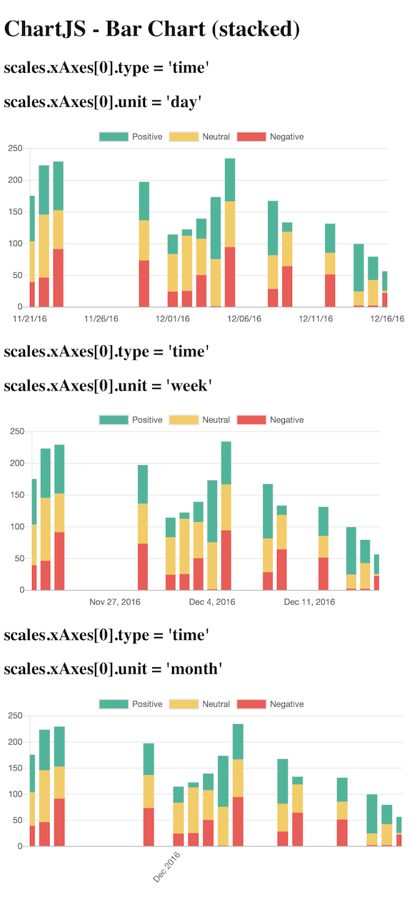
Ah cool, forgot that #4994 is in 2.7.2. Once that’s released I think this can be closed 😄