
Stuck on an issue?
Lightrun Answers was designed to reduce the constant googling that comes with debugging 3rd party libraries. It collects links to all the places you might be looking at while hunting down a tough bug.
And, if you’re still stuck at the end, we’re happy to hop on a call to see how we can help out.
The ToolStripButton borders have low color contrast ratio in high contrast mode
See original GitHub issueNET Core Version:
- .NET Core SDK: 7.0.0-alpha.1.21567.1
Have you experienced this same bug with .NET Framework?:
- Yes for
ToolStripRenderMode.System(from #5502) - No for other rendered modes
Problem description:
- Create a
Formwith aToolStrip - Add a
ToolstripButtontoToolStrip - Set
Systemrendering mode - Enable high contrast mode
- Run the application
Actual behavior:
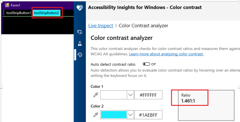
High Contrast Black:
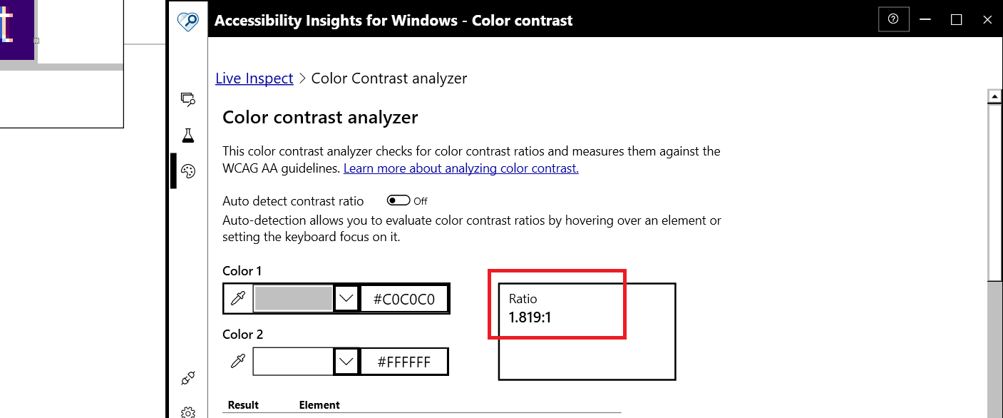
High Contrast White:
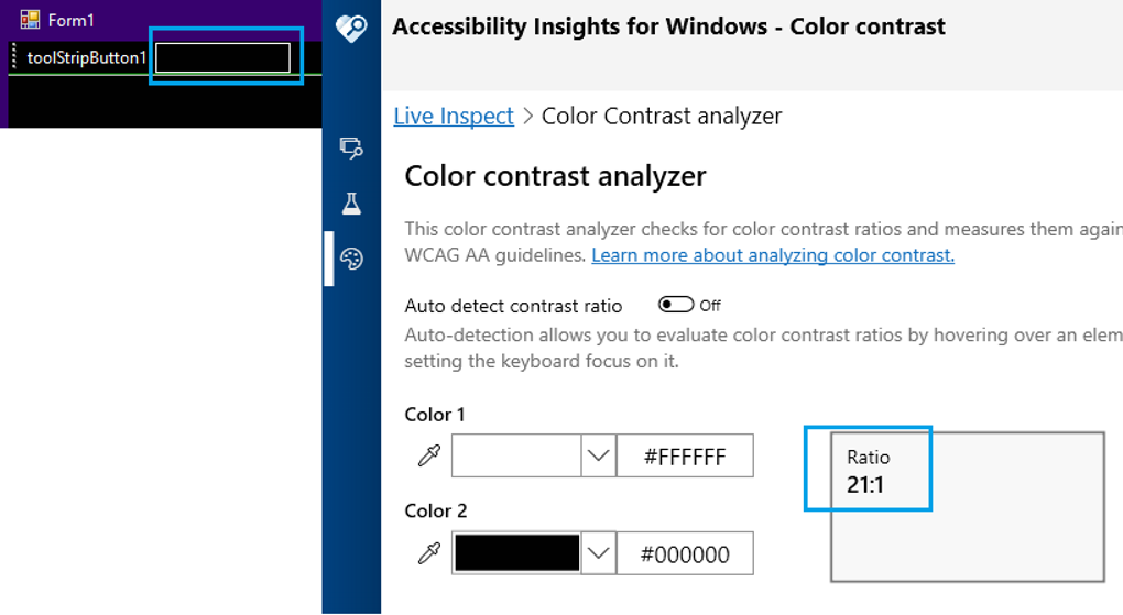
Expected behavior:
High Contrast Black:
Issue Analytics
- State:

- Created 2 years ago
- Comments:9 (9 by maintainers)
 Top Results From Across the Web
The ToolStripButton borders have low color contrast ratio in ...
This issue is reproducing when high contrast is Aquatic/Dusk/Night sky; This issue doesn't repro when high contrast is Desert. Minimal repro:.
Read more >What's new in accessibility in .NET Framework
The ToolStripButton, ToolStripComboBox, and ToolStripDropDownButton controls, which have an increased luminosity contrast ratio in High Contrast ...
Read more >Understanding Success Criterion 1.4.11: Non-text Contrast
Text inputs that have no border and are differentiated only by a background color must have a 3:1 contrast ratio to the adjacent...
Read more >Styling for Windows high contrast with new standards for ...
The feature works by enabling the user to select theme colors for a scoped number of semantic elements. This scheme can then be...
Read more >The Guide To Windows High Contrast Mode
High Contrast mode is an accessibility feature that changes the look of our website and Windows applications by replacing the color of the ......
Read more > Top Related Medium Post
No results found
 Top Related StackOverflow Question
No results found
 Troubleshoot Live Code
Lightrun enables developers to add logs, metrics and snapshots to live code - no restarts or redeploys required.
Start Free Top Related Reddit Thread
No results found
 Top Related Hackernoon Post
No results found
 Top Related Tweet
No results found
 Top Related Dev.to Post
No results found
 Top Related Hashnode Post
No results found
I think you’re probably right. The button needs to have the correct contrast with the text. The border is of less importance per the official CAIAcc team. So we can go ahead and close this issue.
If we have bandwidth I’d probably recommend it.