question-mark
Stuck on an issue?

Lightrun Answers was designed to reduce the constant googling that comes with debugging 3rd party libraries. It collects links to all the places you might be looking at while hunting down a tough bug.

And, if you’re still stuck at the end, we’re happy to hop on a call to see how we can help out.

Multiline does not grow TextInput until several characters into new line

See original GitHub issue

Issue Description

First of all, I’m a big fan of the chat! Thank you to all who have contributed. 🎉

We’re seeing an issue where the TextInput does not grow vertically until several characters into the new line (see attached gif). So, it’ll grow to two lines on, say, the 5th character after the wrap. Same with the third line, fourth line, etc. After a few characters, the TextInput does grow to show the line.

Steps to Reproduce / Code Snippets

Repro Steps:

  1. Type until the end of the first line.
  2. Type 1-3 characters into the second line, so that the text wraps. See the TextInput has not yet grown.
  3. Type a few more characters. See that TextInput grows to show the second line.
      <GiftedChat
        alignTop
        renderSend={() => null}
        renderAccessory={({ text, onSend }) => (
          <MessengerInputButtons
            sendButton={sendButton}
            onSend={onSend}
            text={text}
            showMediaPrompt={this.props.showMediaPrompt}
          />
        )}
        renderBubble={(props) => <ChatBubble {...props} />}
        messages={formattedMessages}
        renderMessageText={(props) => <MessageText {...props} />}
        renderMessageImage={(props) => <MessageImage {...props} />}
        renderTime={() => null}
        renderDay={(props) => <ChatTimeStamp {...props} />}
        renderAvatar={(msgs) => (
          <FailedMessage
            showRetryActionSheet={this.props.showRetryActionSheet}
            messages={msgs}
          />
        )}
        showUserAvatar
        placeholder={'Write a message...'}
        placeholderTextColor={colors.brightGrey}
        textInputStyle={styles.textInputStyle}
        renderInputToolbar={(props) => (
          <InputToolbar
            {...props}
            containerStyle={styles.inputContainerStyle}
          />
        )}
        onSend={sendButton ? () => {} : message => this._onSend(message)}
        minInputToolbarHeight={this.determineMinInputHeight()}
        keyboardShouldPersistTaps={'never'}
        imageStyle={{ margin: 0 }}
        user={{ _id: this.props.user.id }}
        textInputProps={{
          selectionColor: colors.seafoam,
          marginTop: 12,
          marginLeft: 0,
          marginBottom: interfaceHelper.styleSwitch({
            xphone: 21, iphone: 6, android: 6,
          }),
          marginRight: 0,
          paddingTop: 0,
        }}
      />

Expected Results

When text wrapped, we expect the TextInput to grow on the first new character of the new line, not on the, say, 5th or 6th character of the new line.

Additional Information
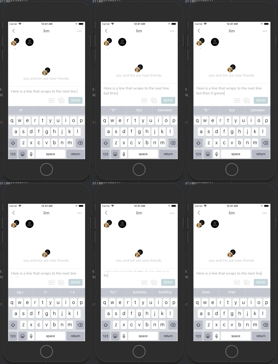
Apr-08-2020 00-41-50

  • Nodejs version: v8.11.4
  • React version: 16.4.1
  • React Native version: 0.56.0
  • react-native-gifted-chat version: 0.13.0
  • Platform(s) (iOS, Android, or both?): iOS

Issue Analytics

  • State:closed
  • Created 3 years ago
  • Reactions:17
  • Comments:27 (12 by maintainers)

github_iconTop GitHub Comments

23reactions
hirbodcommented, May 30, 2020

This was not an easy one. It took me a lot of work to find and fix the issue too + animate the input nicely. You simple can’t use padding for your input, it will break the multi-line calculation (thats why you have this glitch)

Since I really wanted a round input + be flexible with animation, I ended up providing my own InputToolbar and I copied the <Composer> from gifted chat and reworked it, rendering my own <Composer>.

The roudness and padding comes from my <View> (and not from the Input) with border and all that padding around it, too. The input is a dead simple input without any borders or padding. But now, setting lineHeight and fontSize won’t break the calculation, since the input has no padding 😃

I won’t give any support on this, but here is my custom Composer, which you can add as custom prop to <GiftedChat>. Play with it until it fits your needs.

It will prob. not work right away for you and you need to know that I use the UIManager for the animation, which have to be activated for android. (its already in the code) In my case, it works butter smooth on iOS and very good on low end Android devices (also butter smooth on high end devices).

If you don’t want that smooth nice animation, delete that parts and just have a look how I fixed the issue.

Here is a video of my input: https://streamable.com/qedbpb

TL;DR: dont add padding to your input, add the padding you need to a wrapping view.

import PropTypes from "prop-types";
import React from "react";
import { View, Platform, StyleSheet, TextInput, LayoutAnimation, UIManager } from "react-native";
import { MIN_COMPOSER_HEIGHT, DEFAULT_PLACEHOLDER } from "react-native-gifted-chat/lib/Constant";
import Color from "react-native-gifted-chat/lib/Color";
const styles = StyleSheet.create({
  textInput: {
    flex: undefined,
    lineHeight: 22,
    paddingTop: 0,
    paddingBottom: 0,
    paddingLeft: 0,
    borderRadius: 0,
    borderWidth: 0,
    backgroundColor: "transparent",
    borderColor: "transparent",
    paddingRight: 0,
    margin: 0,
    marginLeft: 0,
    marginTop: 0,
    marginRight: 0,
    marginBottom: 0,
    minHeight: 55,
    height: 106,
    maxHeight: 106,
    textAlignVertical: "top",
    width: "100%",
    justifyContent: "flex-start",
    alignItems: "flex-start",
    fontSize: 16,
  },
});
const CustomLayoutSpring = {
  duration: 200,
  create: {
    type: LayoutAnimation.Types.easeOut,
    property: LayoutAnimation.Properties.opacity,
    springDamping: 0.7,
  },
  update: {
    type: LayoutAnimation.Types.easeOut,
    springDamping: 0.7,
  },
  delete: {
    type: LayoutAnimation.Types.easeOut,
    property: LayoutAnimation.Properties.opacity,
    springDamping: 0.7,
  },
};
export default class Composer extends React.PureComponent {
  state = {
    finalInputHeight: 0,
  };

  inputRef = React.createRef();

  constructor() {
    super(...arguments);
    if (Platform.OS === "android") {
      UIManager.setLayoutAnimationEnabledExperimental &&
        UIManager.setLayoutAnimationEnabledExperimental(true);
    }

    this.contentSize = undefined;
    this.onContentSizeChange = (e) => {
      const { contentSize } = e.nativeEvent;
      // Support earlier versions of React Native on Android.
      if (!contentSize) {
        return;
      }
      if (
        !this.contentSize ||
        (this.contentSize && this.contentSize.height !== contentSize.height)
      ) {
        this.contentSize = contentSize;
        if (!this.props.text.length) {
          LayoutAnimation.configureNext(CustomLayoutSpring);
          this.setState({ finalInputHeight: 0 });
          this.props.onInputSizeChanged({ width: 0, height: 0 });
        } else {
          this.calcInputHeight();
          this.props.onInputSizeChanged(this.contentSize);
        }
      }
    };
    this.onChangeText = (text) => {
      if (text.length < 2) {
        LayoutAnimation.configureNext(CustomLayoutSpring);
      }
      this.props.onTextChanged(text);
    };
    this.calcInputHeight = () => {
      if (this.contentSize && this.contentSize.height) {
        if (!this.props.text.length && this.state?.finalInputHeight > 0) {
          LayoutAnimation.configureNext(CustomLayoutSpring);
          this.setState({
            finalInputHeight: 0,
          });
          return;
        }
        let height = this.contentSize.height;
        LayoutAnimation.configureNext(CustomLayoutSpring);
        this.setState({
          finalInputHeight: height + 14,
        });
      }
    };
  }
  render() {
    return (
      <View
        style={{
          flex: 1,
          position: "relative",
          justifyContent: "flex-start",
          borderRadius: 20,
          overflow: "hidden",
          backgroundColor: "#f5f5f5",
          marginLeft: 10,
          marginRight: 10,
          paddingTop: 6,
          paddingBottom: 0,
          paddingLeft: 12,
          paddingRight: 12,
          borderWidth: 0.5,
          borderColor: "#b7cc23",
          marginTop: this.state.finalInputHeight > 44 ? 3 : 6,
          minHeight: 38,
          maxHeight: 118,
          height: this.state.finalInputHeight,
        }}
      >
        <TextInput
          testID={this.props.placeholder}
          accessible
          accessibilityLabel={this.props.placeholder}
          placeholder={this.props.placeholder}
          placeholderTextColor={this.props.placeholderTextColor}
          multiline={this.props.multiline}
          editable={!this.props.disableComposer}
          onContentSizeChange={this.onContentSizeChange}
          onChangeText={this.onChangeText}
          textBreakStrategy="highQuality"
          style={styles.textInput}
          autoFocus={this.props.textInputAutoFocus}
          value={this.props.text}
          autoCompleteType="off"
          enablesReturnKeyAutomatically
          underlineColorAndroid="transparent"
          keyboardAppearance={this.props.keyboardAppearance}
          {...this.props.textInputProps}
          ref={this.inputRef}
        />
      </View>
    );
  }
}
Composer.defaultProps = {
  composerHeight: MIN_COMPOSER_HEIGHT,
  text: "",
  placeholderTextColor: Color.defaultColor,
  placeholder: DEFAULT_PLACEHOLDER,
  textInputProps: null,
  multiline: true,
  disableComposer: false,
  textInputStyle: {},
  textInputAutoFocus: false,
  keyboardAppearance: "default",
  onTextChanged: () => {},
  onInputSizeChanged: () => {},
};
Composer.propTypes = {
  composerHeight: PropTypes.number,
  text: PropTypes.string,
  placeholder: PropTypes.string,
  placeholderTextColor: PropTypes.string,
  textInputProps: PropTypes.object,
  onTextChanged: PropTypes.func,
  onInputSizeChanged: PropTypes.func,
  multiline: PropTypes.bool,
  disableComposer: PropTypes.bool,
  textInputStyle: PropTypes.any,
  textInputAutoFocus: PropTypes.bool,
  keyboardAppearance: PropTypes.string,
};
7reactions
aleksanderpaliszewskicommented, Jan 12, 2021

@izakfilmalter functional component version 😉

really god job @Hirbod

import React, {FC, useState, useRef} from 'react';
import {
  StyleSheet,
  View,
  LayoutAnimation,
  TextInput,
  UIManager,
} from 'react-native';
import {DEFAULT_PLACEHOLDER} from 'react-native-gifted-chat/lib/Constant';
import {ComposerProps} from 'react-native-gifted-chat';

import {isAndroid} from '../../utils/constants';
import {COLORS} from '../../utils/styles';

interface ContentSize {
  width: number;
  height: number;
}

type NativeElement = {
  nativeEvent: {
    contentSize: ContentSize;
  };
};

const CustomLayoutSpring = {
  duration: 200,
  create: {
    type: LayoutAnimation.Types.easeOut,
    property: LayoutAnimation.Properties.opacity,
    springDamping: 0.7,
  },
  update: {
    type: LayoutAnimation.Types.easeOut,
    springDamping: 0.7,
  },
  delete: {
    type: LayoutAnimation.Types.easeOut,
    property: LayoutAnimation.Properties.opacity,
    springDamping: 0.7,
  },
};

const ChatComposer: FC<ComposerProps> = ({
  text = '',
  placeholder = DEFAULT_PLACEHOLDER,
  placeholderTextColor,
  textInputProps,
  onTextChanged,
  onInputSizeChanged,
  multiline = true,
  disableComposer = false,
  textInputAutoFocus,
  keyboardAppearance,
}) => {
  if (isAndroid) {
    UIManager.setLayoutAnimationEnabledExperimental &&
      UIManager.setLayoutAnimationEnabledExperimental(true);
  }
  const inputRef: any = useRef(null);
  const [newContentSize, setNewContentSize] = useState<
    ContentSize | undefined
  >();
  const [finalInputHeight, setFinalInputHeight] = useState(28);

  const calcInputHeight = (contentSize: ContentSize) => {
    if (contentSize?.height) {
      if (!text?.length && finalInputHeight) {
        LayoutAnimation.configureNext(CustomLayoutSpring);
        setFinalInputHeight(0);

        return;
      }
      LayoutAnimation.configureNext(CustomLayoutSpring);
      setFinalInputHeight(contentSize.height + 14);
    }
  };

  const onContentSizeChange = ({nativeEvent: {contentSize}}: NativeElement) => {
    if (!contentSize) {
      return;
    }
    if (
      !newContentSize ||
      (newContentSize && newContentSize.height !== contentSize.height)
    ) {
      setNewContentSize(contentSize);
      if (!text?.length && onInputSizeChanged) {
        LayoutAnimation.configureNext(CustomLayoutSpring);
        setFinalInputHeight(0);
        onInputSizeChanged({width: 0, height: 0});
      } else if (onInputSizeChanged) {
        calcInputHeight(contentSize);
        onInputSizeChanged(contentSize);
      }
    }
  };

  const onChangeText = (text: string) => {
    if (text.length < 2) {
      LayoutAnimation.configureNext(CustomLayoutSpring);
    }
    onTextChanged && onTextChanged(text);
  };

  return (
    <View
      style={[
        styles.composer,
        {marginTop: finalInputHeight > 44 ? 3 : 6, height: finalInputHeight},
      ]}>
      <TextInput
        ref={inputRef}
        testID={placeholder}
        accessible
        accessibilityLabel={placeholder}
        placeholder={placeholder}
        placeholderTextColor={placeholderTextColor}
        multiline={multiline}
        editable={!disableComposer}
        onContentSizeChange={onContentSizeChange}
        onChangeText={onChangeText}
        textBreakStrategy="highQuality"
        style={styles.textInput}
        autoFocus={textInputAutoFocus}
        value={text}
        autoCompleteType="off"
        enablesReturnKeyAutomatically
        underlineColorAndroid="transparent"
        keyboardAppearance={keyboardAppearance}
        {...textInputProps}
      />
    </View>
  );
};

const styles = StyleSheet.create({
  composer: {
    flex: 1,
    position: 'relative',
    justifyContent: 'flex-start',
    borderRadius: 20,
    overflow: 'hidden',
    backgroundColor: '#f5f5f5',
    marginLeft: 10,
    marginRight: 10,
    paddingTop: 6,
    paddingBottom: 0,
    paddingLeft: 12,
    paddingRight: 12,
    borderWidth: 0.5,
    borderColor: '#b7cc23',
    minHeight: 38,
    maxHeight: 118,
  },
  textInput: {
    flex: undefined,
    lineHeight: 22,
    paddingTop: 0,
    paddingBottom: 0,
    paddingLeft: 0,
    borderRadius: 0,
    borderWidth: 0,
    backgroundColor: 'transparent',
    borderColor: 'transparent',
    paddingRight: 0,
    margin: 0,
    marginLeft: 0,
    marginTop: 0,
    marginRight: 0,
    marginBottom: 0,
    minHeight: 55,
    height: 106,
    maxHeight: 106,
    textAlignVertical: 'top',
    width: '100%',
    justifyContent: 'flex-start',
    alignItems: 'flex-start',
    fontSize: 16,
  },

export default ChatComposer;

Read more comments on GitHub >

github_iconTop Results From Across the Web

making a multiline, expanding TextInput with React-Native
Use minHeight, maxHeight instead, and if multiline is enabled, the TextInput will grow till reaching the maxHeight, then will be scrollable.
Read more >
TextBoxBase.Multiline Property (System.Windows.Forms)
Gets or sets a value indicating whether this is a multiline text box control. ... will be displayed on the same line until...
Read more >
TextInput - React Native
This is documentation for React Native 0.63, which is no longer actively maintained. ... If true , the text input can be multiple...
Read more >
Make a text multi-line - Customily Knowledge Base
When a text box has enough height to fit multiple lines, it is multi-line by default. However, in order to jump to the...
Read more >
Text Input — Kivy 2.1.0 documentation
To create a multiline TextInput (the 'enter' key adds a new line): ... Weak modes are currently not implemented in Kivy text layout,...
Read more >

github_iconTop Related Medium Post

No results found

github_iconTop Related StackOverflow Question

No results found

github_iconTroubleshoot Live Code

Lightrun enables developers to add logs, metrics and snapshots to live code - no restarts or redeploys required.
Start Free

github_iconTop Related Reddit Thread

No results found

github_iconTop Related Hackernoon Post

No results found

github_iconTop Related Tweet

No results found

github_iconTop Related Dev.to Post

No results found

github_iconTop Related Hashnode Post

No results found