
Lightrun Answers was designed to reduce the constant googling that comes with debugging 3rd party libraries. It collects links to all the places you might be looking at while hunting down a tough bug.
And, if you’re still stuck at the end, we’re happy to hop on a call to see how we can help out.
Container auto-filling available space
See original GitHub issueSo I’m trying to implement this component and the styling isn’t working as I had expected it would. My expectation is that I get a small search bar, and when I type in some text, the listView of formatted addresses pops up over whatever components I have that are immediately below the GooglePlacesAutocomplete component.
The JSX and GooglePlacesAutocomplete styling is as follows (the three TextInputs and the gaudy backgroundColors are mainly there to test if it’s still being buggy or not):
        <View style={containerStyle}>

            <GooglePlacesAutocomplete
                styles={{
                    container: {
                        backgroundColor: 'blue'
                    },
                    textInputContainer: {
                        width: '100%',
                    },
                    description: {
                        fontWeight: 'bold',
                    },
                    listView: {
                        position: 'absolute',
                        marginTop: 40,
                        backgroundColor: 'green',
                        elevation: 1
                    },
                    separator: {
                        opacity: 0
                    }
                }}
            />
            <TextInput
                style={inputStyle}
            />
            <TextInput
                style={inputStyle}
            />
            <TextInput
                style={inputStyle}
            />

            <Button
                buttonStyle={buttonStyle}
                textStyle={buttonTextStyle}
                text='Submit'
                onPress={this.props.formatAddress.bind(this, this.state.address)}
            />
        </View>
The styles for the other parts of the component are as follows:
const styles = StyleSheet.create({
    containerStyle: {
        flexGrow: 1,
        display: 'flex',
        justifyContent: 'center',
        alignItems: 'center',
    },
    inputStyle: {
        marginTop: 20,
        marginBottom: 20,
        height: 35,
        paddingLeft: 5,
        paddingRight: 5,
        fontSize: 22,
        lineHeight: 35,
        width: '95%',
        borderColor: 'gray',
        borderWidth: 1,
    },
    buttonStyle: {
        height: 70,
        width: '100%',
        backgroundColor: '#C60000',
        alignItems: 'center',
        alignSelf: 'flex-end'
    },
    buttonTextStyle: {
        fontSize: 25,
        color: 'white',
        lineHeight: 50
    }
});
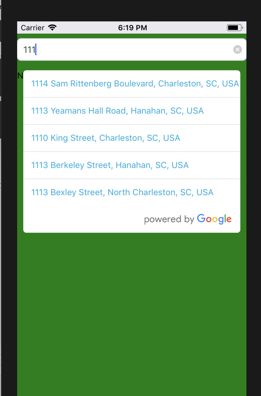
This styling looks like the following images:
No text entered:

Five addresses returned:

Three addresses returned:

I would like the blue container to not be visible and to allow for the TextInputs below to be able to be placed directly under the GooglePlacesAutocomplete component, but thus far setting it to flex: 1, changing its flexGrow or flexShrink properties, or explicitly setting it’s height has done nothing.
Also, when the listView is active, it is sort of transparently floating under the inputs below it (even though it doesn’t show in the screenshots, it shows on the emulator. If I click on one of them I can input text into the TextInput, and it doesn’t choose a GooglePlacesAutocomplete address. I tried setting elevation: 1, adjusting the zIndex, and setting the backgroundColor to white, as those fixes seemed to work for other people, but they didn’t work for me.
Here is a screenshot of that:

The only other styling I have is flex: 1 in the View tag that surrounds the Map component above it and the component holding the GooglePlacesAutocomplete, TextInput, and TouchableOpacity components.
Anyone who has had similar issues and has fixed them, I would appreciate some help!
Issue Analytics
- State:

- Created 6 years ago
- Comments:9
 Top Results From Across the Web
 Top Related Medium Post
 Top Related StackOverflow Question
 Troubleshoot Live Code
 Top Related Reddit Thread
 Top Related Hackernoon Post
 Top Related Tweet
 Top Related Dev.to Post
 Top Related Hashnode Post
Let me know if this works for you:
On the container style for the GooglePlacesAutocomplete component, add a
flexGrow: 0andflexShrink: 0Then set a
paddingTopon your<ScrollView>to whatever the height of your GooglePlacesAutocomplete component is (in my case it was 50pts high, so I set the padding to 60 to give it some breathing room)Should give you something like this:
That extra white space is actually coming from the GooglePlacesAutocomplete component inheriting a
flex: 1style by default.For anyone still looking for this, these are the styles that worked for me: