
Lightrun Answers was designed to reduce the constant googling that comes with debugging 3rd party libraries. It collects links to all the places you might be looking at while hunting down a tough bug.
And, if you’re still stuck at the end, we’re happy to hop on a call to see how we can help out.
Nutrition Label Ex 35-36: Should use Flexbox, not Float
See original GitHub issueDescribe the Issue
I was helping a camper with this challenge today and they were confused about the need to add overflow: hidden to the h1 element. I was too, until I did some research and remembered that containers don’t clear floats automatically unless you use overflow: hidden. This is very counter-intuitive and is not explained at all in the challenge.
Additionally, in the next challenge you have to add a “magic number” to the h1 to get it to optically align. I don’t think this scales well (literally), because if you increase your font size it’s going to break.
Affected Page
Your code
<div class="calories-info">
        <div class="left-container">
          <p class="bold sm-text">Amount per serving</p>
            <h1>Calories</h1>
          </div>
        <h1 class="right">230</h1>
      </div>
.calories-info {
  display: flex;
  justify-content: space-between;
  align-items: flex-end;
}

.left-container {
  display: flex;
  flex-direction: column;
}
Expected behavior
It seems to me that there is a better, much cleaner solution to be had by applying another wrapper around the “Amount Per Serving” and “Calories” elements and using a flex column, then using flex on the .calories-info div with justify-content: space-between and align-items: flex-end;
No magic numbers needed, both the markup and css are cleaner - although you do need one more containing element.
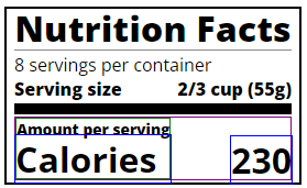
I’ve added a screenshot which shows the layout of the elements in my example.
Screenshots
System
N/A
Additional context
In general, the given solution feels very “old school” to me. Flexbox has been available on most platforms for a number of years now. We really shouldn’t be teaching people to support IE11 (especially since it has reached the end of it’s support life, recently).
I know this is a big change, it just bugs me to see this being taught in what is supposed to be a modern course on the web.
Issue Analytics
- State:

- Created a year ago
- Comments:16 (16 by maintainers)
 Top Related StackOverflow Question
 Troubleshoot Live Code
 Top Related Reddit Thread
 Top Related Hackernoon Post
 Top Related Tweet
 Top Related Dev.to Post
 Top Related Hashnode Post
I’m not where where it should be taught. It should be taught the way it is currently intended to be used: for inline elements that need text to flow around them. A news article with an image on the side which the text wraps around is ideal. The way it was historically used (like in this exercise) is kinda a bastardization of it’s intended function.
@Sboonny We would not want to introduce
gridhere, as that’s not taught until later in the curriculum.However, this project does come immediately after the flexbox project, and would be a good opportunity to reinforce those concepts.