Adding children/child to a button?
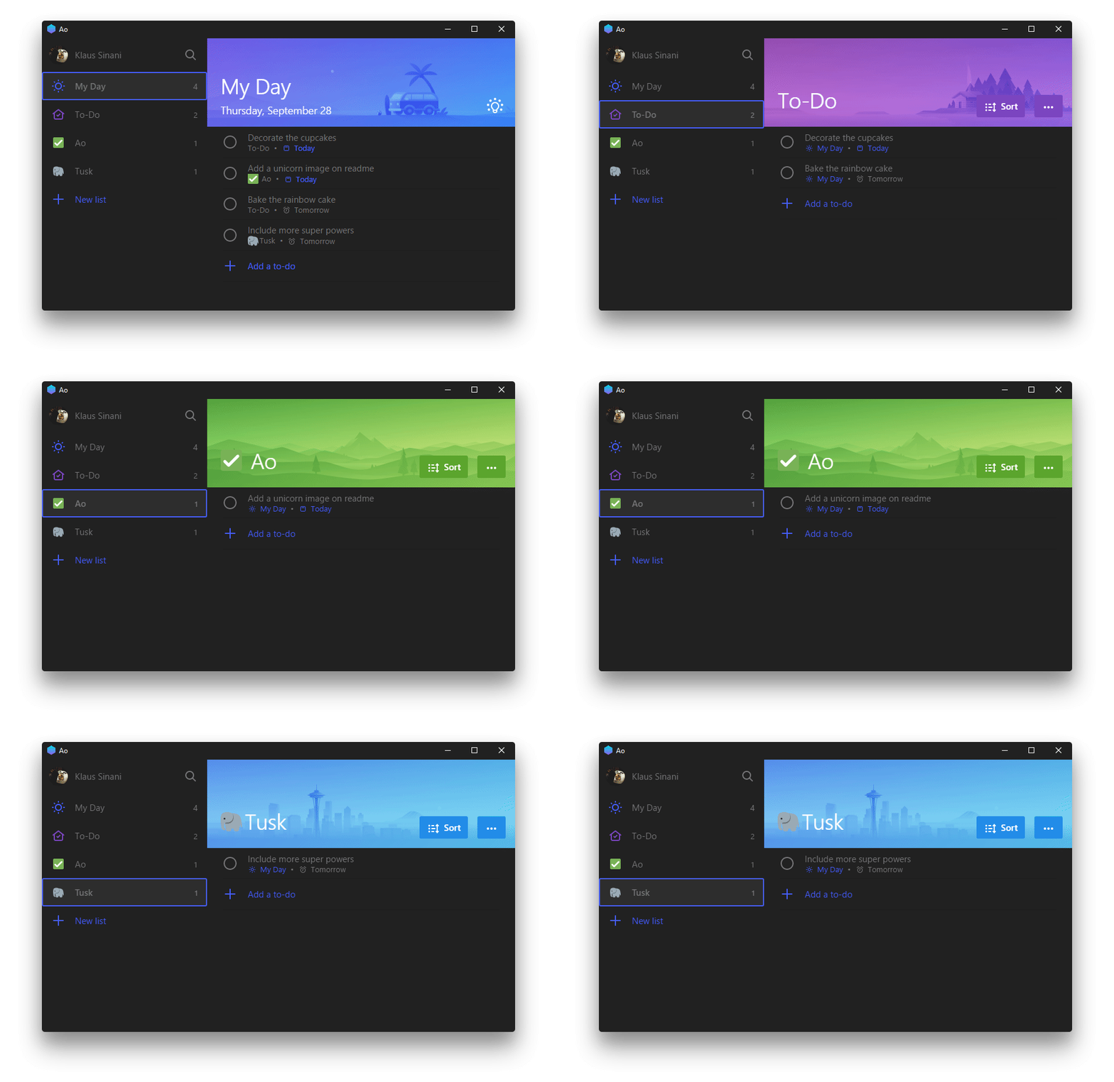
See original GitHub issueIs it possible to add children or a single child to a button? For example to create buttons like those in the sidebar of this app:

So, ideally I’d do something like this:
Button.create [
    Button.child [
        StackPanel.create [ (* ... *) ]
    ]
    Button.fontSize 20.0
    // ...
]
Is that possible or is there another way to achieve this sort of thing?
Issue Analytics
- State:
- Created 3 years ago
- Comments:8 (5 by maintainers)
 Top Results From Across the Web
XAML how to add a child to a button in c# [duplicate]
Let's create a sample app, and add a new window. I named mine AddControls. Here's the XAML: <Window x:Class=“WPFSample001.AddControls“
Read more >Dynamically add component(child) via button(in parent) to ...
My goal is to use a button, which when clicked, add a single 'div' component. Can you help me figure out why this...
Read more >Can I add "Add Child" button to a Issue type in a
Go to the lucky ticket who's about to have children, and click the three-dot menu. Select the child issue type, and type the...
Read more >Child objects of Button trigger the Button.onClick
I'm working on 2018.4.9f1, in case that matters. How can I make it so that the UI elements children of the Button don't...
Read more >"Widget Can't accept additional children." How to fix?
I am creating a widget/menu. I've added a Border and it has to have 3 children buttons. I've added the first button and...
Read more > Top Related Medium Post
No results found
 Top Related StackOverflow Question
No results found
 Troubleshoot Live Code
Lightrun enables developers to add logs, metrics and snapshots to live code - no restarts or redeploys required.
Start Free Top Related Reddit Thread
No results found
 Top Related Hackernoon Post
No results found
 Top Related Tweet
No results found
 Top Related Dev.to Post
No results found
 Top Related Hashnode Post
No results found

@smolck Using HorizontalAlignment = Stretch should work when a control doesn’t fill the available space by default.
(most panels fill the available space by default if you don’t set other constraints)
There is a good section about this in the docs.
https://avaloniaui.net/docs/layout/alignment-margins-padding
@smolck you can use
ItemsControl/ListBoxfor that case and change right panel depending on click / selectionAlso, for
Gridyou could use instead