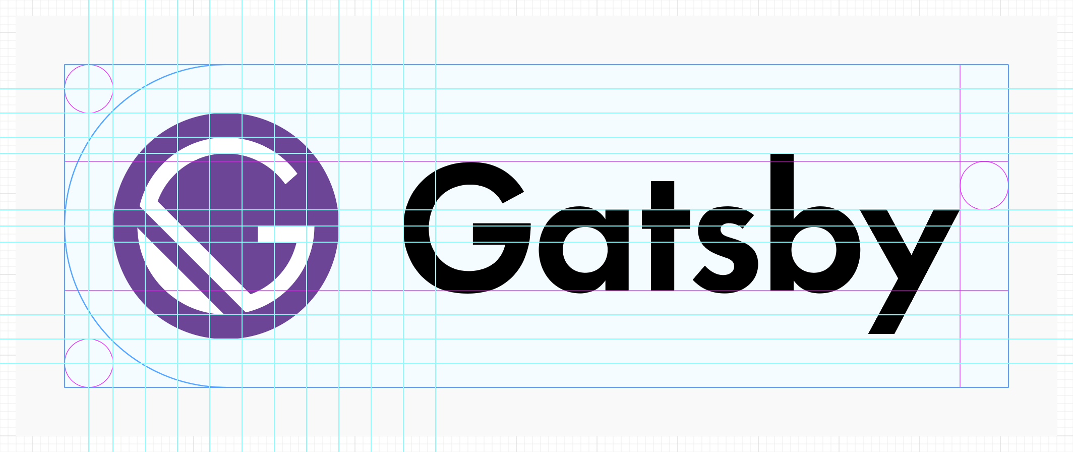
[brand] Gatsby logo definition
See original GitHub issueNot only 😉 in support of the Gatsby t-shirt design contest, I would like to make an effort to settle on a logo definition for the Gatsby brand (starting the “Gatsby Brand Guidelines” I guess).
Ideally, this would eventually result in a section on gatsbyjs.org offering downloads and usage instructions.
Motivation
Seeing the t-shirt mockups by @rdela using the original logo design by @SachaG I felt that for the t-shirt design, the logotype could be a little bigger. On the second look, I started wondering about the logomark font weight. I took another look at gatsbyjs.org – there we use “Futura PT Demi” for the logomark, a heavier weight than what is used in the “OGatsby” version. A little OCD kicked in. 😄 😉
A bit of research
So I started to trace back:
- Here’s the aforementioned initial logo design by @SachaG:

- The logotype is set in “Futura Bold” according to @SachaG, but I think it’s the “Medium” weight (that’s also used in the Figma mockups of the homepage, see below).
- Logomark SVGs from https://github.com/gatsbyjs/gatsby/issues/408#issuecomment-250348924:
- https://cl.ly/hbTv - positive logomark.
- https://cl.ly/hbjr - negative logomark.
- Current gatsbyjs.org colors are coming from @SachaG’s Gatsby Figma board:
- The latter is first mentioned here: https://github.com/gatsbyjs/gatsby/pull/1170#issuecomment-308593192
- Logomark fill:
#744C9E. - Brighter stripe in masthead background:
#9D7CBF. - The logomark is set in “Futura Medium”.
- Archie Hicklin’s suggested palette refresh: https://github.com/gatsbyjs/gatsby/issues/1173#issuecomment-309415650
- Sidenote: The logomark used as the Twitter profile image has a different fill:
#5b2b63. The https://opencollective.com/gatsby has another one:#623F93.
Status Quo and personal opinion
The current gatsbyjs.org uses Futura PT, more specifically @KyleAMathews bought the “Book” and “Demi” cuts plus their italic versions. Futura PT Demi is used to substitute “Futura Medium” from @SachaG’s designs.
I like the bolder logotype (compared to the “OGatsby” version using “Futura Medium”). I think there’s a little too much whitespace in between the gatsbyjs.org logomark and -type.
First shots at a logo definition
Based on the current gatsbyjs.org logo version, I somehow managed to squeeze the current logo into an old brand guideline I found in my (digital) crates. The clearance space currently is defined a little weirdly by cap height minus x-height. I haven’t actually validated how well the current definition works and want to take a look at using the logomark x-height as a base for the Clear Space instead and probably get rid of the “Safe Zone”.


I held back from really tightening the screws, so a few things are a bit off still – but things are lining up quite nicely already. The whitespace between mark and type are reduced. I think the logomark/-type balance works better when compared to the “OGatsby” version.
What’s your opinion? How do you feel about “Futura Medium” vs. “Futura PT Demi”?
Issue Analytics
- State:
- Created 6 years ago
- Reactions:3
- Comments:26 (26 by maintainers)

 Top Related StackOverflow Question
I love it, but could you try a version in Comic Sans?
Just kidding, great work and I can’t wait to see it on a tshirt 😃
Aaaaand … right after posting above I started to squint and revisit the kerning one last time 😕 – moved the “a” away a little from “G” and “sb” a tad closer to “y”:
SVGs coming! 🎉 😶