
Lightrun Answers was designed to reduce the constant googling that comes with debugging 3rd party libraries. It collects links to all the places you might be looking at while hunting down a tough bug.
And, if you’re still stuck at the end, we’re happy to hop on a call to see how we can help out.
Explore using Material 3 web components inside React components (via `Checkbox`)
See original GitHub issueFeature Description
This is going to be the first issue to wrap a Material 3 web component in a React component for use across Site Kit. Since this is the first one, it also acts as an exploration issue, so extra time and care should be taken here to evaluate the approach and whether it would lead to any long-term problems.
Do not alter or remove anything below. The following sections will be managed by moderators only.
Acceptance criteria
- A new directory
assets/js/components/material-3should be added. - Inside of it, a new
Checkboxcomponent should be implemented, which wraps themd-checkboxweb component (see https://github.com/material-components/material-web/tree/master/checkbox) from the@material/webpackage (added in #5802).- The component should wrap the web component in a way that it works reliably within the React environment, e.g. special care needs to be taken around event listeners and binding props.
- A Storybook story for the component should be added, using a new “namespace”
Components/Material 3(i.e. the story should beComponents/Material 3/Checkbox). - Jest test coverage should be added. This may be particularly tricky as well, as it needs to work between React and the web component.
- To make Storybook and Jest work for the web components, extra tweaks may need to be added to the infrastructure to ensure the
@material/web“dist” file is loaded in these environments. - As mentioned in the issue description, the approach here should be carefully evaluated, and since this is the very first web component to wrap like this, we should take extra time to get the approach right. Note that a first exploration was started during the last hackathon in #5718, so this should be taken into account for the work here.
Implementation Brief
_Please note there is a draft PR which includes a PoC of the checkbox behaving as a controlled component, with working Jest tests. This should be used a reference but not necessarily continued with directly. https://github.com/google/site-kit-wp/pull/6131_
Summary
Here is a high level summary of the IB, which also highlights some key details.
- Get up to speed on the basics of Lit in order to understand
@material/webweb components and specifically themd-checkboxweb component. - Review the PoC.
- Review the current
Checkboxand compare it tomd-checkbox. - Implement the new
Checkboxmaking use ofmd-checkboxfor the main checkbox aspect and adding theSpinnerandlabelwith appropriate styling. Ensure it’s a drop-in replacement with the same props and behaviour.- Refer to the PoC for the fleshed out controlled component behaviour.
- Feel free to see if there’s an alternative to the “changing key hack”, but don’t spend too long on it. If no alternative found, implement as per the PoC and create a followup issue to address later.
- Ensure the new Checkbox also has the same accessible behaviour - one point noted in the PoC is this “changing key hack” has a side effect of unfocusing the checkbox when the checked state is changed via keyboard input and this still needs to be addressed.
- Provide Storybook stories which demonstrate use of all of the Checkbox props and behaviour.
- Cover the component with Jest tests. Refer to the PoC for controlled component behaviour tests.
- Update the related NPM dependencies and the Jest config in
tests/js/jest.config.js. - Fix any broken tests. The PoC identified tests failing for
TourTooltips, it’s possible there could be more tests failing since then.- Try to fix the
TourTooltipstests more correctly by getting theFloaterto be rendered as visible but, again, don’t spend too long on this and if it’s not possible, change the expectations instead and create a followup issue to address later.
- Try to fix the
- Update the related NPM dependencies and the Jest config in
Now on to the main body of the IB.
Create Checkbox component
Prelude
- The new
Checkboxcomponent will use themd-checkboxweb component from@material/web. It should be noted that@material/webis currently in an alpha stage and there is no documentation for it. To get an understanding ofmd-checkboxand the interface it presents to consumers (properties, attributes, events etc), it’s necessary to read the source for it and this in turn requires at least some basic understanding of Lit, a library for writing web components. - The new component will fill out the stub implementation in
assets/js/googlesitekit/components-gm3/Checkbox.js. - Refer to
assets/js/googlesitekit/components-gm2/Checkbox.jsfor the currentCheckbox.
Basic Implementation
- Refer to the current
Checkboxto get an understanding of what we are trying to reproduce and update. - Cross reference this with the
md-checkboximplementation, notably therendermethod. - You will see that
md-checkboxprovides the fundamental checkbox aspect but does not provide theSpinneror thelabel. This means we’ll still need to implement these ourselves in a similar manner to the current component. - The component is responsible for including the
@material/webimport that it depends on, so make sure toimport '@material/web/checkbox/checkbox';at the top of the file. - We want the new component to be a drop-in replacement, so copy the props from the current component.
- The component should render the
md-checkbox, thelabeland the optionalSpinnerwith structuraldivelements as necessary. To be clear, we should not be reusing any of themdc-prefixed classes. Thelabelwill need a bit of styling so create a new unique class name for the component’sdivwrapper, and add a new SCSS file with the necessary styles in it.- Create a new folder for the GM3 related SCSS:
assets/sass/components-gm3. - Create a subfolder for the component-specific files:
assets/sass/components-gm3/components. - The new file should be called
_checkbox.scss. - Create
_index.scssfiles and imports as necessary to ensure the newcomponents-gm3entry point and its descendents are included viaassets/sass/admin.scss.
- Create a new folder for the GM3 related SCSS:
- The props
id,name,value,tabIndex,checkedanddisabledcan be provided as attributes tomd-checkbox. - However, Lit boolean attributes treat anything non-
null|undefinedastrue, socheckedanddisabledshould be cooerced fromfalsetonullorundefined.- E.g.
<md-checkbox checked={ checked || null } />
- E.g.
- Event handling needs a bit of extra attention and is covered below.
Events
- In order to attach/remove events to the
md-checkbox, it’s necessary to retrieve arefto the element and add/remove events viaaddEventListener/removeEventListener. - The
onChange()andonKeyDown()props can be directly attached aschangeandkeydownevent handlers as they don’t need any special logic (although, thechangeevent will be manually dispatched as described below). - The trickiest aspect to event handling is ensuring that these components behave as controlled components in order to work as drop-in replacements. Achieving this proved somewhat problematic with
md-checkboxbut it is possible. Please note that this controlled component behaviour was also explored for themd-outlined-text-fieldweb component, and a more elegant solution was found to be possible, so hopefully we can take a cleaner approach for other components. - Nevertheless, to achieve the controlled component behaviour:
- Create a
clickhandler formd-checkboxwhich callsevent.preventDefault(), toggles thecheckedproperty manually, and raises achangeevent. - Create a
changehandler formd-checkboxwhich invokes theonChange()prop with the event. - Here’s the hacky bit. Because of what seems to be a glitch with the React-wrapped
md-checkboxwhereby it doesn’t update visually when thecheckedproperty is changed programmatically following a click on the checkbox, in order for themd-checkboxto visually refresh when thecheckedprop is toggled, it’s necessary to force a rerender of themd-checkbox. This can be achieved with a changingkeyvalue formd-checkbox. As we want to rerender when thecheckedvalue changes, we can simply usecheckedas part of the key.
- Create a
- The above can be seen in working PoC form in the PR mentioned above. It should be noted this limitation was discovered and workaround employed in the initial Hackathon investigation - https://github.com/google/site-kit-wp/pull/5718.
- Some time was spent looking into this so, by all means see if you can find a better solution, but unless an improvement can be found in the short term we should create a separate issue to look into this in more depth. Alternatively it might end up being fixed anyway with a future version of
@material/web.
Styling md-checkbox
- Out of the box, the
md-checkboxdisplays in a purple color. In order to use the correct green theme colors, for this and other@material/webcomponents, add the following to a new SCSS file,assets/sass/components-gm3/_theme.scss:
.googlesitekit-plugin {
  --md-sys-color-primary: #{$c-content-primary};
  --md-sys-color-on-surface: #{$c-surfaces-on-surface};
}
- Refer to https://lit.dev/docs/components/styles/#theming and also see this commit for a little more info: https://github.com/google/site-kit-wp/pull/6131/commits/5f520cb10affc482dc66621d6f63eb73d15713f1
Create Storybook stories
- Create stories for the new component that exercise all the props.
- It might be advisable to add extra stories for the current
Checkboxin order to also exercise all of the props for it, to aid in comparing the components. - As a note, it would be useful to install the Storybook Controls addon in order to write more dynamic stories for testing these new components. This is probably outside of the scope of this issue and should be followed up on separately as we implement more components.
Add Jest tests
Update test environment
- In order for Jest tests to work with
@material/webit’s necessary to do the following:- Update to
@testing-library/jest-dom@5.16.5andjest@26.6.3, and installjest-environment-jsdom-sixteen@26.6.2. Note that these are the specific versions that were installed during PoC time via the following, so you may just want to run this for more recent versions, but if you run into trouble then refer to the specifics just mentioned.npm i -D @testing-library/jest-dom@latest, jest@26, jest-environment-jsdom-sixteen
- Reinstall
@testing-library/reactin order to bump the@testing-library/domversion. Resulted in@testing-library/react@10.4.9and@testing-library/dom@7.31.2at PoC time, see above.npm i @testing-library/react
- Update to
- Add the following Jest config to
tests/js/jest.config.js:
  testEnvironment: 'jest-environment-jsdom-sixteen', // This is needed to allow Jest to work with web components.
  transformIgnorePatterns: [ '<rootDir>/node_modules/(?!@material/web)/.*' ] // This is needed to allow `@material/web` to be Babel-transformed for Jest tests.
Fix broken tests
- There will be tests failing for
TourTooltips. Having looked into it this appears to be a result of bumping to JSDom 16 for Jest tests. As the JSDom Changelog indicates, improvements togetComputedStyle()were made and this seems to interact withgetByRolewhereby elements that were not previously being recognised as being hidden now are, andgetByRolecan no longer find them. - Specifically in the case of
TourTooltipsit appears theFloaterelement’s hidden visibility is now propagating to its descendents and most of thegetByRolecalls in its test suite are failing as a result. - A more correct fix for this would be to get the
Floaterto be rendered as visible. However, if this proves too time consuming, it’s possible to fix by rewriting the tests a bit to avoid this use ofgetByRole, in which case a followup issue should be raised to fix this more correctly. - For more details see this commit: https://github.com/google/site-kit-wp/pull/6131/commits/58ab655845b065a77fd5b0b1250ff6189d7c88a0
Write test cases
- Write test cases for the new
Checkboxcomponent including the controlled component behaviour. This has been fleshed out a bit in the PoC.
QA Brief
- Open the new Material 3 > Checkbox > Checkboxes story and review the new Checkbox component.
- Note that the old
Checkboxesstory has been updated to assist a like for like comparison. - Verify that the checkbox looks and behaves as expected including keyboard input (Space toggles the checkbox).
- Please note, as discussed on the PR, there is a discrepancy between the old and new behaviour when clicking on the checkbox label. The new component will not focus the checkbox when clicking on the label. This is due to a technical issue with the
@material/weblibrary and should hopefully be rectified in a future update. A followup issue has been raised to address this: https://github.com/google/site-kit-wp/issues/6334
- Please note, as discussed on the PR, there is a discrepancy between the old and new behaviour when clicking on the checkbox label. The new component will not focus the checkbox when clicking on the label. This is due to a technical issue with the
- Figma: https://www.figma.com/file/qCZnWSR6fVeRTf5b0EuvNX/sitekit-system-gm3?node-id=553%3A759&t=wRfBl1GyFhdudZix-0
- PR Storybook (will be deleted upon merging the PR): https://google.github.io/site-kit-wp/storybook/pull/6298/?path=/story/components-material-3-checkbox--checkboxes
developStorybook for QA once the PR is merged: https://google.github.io/site-kit-wp/storybook/develop/?path=/story/components-material-3-checkbox--checkboxes

-
Note, the indeterminate state isn’t implemented by the old Checkbox which is what we’re looking to achieve parity with, so this visual state is not yet present:

-
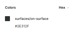
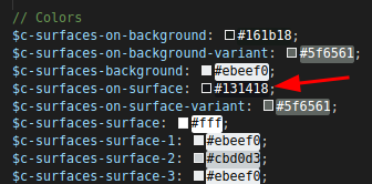
Also, please note the Figma file has the value
#2E312Ffor thesurfaces/on-surfacetoken used for the font colour, whereas in our CSS we have the value#131418, which means there is a disparity with the font colour but this is something we will align in a separate issue.
Definition in Figma:
Definition in CSS:
Changelog entry
Issue Analytics
- State:

- Created a year ago
- Comments:12 (2 by maintainers)
 Top Results From Across the Web
 Top Related Medium Post
 Top Related StackOverflow Question
 Troubleshoot Live Code
 Top Related Reddit Thread
 Top Related Hackernoon Post
 Top Related Tweet
 Top Related Dev.to Post
 Top Related Hashnode Post
@aaemnnosttv could I kindly ask for your eyes on this ASAP as we’d love to get it started this sprint. cc @FlicHollis
Thanks @aaemnnosttv! Good point about setting the CSS custom properties in the scope of
.googlesitekit-plugininstead ofhtml, I’ve made that change to the IB.I’ve added a brief summary to the IB which also highlights some key details. I still think this is a fair estimate for someone who is completely new to
@material/webetc as there’s a lot of new information to take on board; this may also apply to the review process and potentially feed into testing as well. It would certainly be quicker if I were to continue with the implementation myself, however it would be useful from a knowledge sharing perspective if someone who is indeed new to it were to pick it up.