
Lightrun Answers was designed to reduce the constant googling that comes with debugging 3rd party libraries. It collects links to all the places you might be looking at while hunting down a tough bug.
And, if you’re still stuck at the end, we’re happy to hop on a call to see how we can help out.
Introduce button tooltips to help clarify icons
See original GitHub issueIn much of Google UI, buttons (particularly icon buttons) have tooltips with a (secondary) text label. While for regular buttons, this is not as critical, for icon buttons this is quite helpful as it helps convey the meaning of each icon. For screen readers, we already have assistive text, but that text is not accessible for e.g. browser users.
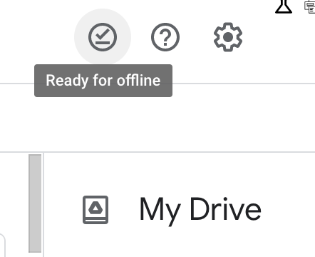
Here is a screenshot from Google Drive as example:
 (originally posted in https://github.com/google/site-kit-wp/issues/3379#issuecomment-849039705)
Site Kit should support tooltips with similar appearance for its icon buttons. This is somewhat related to the user feedback epic since a few of those icon buttons are present there.
Do not alter or remove anything below. The following sections will be managed by moderators only.
Acceptance criteria
- Site Kit’s
Buttoncomponent should be enhanced so that, if it displays an icon (viaiconprop) and a text label is also present (e.g. viaaria-labelprop), that text label displays as a small tooltip with white text on gray background, following the overall design present in the screenshot above. - The following
aria-labelprops related to the above enhancement should be changed to be more concise:- In
HelpMenu, the help icon’saria-labelshould say just “Help” - it does not need the full actions since it appears in a list of menu items and controls where this is unnecessary. - In
SurveyHeader, the dismiss icon’saria-labelshould say just “Dismiss” - the user is in the survey and its title comes just before in the DOM order, so it’s unnecessary to state that they’re dismissing the survey. - In
SurveyQuestionRatingChoice, the choice icon’saria-labelshould just saychoice.text- the “icon” suffix is rather useless since for screen reader users it is irrelevant that the choice is an icon, while visually it’s obvious that it is an icon anyway (it’s a label rather than analtdescription).
- In
Implementation Brief
- Install the
@material-ui/corepackage. - Update the
Buttoncomponent,- Add the
aria-labelprop as it is done in theLinkcomponent. - Wrap the markup for the component within the
Tooltipcomponent (imported from the@material-ui/corepackage) with thetitleprop set to thearia-labelvalue if there is an icon andaria-labeland nochildren. - When wrapping around the
Tooltipcomponent, add an extra span tag around the markup or else the tooltip is not positioned correctly.
- Add the
- Update the
aria-labelused in theHelpMenu,SurveyHeaderandSurveyQuestionRatingChoiceas per the AC.
Test Coverage
- No new tests to be added.
Visual Regression Changes
- There should be no visual changes.
QA Brief
- Run storybook locally via the
npm run storybookcommand. - Upon hovering the icons in the “Surveys -> Current Survey -> Single Question” story, a tooltip should appear with the label of the icon and “Dismiss” for the close icon.
- Do the same for the “Plugin Header with Help menu” story. A tooltip saying “Help” should appear upon hovering the help icon.
Changelog entry
- Improve button tooltips across plugin.
Issue Analytics
- State:

- Created 2 years ago
- Comments:7
 Top Results From Across the Web
 Top Related Medium Post
 Top Related StackOverflow Question
 Troubleshoot Live Code
 Top Related Reddit Thread
 Top Related Hackernoon Post
 Top Related Tweet
 Top Related Dev.to Post
 Top Related Hashnode Post
Thanks @wpdarren . A follow up PR has been created.
QA Update: Pass ✅
Thanks @asvinb @aaemnnosttv 👍