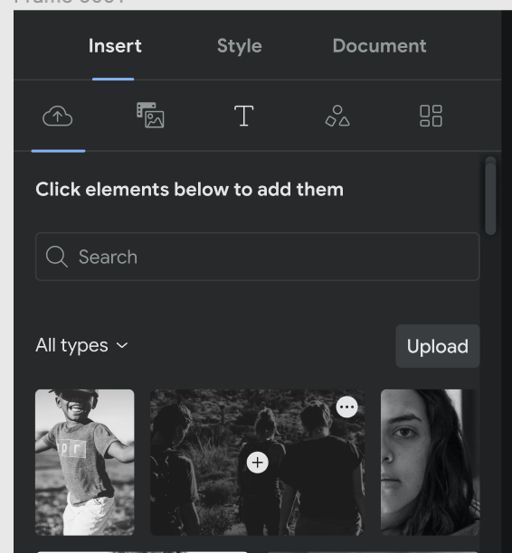
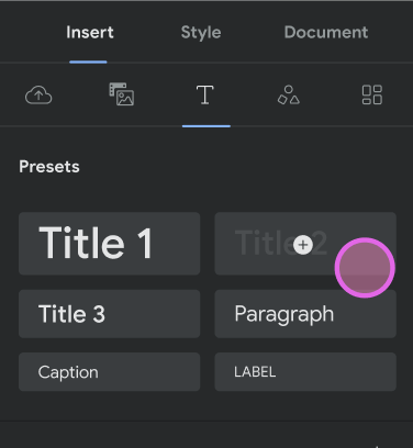
UI Simplification: Add menu / icon for adding elements
See original GitHub issueFeature Description
See Figma (NB – as of 7th of Feb, the file has previous design, needs updating to the new with 2 buttons)
It was decided to use the two buttons/menus option for the element (where applicable). The changes per element:
Local image / video:
- We will have two buttons visible when hovering / focusing on the media element in the library: the three dotted “More” menu and also Insertion menu with
+icon. - When clicking on the Insertion menu button, the following options appear:
- Insert Image (or Video, depending)
- Add as background
- When clicking on the “More” menu button, the “Edit meta data” and “Delete from library” options appear (as currently but slightly changed names)
- Accessibility:
- The Media element itself will not be focusable anymore.
- When tabbing into a Media element, the Insertion menu button will be in focus first (Enter/Space will open that menu)
- When tabbing while being focused on the Insertion button, the “More” button will be in focus (Enter/Space will open that menu)
- When tabbing while focused on “More” button, the next focusable element after the Media Library will be in focus (as previously when tabbing while focused on the media item in the library
- When using arrow keys while focused on either of the menu buttons, the focus will move to the Insertion menu of the next / previous etc. Media item Insertion menu button (as currently, but the Insertion menu button will get the focus)
3rd party image / video:
- We will have the Insertion menu visible when hovering focusing on the 3p media element in the library.
- When clicking on the Insertion menu, the following options appear:
- Insert Image (or Video, depending)
- Add as background
- Accessibility:
- As in case of local media, the focus outline will now (visibly) be on the Insertion menu button when focusing instead of the whole media element. The rest of the things will stay the same since we have one button here only.
Shape, stickers, Text elements, Default Page Templates:
- We will have the Insertion button visible when hovering focusing on the 3p media element in the library.
- When clicking on the insertion button, the element will be inserted right away (or template applied) – that’s the only option for these elements so no need for opening a menu.
- Accessibility:
- The focus outline will now (visibly) be on the insertion button when focusing instead of the whole media element. The rest of the things will stay the same as we have one button here only.
Saved Page Templates:
- We will have two buttons visible when hovering / focusing on the media element in the library: the Delete button in the corner (as currently), and also Insertion button with
+icon. - When clicking on the insertion button, the page template will be applied.
- When clicking on the Delete button, the confirmation dialogue will open (as currently)
- Accessibility:
- The page template itself will not be focusable anymore.
- When tabbing into a Saved Page Template, the Insertion button will be in focus first (Enter/Space will use the template)
- When tabbing while being focused on the Insertion button, the “Delete” button will be in focus (Enter/Space will the Delete confirmation dialogue)
- When tabbing while focused on “Delete” button, the next focusable element after the Library will be in focus (as currently when tabbing while focused on a Saved Page templates in the library)
- When using arrow keys while focused on either of the buttons, the focus will move to the Insertion button of the next / previous etc. (depending on the arrow direction) saved Page Template Insertion button (as currently, but the Insertion button will get the focus instead of the whole template)
Todo:
- Add additional
+icon when hovering / focusing on element in the library - When clicking anywhere else but the icon on the element, the element is directly inserted.
- When clicking on the icon, it either opens the menu or adds the element (if inserting is the only option available).
- Rework the accessibility to display focus on the insertion button by default (see details above)
- Rework accessibility to allow tabbing between the insertion button and the More menu (where applicable, see above)
- Enter / Space on the focused button is the same as clicking
- Ensure drag-drop still works as expected as well
- Remove the text quick-add button from the tabs
OLD INFORMATION: ~NB! Please see https://github.com/google/web-stories-wp/issues/10109#issuecomment-1016614451 – the UX changed a bit meanwhile but Figma might not be updated!~
~We will have just one button (and get rid of the three-dotted button / delete buttons) with the following options: Media~
- ~Insert Image (or Video, depending)~
- ~Add as background~
- ~Edit meta data~
- ~Delete from library~
~Shape, Text, default Page Templates: clicking will insert directly~
~Custom Page Templates: Menu will open:~
- ~Use template~
- ~Delete ~
~(Remove the Delete icon from the corner)~
Alternatives Considered
Additional Context


Issue Analytics
- State:
- Created 2 years ago
- Comments:10

 Top Related StackOverflow Question
Tested against https://stories-qa-wordpress-amp.pantheonsite.io/wp-admin, using PR #10493.
Ah, of course, thank you! Somehow I missed this when looking at Figma currently 🤦