
Stuck on an issue?
Lightrun Answers was designed to reduce the constant googling that comes with debugging 3rd party libraries. It collects links to all the places you might be looking at while hunting down a tough bug.
And, if you’re still stuck at the end, we’re happy to hop on a call to see how we can help out.
WCAG 2.1: 'Switcher' drop down's inner background color has insufficient contrast against its adjacent background
See original GitHub issueDescribe the bug
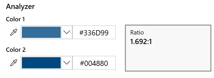
Related to WCAG SC 1.4.11: Non-text Contrast
For active controls such as buttons and form fields: any visual information provided that is necessary for a user to identify that a control is present and how to operate it must have a minimum 3:1 contrast ratio with the adjacent colors
To Reproduce Steps to reproduce the behavior:
- Run assessment on any page
- Open details view
- Observe that the
FastPass/Assessmentswitcher’s background isn’t having sufficient contrast against the adjacent background
Expected behavior
The contrast ratio between the switcher’s background and the adjacent background should be at least 3:1
Screenshots

Extension
- Accessibility Insights for Web - prod
- Browser Version: Chrome 75.0.3770.80
- Target Page: Any page
Did you search for similar existing issues?
Yes
Issue Analytics
- State:

- Created 4 years ago
- Comments:11 (8 by maintainers)
 Top Results From Across the Web
Understanding Success Criterion 1.4.11: Non-text Contrast | WAI
If components use several colors, any color which does not interfere with identifying the component can be ignored for the purpose of measuring...
Read more >WCAG 2.1: Buttons' inner background color has insufficient ...
Observe both the Continue previous and Start new buttons have a background color that isn't having enough contrast with the adjacent background.
Read more >Insufficient Color Contrast - Equalize Digital
Color contrast is important for all users. Without enough contrast between the foreground and background colors, users may find it difficult to read...
Read more >Word Accessibility Playbook - Pearson A11y
Thus, it is essential that sufficient contrast is present between foreground text and its background. Color contrast should be sufficient for all the ......
Read more >Accessibility test digest
Package alfa , test r11 , score 8 (Link has no accessible name); Package tenon , test 91 , score 4 (Link has...
Read more > Top Related Medium Post
No results found
 Top Related StackOverflow Question
No results found
 Troubleshoot Live Code
Lightrun enables developers to add logs, metrics and snapshots to live code - no restarts or redeploys required.
Start Free Top Related Reddit Thread
No results found
 Top Related Hackernoon Post
No results found
 Top Related Tweet
No results found
 Top Related Dev.to Post
No results found
 Top Related Hashnode Post
No results found
Working on solutions for this - it’s on my radar 😃
Validated the fix in prod version 2.15.0