
Lightrun Answers was designed to reduce the constant googling that comes with debugging 3rd party libraries. It collects links to all the places you might be looking at while hunting down a tough bug.
And, if you’re still stuck at the end, we’re happy to hop on a call to see how we can help out.
A more flexible ScrollViewer
See original GitHub issueProposal: ScrollViewer
Summary
tl:dr; Provide a flexible, yet easy-to-use, scrolling and zooming control in XAML that can still be leveraged when targeting downlevel releases of Win10.
The ScrollViewer control plays a critical role in any UI because of how fundamental scrolling is for applications and controls (platform and non-platform alike). The control provides panning and zooming capabilities along with default policies and UX (e.g. conscious scroll bars, focus/keyboard interaction, accessibility, default scroll animation, etc). It must also be flexible enough that it can go from making everyday app scenarios easy to being a key component in scroll-based controls and servicing very advanced use cases. The current control does not provide this level of flexibility.
Rationale
Bringing the ScrollViewer control to the repo in a way that is layered over the core platform’s public APIs is an important stepping stone that:
- enables lifting more controls into the repo (increased agility),
- gives developers an easy-to-use control that surfaces the flexibility of the lower-level platform capabilities combined with the benefit of the higher-level framework services (e.g. accessibility), and
- enables newer scrolling-related features in XAML to light up on earlier versions of Win10.
The existing control was authored in Win8 based on the DirectManipulation APIs which 1) are not available to use directly within UWP, 2) do not allow the level of customization that developers have come to expect to create unique scrolling experiences, and 3) are superceded by UWP’s newer InteractionTracker APIs.
Extracting the existing ScrollViewer control as-is would be a non-starter. The control must instead be a re-implementation with a near identical API surface based on the newer (and already available) capabilities of InteractionTracker.
High-level Plan
The existing ScrollViewer in the Windows.UI.Xaml.Controls namespace will remain untouched (other than fixing critical bugs).
The new ScrollViewer will live in the Microsoft.UI.Xaml.Controls namespace. It’s API will be mostly identical to the Windows version. We will make targeted adjustments to the control’s API where there is clear benefit (simplify a common scenario, introduce new capabilities, etc).
In combination with the new ScrollViewer we will introduce a new type, Scroller, that will live in the Microsoft.UI.Xaml.Controls.Primitives namespace. The Scroller will provide the core functionality for scrolling and zooming in XAML based on the capabilities of InteractionTracker.
The initial goal for both controls will be on getting core functionality to ship quality to be part of the next official release. Non-finalized APIs will remain in ‘preview’ and only be available as part of the pre-release packages.
Functional Requirements
| # | Feature | Priority | |
|---|---|---|---|
| 1 | Provides a non-sealed, panning and zooming control with a default UX matching the existing ScrollViewer. | Must | |
| 2 | Demonstrates platform capabilites by relying solely on public, platform-supported APIs. | Must | |
| 3 | Integrates with framework-level XAML services. For example: - correctly renders system focus rects - automatically brings focused elements into view (keyboard, GamePad, screen readers) - participates in effective viewport changes - supports scroll anchoring |
Must | |
| 4 | Able to perform input-driven animations | Must | |
| 5 | Can be used in combination with existing scroll-dependent controls already in the repo (i.e. ParallaxView, RefreshContainer, SwipeControl). | Must | |
| 6 | Able to control the curve for inertial view changes (i.e. custom animated scrolling or zooming). | Must | |
| 7 | Able to change the view based on absolute or relative offsets (e.g. scroll to a point of interest) | Must | |
| 8 | Able to change the view based on an impulse / additional velocity (e.g. automatic smooth scrolling during drag-and-drop or multi-select via a mouse selection rectangle) | Must | |
| 9 | Able to detect overpan and by how much | Must | |
| 10 | Able to observe and react to changes in the state of scrolling | Must | |
| 11 | Support for scrolling and zooming snap points. | Should | |
| 12 | Able to use a custom “scroll bar” control to drive scrolling (e.g. photos timeline scrubber). | Should | |
| 13 | Able to easily configure the control to ignore specific input kinds (e.g. respond to touch or pen, but ignore mouse wheel input). | Should | |
| 14 | Able to save and restore the scroll position (e.g. in a virtualizing list) | Should | |
| 15 | Support for sticky headers / elements. | Should | |
| 16 | Support for accelerated scrolling when a user makes repeated gestures in quick succession. | Should | |
| 17 | <span style="vertical-align: top">Provide a default UX to support a mouse middle click and scroll.</span> |  |
Should |
| 18 | <span style="vertical-align: top">Support a mode to click and pan via mouse (e.g. moving content inside a PDF viewer).</span> |  |
Should |
| 19 | Able to use a custom control to drive zooming (e.g. a zoom slider). | Should | |
| 20 | Able to print content contained in the scrollable area. | Should | |
| 21 | Support rotation gestures. | Could | |
| 22 | Able to synchronize two or more areas with flicker- and jank-free scrolling (e.g. a text diff scenario). | Could | |
| 23 | Able to customize the animation curve for input-driven view changes (i.e. define finger down behaviors such as gravity wells). | Could | |
| 24 | Support a scroll-to-top or bottom gesture. | Could | |
| 25 | Able to disable overpanning. | Could | |
| 26 | Able to selectively manipulate content within the ScrollViewer based on a UIElement’s ManipulationMode property. | Could | |
| 27 | Able to turn off inertia and/or bouncing from inertia. | Could | |
| 28 | Able to disable clipping the content (i.e. CanContentRenderOutsideBounds). | Could | |
| 29 | Able to determine the completion reason at the end of a view change. | Could |
Terminology
- Overpan is when the user attempts to pan or zoom beyond the size of the content and results in the elastic / rubber band effect.
- Railing is when the scroller automatically locks movement to a “preferred” axis based on the direction of the initial gesture.
- Chaining is when there is a scrollabe surface nested inside another and when the scrolling movement of the inner reaches its extent it is promoted to continue on the outer one.
- Snap points are locations within the scrollable content where the viewport will come to rest at the end of inertial scrolling (i.e. an animated scroll after the user lifted their finger). Snap points are required for a control like FlipView.
- Scroll anchoring is where the viewport automatically shifts to maintain the relative position of visible content. It prevents users from being impacted by sudden shifts in the position or size of the content due to layout (i.e. the user is reading an article and a few moments later everything jumps down because an image/ad at the top of the article finally loaded). Scroll anchoring is a necessity for UI virtualization when dealing with variable-sized content.
- Gravity wells are locations within the scrollable content that affect the scrolling behavior while the user is manipulating the content (i.e. the user’s finger is down). For example, gravity wells could be used to alter the perceived friction of scrolling where the movement appears to slow down or speed up as the user actively pans or zooms.
Usage Examples
Foreword
By default the ScrollViewer supports panning over its content when the size of the content is larger than its viewport. The size of the content is determined by XAML’s layout system.
The examples here are intended to highlight the main API difference between the current ScrollViewer and the new ScrollViewer.
Vertical Scrolling (No difference)
The width of the content is automatically constrained to be the same as the viewport. The height is unconstrained. If it exceeds the height of the viewport then the user can pan via various input modalities.
<ScrollViewer Width="500" Height="400">
    <ItemsRepeater ItemsSource="{x:Bind ViewModel.Items}" ItemTemplate="{StaticResource MyTemplate}"/>
</ScrollViewer>
Horizontal Scrolling
This is an intentional departure from the existing ScrollViewer which previously required changing the HorizontalScrollBarVisibility. It has confused many developers.
<ScrollViewer Width="500" Height="400" ContentOrientation="Horizontal">
    <StackPanel Orientation="Horizontal">
        <!-- ... -->
    </StackPanel>
</ScrollViewer>
Horizontal-only scrolling is enabled by setting the ContentOrientation property. It determines what constraints are used on the content during layout. A value of Horizontal implies that the content is unconstrained horizontally (allowed infinite size) and vertically constrained to match the viewport. Similarly, Vertical (the default) implies its unconstrained vertically and constrained horizontally.
Scrolling a Large Image
A ContentOrientation of Both implies the content is unconstrained both horizontally and vertically.
<ScrollViewer Width="500" Height="400" ContentOrientation="Both">
    <Image Source="Assets/LargeEiffelTower.png"/>
</ScrollViewer>
Changing the ScrollBar Visibility
This example always hides both scrollbars. The user can still pan the content in either direction.
<ScrollViewer Width="500" Height="400"
              ContentOrientation="Both"
              HorizontalScrollBarVisibility="Hidden"
              VerticalScrollBarVisibility="Hidden">
    <Image Source="Assets/LargeEiffelTower.png"/>
</ScrollViewer>

Turning off built-in support for specific kinds of input
In this example a developer is creating a canvas-based app that will perform custom processing on mouse wheel input and support a lasso selection experience via Pen. It can configure the ScrollViewer to ignore those input kinds while still accepting others such as Touch.
<ScrollViewer IgnoredInputKind="MouseWheel,Pen"
              Width="500" Height="400"
              ContentOrientation="Both" >
    <SwapChainPanel x:Name="swapChainPanel" Width="40000" Height="40000">
        ...
    </SwapChainPanel>
</ScrollViewer>
Customize the animation of a programmatic scroll
The developer listens to a Slider’s ValueChanged event and animates a ScrollViewer’s VerticalOffset using a custom duration on the default animation.
private void VerticalOffsetSlider_ValueChanged(
    object sender,
    RangeBaseValueChangedEventArgs e)
{
    double verticalOffsetDelta = GetOffsetDelta();
    TimeSpan animationDuration = GetCustomAnimationDuration();

    // Initiate the scroll and enqueue the ScrollInfo we'll use to identify related events
    ScrollInfo scrollInfo = _scrollViewer.ScrollBy(0.0, verticalOffsetDelta);
    _myScrollRequests.Add(new MyScrollRequest(scrollInfo, animationDuration));
}

// Listen to the ScrollViewer's ScrollAnimationStarting event and customize
// the default animation
private void ScrollViewer_ScrollAnimationStarting(
    ScrollViewer scrollViewer,
    ScrollAnimationStartingEventArgs e)
{
    MyScrollRequest myScrollRequest = _myScrollRequests.FindRequest(e.ScrollInfo);
    e.Animation.Duration = myScrollRequest.AnimationDuration;
}

// Dequeue the ScrollInfo once the action completes
private void ScrollViewer_ScrollCompleted(
    ScrollViewer scrollViewer,
    ScrollCompletedEventArgs e)
{
    _myScrollRequests.RemoveRequest(e.ScrollInfo);
}
Detailed Feature Design
High-policy and Low-policy Scrolling
Scroller (low-policy)
The Scroller is a chrome-less, low-level building block that provides all the essential panning and zooming logic. It wraps the platform’s even lower-policy InteractionTracker as a XAML markup-friendly element. In a very literal way the Scroller is “the viewport” for ScrollViewer and takes the place of the ScrollContentPresenter. However, the Scroller, unlike the ScrollContentPresenter, does much more than simply clipping its content.
Scroller provides the flexibility of using InteractionTracker directly along with the following advantages:
- Accessibility support
- Markup-friendly syntax and easy-to-use API
- Integration with XAML’s layout system and virtualization capabilities
ScrollViewer (high-policy)
The new ScrollViewer wraps the Scroller and sets its properties to common values. For example, a <ScrollViewer/> configures its Scroller to support both horizontal and vertical scrolling interactions, but constrain the width of its content such that the default user experience appears to be vertical-only scrolling (the common case).
ScrollViewer provides the following advantages over using a Scroller:
- A default UX (e.g. the scroll indicator, conscious scrollbars for mouse, a default animation curve)
- Default support for UI-thread bound input not handled by Scroller/InteractionTracker (i.e. keyboard and GamePad)
- Default focus movement for GamePad (page up/down and automatically set focus in response to the triggers)
- Default awareness of the user’s system settings (e.g. automatically hide scroll bars in Windows)
- (Future) Easy configuration options for snap points
- (Future) Support for more mouse panning modes (e.g. click-and-drag content with an open/close hand, mouse panning via mouse wheel / middle button click showing a “compass” cursor)
Which one to use?
The default choice for apps and many control authors should be to use the ScrollViewer. It provides greater ease-of-use and a default UX that is consistent with the platform. The Scroller is appropriate when the default UX / policies are not required - for example, creating an improved FlipView control or a chrome-less scrolling surface.
ScrollViewer-only APIs
HorizontalScrollBarVisibility / VerticalScrollBarVisibility
The default value for both horizontal and vertical scroll bars is Auto. They are automatically shown or hidden based on whether the content is wider/taller than the viewport or not.
The ‘Disabled’ option will not exist in the enum options available for the new ScrollViewer. Instead, configuring the control to respond to user interactions that pan horizontally or vertically will be based solely on the HorizontalScrollMode and VerticalScrollMode properties.
namespace Microsoft.UI.Xaml.Controls
{
    public enum ScrollBarVisibility
    {
        Auto = 0,    // Only visible when the ZoomFactor * content size > viewport
        Visible = 1, // Always visible
        Hidden = 2   // Always hidden
    }
}
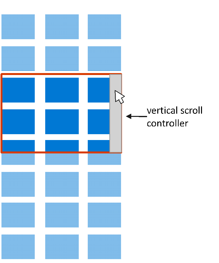
In the picture below the mouse cursor is over the vertical scroll bar. It is the only one visible because the content is the same width as the viewport.
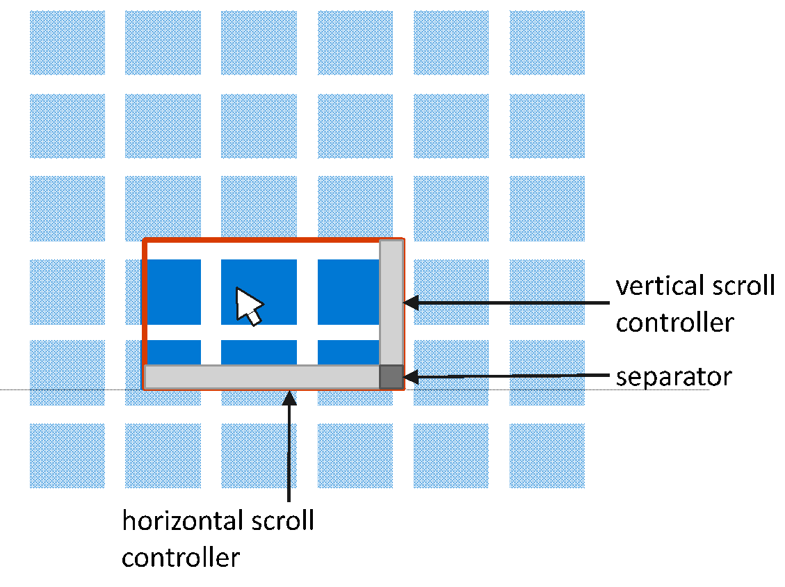
When the content is larger than the viewport in both dimensions then both conscious scroll bars can be seen as well as their separator in the bottom right corner.
Scroller-only APIs
HorizontalScrollController / VerticalScrollController
The Scroller can be connected to an interactive “widget” that controls scrolling by setting its HorizontalScrollController and VerticalScrollController to a type that implements an IScrollController interface. ScrollBars are familiar examples of such widgets. The ScrollViewer supplies its Scroller with two such widgets. For example, a developer could create a custom IScrollController implementation that relies on a Composition.Visual for UI-thread independent input.
_scroller.HorizontalScrollController = new Acme.Slider(orientation: Orientation.Horizontal);
_scroller.VerticalScrollController = new Acme.Slider(orientation: Orientation.Vertical);
Downlevel Limitations of ScrollViewer / Scroller
The framework should have all the necessary hooks exposed to build a custom scrolling control as of the Windows 10 April 2018 Update. When targeting earlier releases there may be limitations:
| Release | Limitation | Reason |
|---|---|---|
| Windows 10 Fall Creators Update (Build 16299) and earlier | Elements won’t be automatically brought into view upon receiving focus. | UIElement’s BringIntoViewRequested event is not available |
| The control cannot participate in EffectiveViewportChanged events. System-rendered focus rects won’t be clipped to the bounds of the viewport. | UIElement’s RegisterAsScrollPort is not available |
Proposed API
ScrollViewer
public class Microsoft.UI.Xaml.Controls.ScrollViewer : Control
{
    ScrollViewer();

    // Default Value: non-null instance
    Windows.UI.Composition.CompositionPropertySet ExpressionAnimationSources { get; }

/*
 * Layout-centric Properties
 */
    // Default Value: null
    UIElement Content { get; set; };

    // Default Value: Vertical
    Microsoft.UI.Xaml.Controls.ContentOrientation ContentOrientation { get; set; };

    // Default Value: 0.0
    Double HorizontalOffset { get; };

    // Default Value: 0.0
    Double VerticalOffset { get; };

    // Default Value: 1.0
    Single ZoomFactor { get; };

    // Default Value: 0.0
    Double ExtentWidth { get; };

    // Default Value: 0.0
    Double ExtentHeight { get; };

    // Default Value: 0.0
    Double ViewportWidth { get; };

    // Default Value: 0.0
    Double ViewportHeight { get; };

    // Default Value: 0.0
    Double ScrollableWidth { get; };

    // Default Value: 0.0
    Double ScrollableHeight { get; };

    // Default Value: Auto
    M.UI.Xaml.Controls.ScrollBarVisibility HorizontalScrollBarVisibility {get;set;};

    // Default Value: Auto
    M.UI.Xaml.Controls.ScrollBarVisibility VerticalScrollBarVisibility {get;set;};

    // Default Value: Collapsed
    // Used for template binding the Visibility property of the horizontal
    // ScrollBar in the control template
    Visibility ComputedHorizontalScrollBarVisibility{ get; };

    // Default Value: Collapsed
    // Used for template binding the Visibility property of the vertical
    // ScrollBar in the control template
    Visibility ComputedVerticalScrollBarVisibility{ get; };

/*
 * User Interaction-centric Properties
 */
    // Default Value: Enabled
    Microsoft.UI.Xaml.Controls.ScrollMode HorizontalScrollMode { get; set; };

    // Default Value: Enabled
    Microsoft.UI.Xaml.Controls.ScrollMode VerticalScrollMode { get; set; };

    // Default Value: Disabled
    Microsoft.UI.Xaml.Controls.ZoomMode ZoomMode { get; set; };

    // Default Value: All
    Microsoft.UI.Xaml.Controls.InputKind IgnoredInputKind { get; set; };

    // Default Value: Idle
    Microsoft.UI.Xaml.Controls.InteractionState State { get; };

    // Default Value: Auto
    Microsoft.UI.Xaml.Controls.ChainingMode HorizontalScrollChainingMode { get; set; };

    // Default Value: Auto
    Microsoft.UI.Xaml.Controls.ChainingMode VerticalScrollChainingMode { get; set; };

    // Default Value: True
    boolean IsHorizontalRailEnabled { get; set; };

    // Default Value: True
    boolean IsVerticalRailEnabled { get; set; };

    // Default Value: Auto
    Microsoft.UI.Xaml.Controls.ChainingMode ZoomChainingMode { get; set; };

    // Default Value: None
    M.UI.Xaml.Controls.SnapPointsType HorizontalSnapPointsType { get; set; };

    // Default Value: None
    M.UI.Xaml.Controls.SnapPointsType VerticalSnapPointsType { get; set; };

    // Default Value: Near
    M.UI.Xaml.C.Primitives.SnapPointsAlignment HorizontalSnapPointsAlignment { g;s; };

    // Default Value: Near
    M.UI.Xaml.C.Primitives.SnapPointsAlignment VerticalSnapPointsAlignment { g;s; };

    // Default Value: 0.95, 0.95
    Windows.Foundation.Numerics.Vector2 ScrollInertiaDecayRate { get; set; };

    // Default Value: 0.95
    Single ZoomInertiaDecayRate { get; set; };

    // Default Value: 0.1
    Double MinZoomFactor { get; set; };

    // Default Value: 10.0
    Double MaxZoomFactor { get; set; };

    // Default Value: 0.0
    Double HorizontalAnchorRatio { get; set; };

    // Default Value: 0.0
    Double VerticalAnchorRatio { get; set; };

    // Forwarded to inner Scroller’s IScrollAnchorProvider implementation
    // Default Value: null
    Windows.UI.Xaml.UIElement CurrentAnchor { get; };

/*
 * Methods
 */
    // Asynchronously scrolls to specified offsets. Allows animation,
    // respects snap points. Returns a ScrollInfo struct.
    Microsoft.UI.Xaml.Controls.ScrollInfo ScrollTo(
        double horizontalOffset,
        double verticalOffset);

    // Asynchronously scrolls to specified offsets with optional animation,
    // with optional snap points respecting. Returns a ScrollInfo struct.
    Microsoft.UI.Xaml.Controls.ScrollInfo ScrollTo(
        double horizontalOffset,
        double verticalOffset,
        Microsoft.UI.Xaml.Controls.ScrollOptions options);

    // Asynchronously scrolls by the provided delta amount.
    // Allows animation, respects snap points. Returns a ScrollInfo struct.
    Microsoft.UI.Xaml.Controls.ScrollInfo ScrollBy(
        double horizontalOffsetDelta,
        double verticalOffsetDelta);

    // Asynchronously scrolls by the provided delta amount with
    // optional animation, with optional snap points respecting.
    // Returns a ScrollInfo struct.
    Microsoft.UI.Xaml.Controls.ScrollInfo ScrollBy(
        double horizontalOffsetDelta,
        double verticalOffsetDelta,
        Microsoft.UI.Xaml.Controls.ScrollOptions options);

    // Asynchronously adds scrolling inertia. Returns a ScrollInfo struct.
    Microsoft.UI.Xaml.Controls.ScrollInfo ScrollFrom(
        Vector2 offsetsVelocity,
        Nullable<Vector2> inertiaDecayRate);

    // Asynchronously zooms to specified zoom factor. Allows animation
    // (respects snap points in v2). Returns a ZoomInfo struct.
    Microsoft.UI.Xaml.Controls.ZoomInfo ZoomTo(
        float zoomFactor,
        Nullable<Vector2> centerPoint);

    // Asynchronously zooms to specified offsets with optional animation
    // (with optional snap points respecting in v2). Returns a ZoomInfo struct.
    Microsoft.UI.Xaml.Controls.ZoomInfo ZoomTo(
        float zoomFactor,
        Nullable<Vector2> centerPoint,
        Microsoft.UI.Xaml.Controls.ZoomOptions options);

    // Asynchronously zooms by the provided delta amount. Allows animation
    // (respects snap points in v2). Returns a ZoomInfo struct.
    Microsoft.UI.Xaml.Controls.ZoomInfo ZoomBy(
        float zoomFactorDelta,
        Nullable<Vector2> centerPoint);

    // Asynchronously zooms by the provided delta amount with optional animation
    // (with optional snap points respecting in v2). Returns an ZoomInfo struct.
    Microsoft.UI.Xaml.Controls.ZoomInfo ZoomBy(
        float zoomFactorDelta,
        Nullable<Vector2> centerPoint,
        Microsoft.UI.Xaml.Controls.ZoomOptions options);

    // Asynchronously adds zooming inertia. Returns a ZoomInfo struct.
    Microsoft.UI.Xaml.Controls.ZoomInfo ZoomFrom(
        float zoomFactorVelocity,
        Nullable<Vector2> centerPoint,
        Nullable<float> inertiaDecayRate);

/*
 * Forwarded to inner Scroller’s IScrollAnchorProvider implementation
 */
    void RegisterAnchorCandidate(UIElement element);
    void UnregisterAnchorCandidate(UIElement element);

/*
 * Events
 */
    // Raised whenever any of the HorizontalOffset, VerticalOffset and ZoomFactor
    // dependency property changed.
    event TypedEventHandler<ScrollViewer, Object> ViewChanged;

    // Raised when any of the ExtentWidth and ExtentHeight dependency property changed.
    event TypedEventHandler<ScrollViewer, Object> ExtentChanged;

    // Raised when the State dependency property changed.
    event TypedEventHandler<ScrollViewer, Object> StateChanged;

    // Raised when a ScrollTo or ScrollBy call triggers an animation.
    // Allows customization of that animation.
    event TypedEventHandler<ScrollViewer, Microsoft.UI.Xaml.Controls.ScrollAnimationStartingEventArgs>
        ScrollAnimationStarting;

    // Raised when a ZoomTo or ZoomBy call triggers an animation.
    // Allows customization of that animation.
    event TypedEventHandler
        <ScrollViewer, Microsoft.UI.Xaml.Controls.ZoomAnimationStartingEventArgs>
        ZoomAnimationStarting;

    // Raised at the end of a ScrollTo, ScrollBy, or ScrollFrom asynchronous
    // operation. Provides the original ScrollInfo struct.
    event TypedEventHandler
        <ScrollViewer, Microsoft.UI.Xaml.Controls.ScrollCompletedEventArgs>
        ScrollCompleted;

    // Raised at the end of a ZoomTo, ZoomBy, or ZoomFrom asynchronous operation.
    // Provides the original ZoomInfo struct.
    event TypedEventHandler
        <ScrollViewer, Microsoft.UI.Xaml.Controls.ZoomCompletedEventArgs>
        ZoomCompleted;

    // Raised at the beginning of a bring-into-view-request participation.
    // Allows customization of that participation.
    event TypedEventHandler
        <ScrollViewer, Microsoft.UI.Xaml.Controls.BringingIntoViewEventArgs>
        BringingIntoView;

    // Raised to allow the listener to pick an anchor element, when anchoring
    // is turned on.
    event TypedEventHandler
        <ScrollViewer, Microsoft.UI.Xaml.Controls.AnchorRequestedEventArgs>
        AnchorRequested;

/*
 * Dependency Properties
 */
    static DependencyProperty ContentProperty { get; };
    static DependencyProperty ContentOrientationProperty { get; };
    static DependencyProperty ComputedHorizontalScrollBarVisibilityProperty { get; };
    static DependencyProperty ComputedVerticalScrollBarVisibilityProperty { get; };
    static DependencyProperty HorizontalScrollBarVisibilityProperty { get; };
    static DependencyProperty VerticalScrollBarVisibilityProperty { get; };

    static DependencyProperty IgnoredInputKindProperty { get; };
    static DependencyProperty HorizontalScrollModeProperty { get; };
    static DependencyProperty VerticalScrollModeProperty { get; };
    static DependencyProperty ZoomModeProperty { get; };
    static DependencyProperty HorizontalScrollChainingModeProperty {g};
    static DependencyProperty VerticalScrollChainingModeProperty {g};
    static DependencyProperty IsHorizontalRailEnabledProperty {g};
    static DependencyProperty IsVerticalRailEnabledProperty {g};
    static DependencyProperty ZoomChainingModeProperty { get; };
    static DependencyProperty MinZoomFactorProperty { get; };
    static DependencyProperty MaxZoomFactorProperty { get; };
    static DependencyProperty HorizontalAnchorRatioProperty { get; };
    static DependencyProperty VerticalAnchorRatioProperty { get; };
}
Open Questions
- Would having a ContentOrientation property (or one by a different name) that affects how layout constraints are applied to the content make things more complicated or easier?
- Should the zooming-related APIs be separated into a derived control (e.g. ZoomViewer) such that ScrollViewer is strictly about scrolling?
Issue Analytics
- State:

- Created 5 years ago
- Reactions:38
- Comments:66 (28 by maintainers)
 Top Results From Across the Web
 Top Related Medium Post
 Top Related StackOverflow Question
 Troubleshoot Live Code
 Top Related Reddit Thread
 Top Related Hackernoon Post
 Top Related Tweet
 Top Related Dev.to Post
 Top Related Hashnode Post
three years, any updates?
Another ping on this one, any updates on supporting this?