
Lightrun Answers was designed to reduce the constant googling that comes with debugging 3rd party libraries. It collects links to all the places you might be looking at while hunting down a tough bug.
And, if you’re still stuck at the end, we’re happy to hop on a call to see how we can help out.
Feature Proposal: new TeachingTip control
See original GitHub issueThis control is now available in WinUI and this Proposal is archived. See Guidelines and API Docs for this control’s documentation.
Proposal: TeachingTip Control
Summary
The XAML TeachingTip Control provides a way for your app to guide and inform users in your application with a non-invasive and content rich notification. TeachingTip can be used for bringing focus to a new or important feature, teaching users how to perform a task, or enhancing the user workflow by providing contextually relevant information to their task at hand.
Rationale
Even the most intuitive app might want to spotlight important updates or available features that have not yet been explored by the user. Focusing on these new updates and previously ignored features will help users use the app more effectively, leading to improved user engagement and retention in an accessible and focused way that does not invade the flow of the user or the application. These tips are already widely used among first and third-party customers but are often disjoint implementations. Teaching tips are also frequently used by other platforms and in many products, but they often offer no official control to implement these tips. Providing a XAML TeachingTip control would help standardize how these tips are delivered across all apps using the Fluent Design System and ease the job of developers so they can focus on implementing other important features.
Requirements
| # | Feature | Priority |
|---|---|---|
| 1 | Able to target UI elements and be used without UI targets. | Must |
| 2 | Able to include a variety of media including videos, images, icons, and gifs, and other XAML content. | Must |
| 3 | Able be able to be closed manually. | Must |
| 4 | Has a light-dismiss option. | Must |
| 5 | Able to have an action button. | Must |
| 7 | Able to specify size of tip. | Must |
| 8 | Able to specify the location of tips. | Must |
| 9 | Accessible to narrator and keyboard navigation. | Must |
| 10 | Has a timed auto-dismiss option. | Should |
| 11 | Able to be dismissed by swiping. | Could |
| 12 | Able to follow moving UI elements. | Could |
| 13 | Cortana command integration. | Could |
Important Notes
Usage Examples
Create a targeted teaching tip with title, subtitle, and content.
Here’s the XAML for a targeted teaching tip control that demonstrates the default look of the TeachingTip with a title and subtitle. Note that the teaching tip can appear anywhere in the element tree or code behind. In this example below, it’s located in a ResourceDictionary.
XAML
<Button x:Name="SaveButton" Content="Save">
    <Button.Resources>
        <controls:TeachingTip x:Name="AutoSaveTip"
            Target="{x:Bind SaveButton}"
            Title="Save automatically"
            Subtitle="When you save your file to OneDrive, we save your changes as you go - so you never have to.">
        </controls:TeachingTip>
    </Button.Resources>
</Button>
C#
public MainPage()
{
    this.InitializeComponent();

    if(!HaveExplainedAutoSave())
    {
        AutoSaveTip.IsOpen = true;
        SetHaveExplainedAutoSave();
    }
}
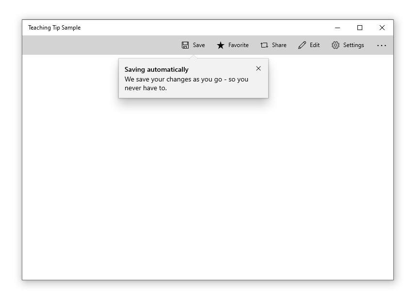
Here’s the result when the Page containing the button and teaching tip is shown:
Create an non-targeted teaching tip
Not all tips relate to an element onscreen. For these scenarios, do not set the Target property and the teaching tip will instead display relative to the edges of the xaml root. However, a teaching tip can have the tail removed while retaining placement relative to a UI element by setting the TailVisibility property to “Collapsed”. The following example is of a non-targeted teaching tip.
XAML
<Button x:Name="SaveButton" Content="Save" />

<controls:TeachingTip x:Name="AutoSaveTip"
    Title="Saving automatically"
    Subtitle="We save your changes as you go - so you never have to.">
</controls:TeachingTip>
Note that in this example the TeachingTip is in the element tree rather than in a ResourceDictionary or in code behind. This has no effect on behavior; the TeachingTip only displays when opened, and takes up no layout space.

Visual Components
| Component | Notes |
|---|---|
| Container | * The container is the body of the tip and encapsulates all the tip components. * Nonmodal. * If content height exceeds max height or width, vertical scrolling will be enabled. See Scroll. * For visibility concerns, the container has a border around the outer edge, which adheres to the tail if present. See Tail. * For visibility concerns, the top edge of the container has a 1px highlight which also adheres to the tail if present. See Tail.  |
| Title | * Semi-bolded. * Text wraps at Close (X) Button and Container border.  |
| Subtitle | * Text wraps at Close (X) Button and Container border.  |
| Content | * Can be customized to include text, images, videos, animation, checkboxes, hyperlinks, and any other XAML content. * Will scroll if there is more content to show than tip height allows. See Scroll Bar. * Placed below Subtitle and above Close/Action Button.  |
| Close Button | * Will appear as an X Button in the top right corner by default and in the top left corner automatically for RTL languages. The close button may also be set to appear in the bottom right corner of the tip as a traditional button or be set to not show at all so that a custom close option may be implemented in the Content Area. * If a tip is set to light-dismiss, no close button will appear at all.   |
| Action Button | * Allows the user to invoke a custom event. * This is the only non-Close button provided out of the box. Other buttons may be implemented in the Content Area.  |
| Pointer | * Triangular extension of the tip body that can be used to indicate that the tip is referring to on-screen UI element. * When PointerMode is set to auto, the pointer will automatically appear on tips that are attached to a target and off for tips that are not attached to a target. * Prefers to center on target. * Maintains a 12px margin from edges of the tip. * Not animated. * Will not have a shadow as shadows cannot yet be added to nonrectangular surfaces.  |
| Icon | * Added to the left of the Title and Subtitle by default and automatically moved to the right for RTL languages.  |
| Bleeding Content | * Bleeding Content is media that stretches to the edges of a tip. * Can be placed at the top or bottom of a tip.  |
| Scroll Bar | * If the tip’s contents are large enough to require scrolling, a scrollbar which will not intersect the Close (X) Button will be added to the content area.  |
Behavioral Components
| Property | Notes |
|---|---|
| Opening | * A tip is shown by setting its IsOpen property to true. * Tips will animate on opening. * When a tip does not have enough available window space to fully show in any location [see Placement], it will not open and will instead overwrite IsOpen to false. |
| Closing | * There are three ways to close a tip: set the IsOpen property to false, the user invokes a close button, or the tip is closed via light dismiss. These will return the method used in TeachingTipCloseReason. * Closing can be deferred by taking a handle to the deferral object in the closing event args. |
| Placement | * Placement modes for targeted tips will follow the precedent of Flyout. Full placement mode will be replaced by Center which positions Tail at the center of the element. * Placement modes for untargeted tips will include each side, corner, and center of the application window. * The following properties are not preferred in tip placement: * There is not enough space for the tip to show without clipping. * The target is not large enough to maintain the tip’s alignment and the Tail’s 12px margin from the edge of the tip. * The target element is too large to maintain edge alignment while keeping the Tail centered on the target. |
| Light-dismiss | * Allows a tip to be dismissed when the user scrolls or clicks elsewhere within the application. * TODO: Work with Accessibility and Design to create a timed fade-out that would allow users to recover a dismissing tip via click or cursor hover. |
| Persistent Tip Location | * Once a tip is open, it will not move even if its target does. The exception to this is when the window is resized. |
| Motion | * Tips have built in open and close animations that can be customizable using Storyboards. |
| Tail/Bleeding Content Avoidance | * To avoid the visual oddity of the Tail emerging from Bleeding Content, the Tail and Bleeding Content will attempt to avoid intersecting using the following rules: * Move the bleeding content to Top or Bottom (Disabled when BleedingContentPlacement is not auto). * Shift the beak along the edge of the tip (Disabled when the placement of the tip is edge aligned). * Change the placement of the tip (Disabled when the tip placement is not auto). |
| Out of Window Bounds | * Tips can escape window bounds on newer OS versions via the ShouldConstrainToRootBounds property. When this property is set to false, the tip uses screen boundaries instead of window boundaries during its placement algorithm. |
Accessibility
| State | Action | Narrator |
|---|---|---|
| Tip first appears and is not in focus | No action is needed invoke the tip. | “New tip. It says …." |
| Tip is first focused on by tabbing through to the tip | Targeted Tip: Tip is injected to tab stop right after its target element. User tabs to reach tip and put it into focus. Untargeted Tip: Tip is injected to tab stop as the last item to be created. User tabs to reach tip and put it into focus. Light-dismiss: Automatically take focus. |
Default Tab Stop, Title, and Subtitle. Ex: “X Button, Tip Title, Tip Subtitle.” |
| Tip is tabbed through | Tab Button: Will go through all actionable items regardless of group in order. Arrow keys: Will be able to explore groups in the specified directions. Enter and Escape: Will result in closing the tip. Spacebar: Will select the component focused on. Home and End: Do not have use unless within a XAML component that supports their functionality |
Name of XAML or visual component. Ex: “X Button” “Save Button” “Learn More Hyperlink” |
| Tip is dismissed | 1. X Button is pressed. 2. Close Button is pressed. 3. Action Button is pressed. Tab focus goes back to where it should be, the predecessor. |
Nothing |
Open Questions
- We are thinking about creating an optional tip service that automates when tips show and also collects them somewhere the user can access at any time. Is this valuable? Are there more things it could do to create a better experience for users and developers?
Release Checklists
Prerelease readiness
- Dev: quality review + code review done
- Dev: test coverage added
- Dev: initial accessibility review done
- Dev: data metrics plan ready
- PM: spec up to date
- PM: feature ready for feedback
- PM: docs.microsoft.com updates ready
Stable release readiness
- Dev: feature previously shipped in a prerelease NuGet package
- Dev: Azure CI tests passing
- Dev: data metrics ready
- Dev: accessibility review done
- Dev: API review done
- Dev: IDL attribute switched from preview to public
- PM: spec done
- PM: glob/loc, privacy, security, license compliance ready
- PM: customer validation done
- PM: docs.microsoft.com updated
- PM: Xaml Controls Gallery updated
Issue Analytics
- State:

- Created 5 years ago
- Reactions:22
- Comments:27 (20 by maintainers)
 Top Results From Across the Web
 Top Related Medium Post
 Top Related StackOverflow Question
 Troubleshoot Live Code
 Top Related Reddit Thread
 Top Related Hackernoon Post
 Top Related Tweet
 Top Related Dev.to Post
 Top Related Hashnode Post
TeachingTip is in prerelease!
You can find the release notes and the link to the public NuGet package through the link above.
Thanks again to our contributors so far: @michael-hawker, @mdtauk, @TiredTrident, and @invigoro. We will be continuing to improve this control and shape it up for a full release, so please feel free to file bugs and continue providing feedback.
I would also eager for you to share screenshots of your implementation to our Twitter. I am excited to see what you do with TeachingTip!
I believe it might be better for light-dismiss to decay rather than just vanish.
I would like to suggest that, if dismissed by light-dismiss, the tip turns 85% transparent and decays over 2 seconds. During this time, the user could click or hover over it to make it return in full. This could possibly circumvent a misinput dismissing a tip the user would like to see?