Proposal: Bring native NavigationView experience to XBox
See original GitHub issueCurrently, XBox’s NavigationView control has the same behaviors as the desktop. Like all the other controls, we have to customize their appearance to adapt to Xbox. Most of them are simple, but NavigationView is a special case.
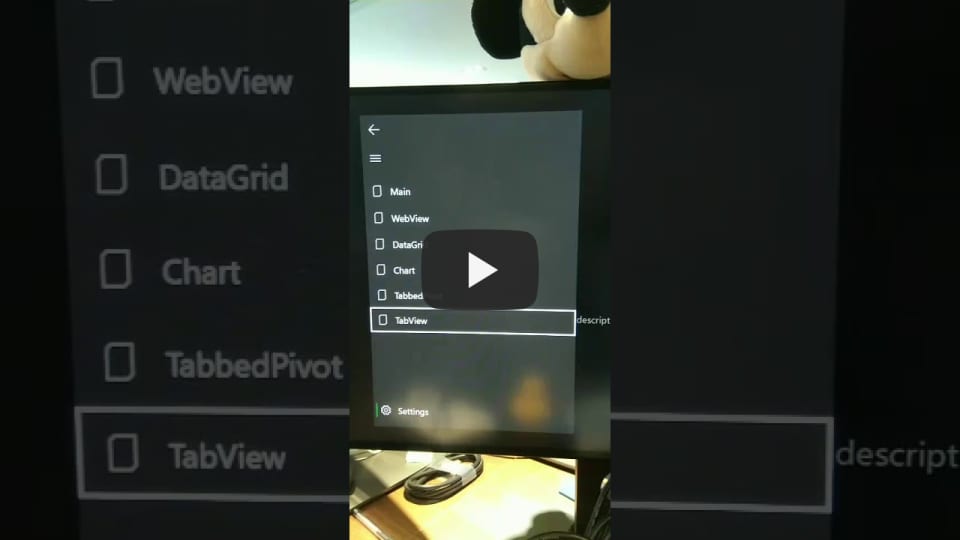
Many behaviors and appearance of NavigationView seems perfect on desktop, but performs terribly on the Xbox platform. I tried to modify some of the xaml resource and behavior, but still not perfect, comparing to Android TV’s hamburger menu.
For example:
-
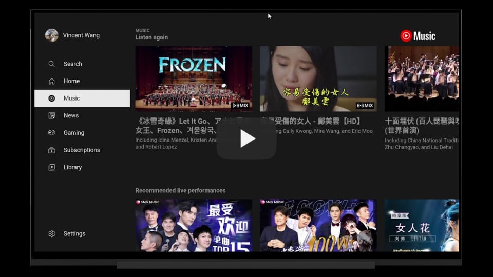
Android TV’s menu has the focus style, better than Xbox’s rectangle border focus.

-
Android TV support navigates right to enter the selected page on the menu item. When the focus on the page, navigate left to open the menu.

-
Android TV’s menu support sub menu, like Item A – Item A1 – Item A2 Item B Item C When open the menu, it shows like above. When closed, it shows below. Item A Item B Item C
A UI/UX video on Xbox.👇👇👇
Issue Analytics
- State:
- Created 3 years ago
- Comments:9 (6 by maintainers)


 Top Related StackOverflow Question
@hupo376787 This is by design. See the discussion starting here. Feel free to voice your concerns in that issue (and perhaps include pinging YuliKI from the WinUI team) if you disagree with that design thought.
We also still need to add that info to the NavigationView IsPaneOpen documentation (if kept) and I plan to create a commit soon.
Once WinUI 3.0 is out, I hope every control will get a ControlTemplate with all the typographic and metric changes needed so when running on Xbox, the controls will look and behave correctly.
I suspect Microsoft will push more towards ReactNative for Xbox, as the new Store uses it to render the native controls, and WinUI 3.0 wont be supported at launch on Xbox, or non Desktop/Tablet form factors.
#698