
Lightrun Answers was designed to reduce the constant googling that comes with debugging 3rd party libraries. It collects links to all the places you might be looking at while hunting down a tough bug.
And, if you’re still stuck at the end, we’re happy to hop on a call to see how we can help out.
mj-column width doesn't work on Gmail mobile and desktop when printing
See original GitHub issueDescribe the bug
the width property of the mj-column element is ignored on mobile and on desktop when using the Print functionality of Gmail.
To Reproduce Steps to reproduce the behavior:
- Create a file with this MJML code:
<mjml>
  <mj-body>
    <mj-section>
      <mj-column width="50%" background-color="red">
        <mj-text>Left column</mj-text>
      </mj-column>
      <mj-column width="50%" background-color="orange">
        <mj-text>Right column</mj-text>
      </mj-column>
    </mj-section>
  </mj-body>
</mjml>
- Render it to HTML
- Send the HTML to a Gmail address
- Open the mail with Gmail
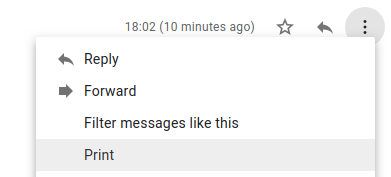
- On desktop, use the “Print” functionality on the dropdown of the mail
- See the error
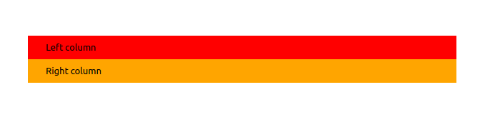
Expected behavior Columns should be displayed side-by-side :

Observed behavior Columns are displayed over under, with a width of 100%.
MJML environment (please complete the following information):
- OS: Linux
- MJML Version 4.0.5
Email sending environment(for rendering issues):
- SendGrid
Affected email clients (for rendering issues):
- Email Client: Gmail (others untested yet)
- OS: All
- Browser: All
Additional context I tried the solutions given for the following issues but they didn’t do the trick (unless I missed something) :
Issue Analytics
- State:

- Created 5 years ago
- Comments:5 (3 by maintainers)
 Top Results From Across the Web
 Top Related Medium Post
 Top Related StackOverflow Question
 Troubleshoot Live Code
 Top Related Reddit Thread
 Top Related Hackernoon Post
 Top Related Tweet
 Top Related Dev.to Post
 Top Related Hashnode Post
And you have also Mj-group to keep the same behavior on mobile
On Mon, Dec 3, 2018 at 7:55 PM Maxime Brazeilles < maxime.brazeilles@gmail.com> wrote:
– Cordialement, Maxime BRAZEILLES
Thanks! I should’ve had a better read at the doc for mobiles. I’m closing the issue.