
Lightrun Answers was designed to reduce the constant googling that comes with debugging 3rd party libraries. It collects links to all the places you might be looking at while hunting down a tough bug.
And, if you’re still stuck at the end, we’re happy to hop on a call to see how we can help out.
discrepancy when plotting vertex time course with pyvista backend
See original GitHub issueDescribe the bug
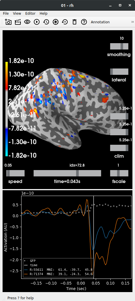
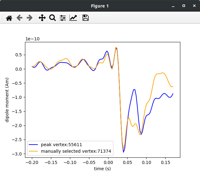
The MNE time course looks different when plotting a vertex within the brain visualization GUI via the pyvista backend (top figure shown below) compared to manually plotting the vertex using SourceEstimate.data (bottom figure shown below).
Steps to reproduce
See https://gist.github.com/rythorpe/3c57fdb572bc17bb1f3e4bb70b3e1104 using the somato dataset. Selecting the exact vertex within the brain visualization window can be tricky (unless there is a more controlled way to to this through the API?).
Expected results
I expected the vertex time courses rendered in the GUI to match those plotted manually with matplotlib. Furthermore, I expected the vertex of maximal activity (blue trace shown below) to reflect the largest peak (compared to the orange trace) in the GUI.
Actual results
Note that the blue trace represents the time course of the right hemisphere vertex retrieved with SourceEstimate.get_peak() and that the vertex IDs are the same in each figure.
Issue Analytics
- State:

- Created 3 years ago
- Comments:8 (5 by maintainers)
 Top Related StackOverflow Question
 Troubleshoot Live Code
 Top Related Reddit Thread
 Top Related Hackernoon Post
 Top Related Tweet
 Top Related Dev.to Post
 Top Related Hashnode Post
The source space is a decimated surface, so to get a proper visualization you need to smooth the result. You could also plot directly on the source space but since it’s so decimated it will look very weird
Thanks for the help @larsoner and @jasmainak!