[Badge] Improve accessibility
See original GitHub issue- I have searched the issues of this repository and believe that this is not a duplicate.
Summary 💡
It would be helpful to have a little more flexible control over both nodes used to compose the <Badge>, so the badge can display the correct UI for sighted users and also render a helpful label for assistive technology.
Examples 🌈
In my app we have a link in the primary nav that wraps badge wrapping an icon, used to indicate the total number of notifications for the current user.

Demo: https://codesandbox.io/s/material-demo-cc7rw?file=/demo.js
const notificationsCount = 1000

<a href="/notifications">
  <Badge badgeContent={notificationsCount} color="primary">
    <MailIcon titleAccess="notifications" />
  </Badge>
</a>
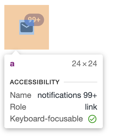
But with the above markup the link’s accessible name — used when screen readers encounter the link, for example — is
notifications 99+

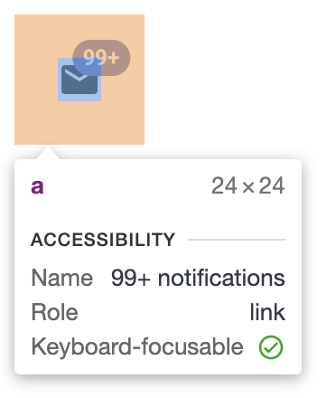
when it would ideally be
99+ notifications

One option is to change the DOM order of these nodes and put the {children} after the <span>{displayValue}</span>. If it’s safe to assume that this is a logical DOM order for most users, and it doesn’t affect the visual layout, then that seems like a reasonable solution.
But I was hoping to have full props access to the <span>{displayValue}</span> node, so I could find another solution like hiding it from assistive technology using aria-hidden and moving the equivalent of displayValue to the accessible icon title. It’s a little annoying that we’d have to recreate the logic of displayValue, but I could live with that.

Demo: https://codesandbox.io/s/material-demo-3ghl7?file=/demo.js
const notificationsCount = 1000
const max = 99;
const displayValue = notificationsCount > max ? `${max}+` : notificationsCount;

<a href="/notifications">
  <Badge
    badgeContent={notificationsCount}
    color="primary"
    displayValueProps={{ "aria-hidden": true }}
  >
    <MailIcon titleAccess={`${displayValue} notifications`} />
  </Badge>
</a>
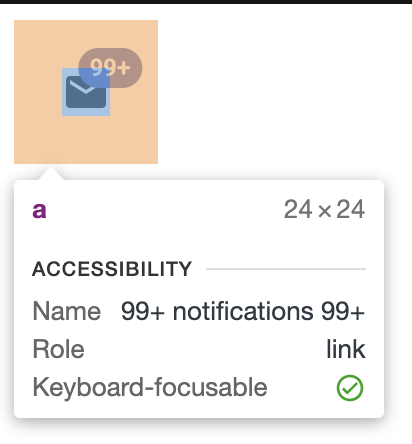
Unfortunately that’s not part of the <Badge> API, so that’s not possible. And using the classes prop won’t help here, either, since there’s no CSS that will hide a node from assistive technology and preserve it visually, only the opposite (e.g. display: none). So the resulting accessible label is
99+ notifications 99+

The next option I tried was wrapping the badgeContent in an aria-hidden node directly, but that breaks some more default functionality, like passing in my own displayValue and specifiying that it should be hidden when the count is 0. If it were possible for the <Badge> component to read children as the equivalent of innerText and then parse it as an integer, then <span aria-hidden>8</span> could still be parsed as the number 8 instead of a string or a component, etc.

Demo: https://codesandbox.io/s/material-demo-fxbpy?file=/demo.js
const notificationsCount = 1000
const max = 99;
const displayValue = notificationsCount > max ? `${max}+` : notificationsCount;

<a href="/notifications">
  <Badge
    badgeContent={<span aria-hidden>{displayValue}</span>}
    color="primary"
    invisible={notificationsCount === 0}
  >
    <MailIcon titleAccess={`${displayValue} notifications`} />
  </Badge>
</a>
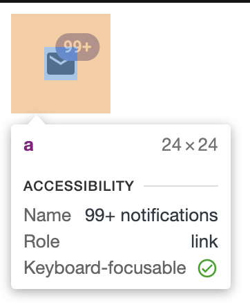
Finally, it all works! But it seems unnecessarily painful to get there.
I recognize there are other options, still, like
Demo: https://codesandbox.io/s/material-demo-ycehq?file=/demo.js
const notificationsCount = 1000

<a href="/notifications">
  <Badge badgeContent={notificationsCount} color="primary">
    <MailIcon />
  </Badge>
  <span className="visually-hidden">notifications</span>
</a>
But either changing the default DOM order of the two nodes or providing props access to the displayValue both seem like reasonable enhancements, as well.
Motivation 🔦
I’d love to leverage of all the great existing logic and UI built into <Badge>, instead of re-writing big chunks of it to accomodate an accessible label.
Issue Analytics
- State:
- Created 3 years ago
- Reactions:2
- Comments:14 (10 by maintainers)

 Top Related StackOverflow Question
Hey @eps1lon I’m sorry if I’ve come across wrong, or, on the flip side, if I’m misinterpreting your responses. It feels like this conversation has gone astray somehow. I opened the issue with the understanding it wasn’t an obvious show-stopper with a clear solution. But I thought I’d put it out there and that if the maintainers saw merit in some of the suggestions, that’d be great! And if not, that’s totally fine too.
Originally, the only suggestion I had written was that it’d be helpful (and seemingly on par for other MUI components) to spread props on the
displayValuenode, so the component had a tiny bit more flexibility for consumers like myself. But then when I saw the “Motivation” section of the issue template, it seemed more useful to explain why I got to that conclusion in the first place — describing the problem, not just one potential solution.As I said earlier, I will absolutely understand if MUI doesn’t think this is worth tackling. It’s not important to me to be right, I was just hoping to find opportunities to contribute to MUI. My teammates and I work with the framework everyday and would love to give back more where it’s helpful. So I would love start out on the right foot. 🙏
In any case, I’m still happy to answer your questions best as I understand them.
I don’t believe there’s an objective “correct” here when talking about strings that correspond to localized written language. If you were to ask me, “How many comments are there on this thing?” I would say, “8 comments” as opposed to “comments 8”. That’s not “correct” per se, just more conventional, at least in English. So I’m reading the accessible badge label from the same lens.
I’m not sure how MUI’s approach to localization would affect this, but my assumption is that the DOM order in this component doesn’t change in different locales and that the default locale for the app is considered English. If those things are true, it doesn’t seem like a stretch to imagine that some particular formulation(s) of English phrases are more conventional than others and thus worth aiming for in MUI’s components. But I definitely don’t believe there is one “correct” solution here, and if that makes it more challenging to find an agreeable solution that’s totally fair.
I totally agree about the first rule of aria. And I agree that we should be deferring to AT as a rule of thumb about how to treat web content, that they should be considered the domain experts. But I think this particular case could be considered a real world shortcoming of AT that’s worth acknowledging and working around. For example, NVDA ignores the plus and equals symbols. It says “five two seven” when it should say “five plus two equals seven.” They have clearly made that choice for some reason, but it may not align with this component’s intent. Given that the screen reader is an entirely different medium and it’s my assumption that MUI is not building primarily for AT, the screen reader naturally has to make some assumptions on our behalf.
It’s my understanding that the
+character in the Badge label is intended to convey that there are more than 99 of something, or whatever the max number is. But for NVDA users (the most popular screen reader) it will always read “99” even when the count is greater than “99”. It’s obviously not intentional and annoying that we even have to think about it, but it’s a small way in which we could gain more parity between sighted and non-sighted users. I think letting all users know there are more thannof something seems to match the spirit of the+.I’ll try my best to clarify my earlier statements. I’m sorry if it came across this way, but I don’t mean to suggest there’s a single “correct” position or that changing the DOM order would create a conventionallly semantic label for all users in all locales.
But if (it’s a big if) MUI considers English the default locale, then
[count] [things]seems more conventional, that more people might understand what it means. MUI doesn’t seem to be intentionally taking a stand about the accessible label by using a specific DOM order. But a given DOM order exists nonetheless, which creates accessible label by default. So if you agreed that the MUI default could better match the default locale of English, then maybe that’d be worth pursuing. I recognize, though, that it’s subjective and might be safer to not take a stand at all and let individual consumers decide on accessible labels for themselves.It’s manually translatable just like any string in a codebase, but some of the common automatic machine translation services (e.g. Google Translate) won’t reliably translate that attribute. This is one example Adrian gives in his article, where the
aria-labelofLeft-Pointing Magnifying Glassremains untranslated. So if there are more reliable alternatives like.visually-hiddenlabel text, it’s nice to use them. Support for automatically translating aria-label has been improving, but it’s still not perfect. And I agree with you that the first rule of aria would apply here, too.It’s not a React problem or specifically related to the
<Badge>component, just an issue witharia-labelin general. I shared the links to explain why your suggestion about usingaria-labeltext is totally valid (and appreciated!) but not applicable in my specific use case. I’d like to be able to support automatic translation services in the app I’m working in.So the idea is that you don’t handle translation at all but defer to google translate. And that approach does not work with certain naming techniques.
While I understand that concern I don’t see this as a viable restriction for us. aria-label is specified, implemented and used by authors. Are there any plans by the ARIA folks to remove this attribute since it’s not translateable and if not what reasons did they give? Especially considering
aria-descriptionis on track to become standardized as well. Seems like they’re doubling down on problematic attributes.Seems like
be the best approach but I would only start with
idfor now. That way you could do:For the
+vsplusissue a bit more research would be appreciated like existing issues, behavior in other screen readers etc. Because you can fix this right now manually with<Badge badgeContent={<React.Fragment>99<div aria-hidden>+</div><span className="visually-hidden">plus</span></React.Fragment>} />