question-mark
Stuck on an issue?

Lightrun Answers was designed to reduce the constant googling that comes with debugging 3rd party libraries. It collects links to all the places you might be looking at while hunting down a tough bug.

And, if you’re still stuck at the end, we’re happy to hop on a call to see how we can help out.

Implement native Select validation for non-native select field

See original GitHub issue

Previously there have been requests (#12749, #11836) to allow native required validation on Select fields without using the native UI, and it was never tackled because it wasn’t seen as possible:

@mciparelli Let us know if you find a way to change the implementation to get this done. But I have some doubt that we can achieve it.

However I have found a way to implement it which I believe would resolve any issues.

  • I have searched the issues of this repository and believe that this is not a duplicate.

Summary 💡

Currently the hidden native input element rendered by the SelectInput component is as follows:

<input type="hidden" value={value} />

We are allowed to spread other props to the hidden input, however the props type, style, className and required, which can be used to implement my fix, are excluded.

Instead a proper hidden input which detects and displays native required validation messages without polluting the screen or click surface area would be defined as follows:

<input
  type="select"
  value={value}
  required={required} // or just allow `required` to be spread
  style={{
    // make it invisible
    opacity: 0;
    // avoid letting click events target the hidden input
    pointer-events: none;
    // position the input so the validation message will target the correct location
    // (fake input is already position: relative)
    position: absolute;
    bottom: 0;
    left: 0;
  }}
  // added in response to issue comments
  aria-hidden={true}
  tabIndex={-1}
/>

Examples 🌈
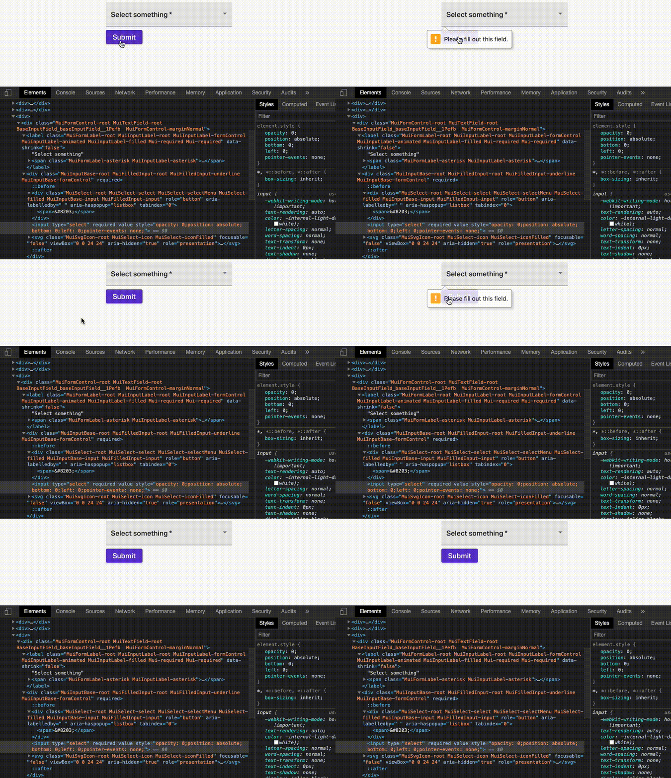
native-mui-select-validation

And here’s a hacky implementation of a Select with validation, using direct DOM manipulation and the current library:

import React, { useRef, useLayoutEffect } from "react";
import { Select } from "@material-ui/core";

export default React.memo(function SelectWithValidation(props) {
  const inputContainerRef = useRef();
  useLayoutEffect(() => {
    if (props.native) {
      return;
    }
    const input = inputContainerRef.current.querySelector("input");
    input.setAttribute("type", "select");
    if (props.required) {
      input.setAttribute("required", "");
    }
    // invisible
    input.style.opacity = 0;
    // don't interfere with mouse pointer
    input.style.pointerEvents = "none";
    // align validation messages with fake input
    input.style.position = "absolute";
    input.style.bottom = 0;
    input.style.left = 0;
    // added in response to issue comments
    input.setAttribute("tabindex", "-1");
    input.setAttribute("aria-hidden", "true");
  }, [props.native, props.required]);
  return (
    <div ref={inputContainerRef}>
      <Select {...props} />
    </div>
  );
});

And here’s that code running in an example app: https://codesandbox.io/s/material-demo-t9eu2

Motivation 🔦

The native client-side validation in the browser can be useful and good sometimes and wanting to use that validation isn’t a good reason to forsake the look and feel of the UI.

Issue Analytics

  • State:closed
  • Created 3 years ago
  • Reactions:2
  • Comments:18 (17 by maintainers)

github_iconTop GitHub Comments

3reactions
oliviertassinaricommented, Apr 24, 2020

@benwiley4000 I had a closer look at the problem, with this playground case:

import React from "react";
import { Typography, Select, InputLabel, MenuItem } from "@material-ui/core";

export default function SelectDemo() {
  const [option, setOption] = React.useState("");
  const [successMessage, setSuccessMessage] = React.useState("");

  return (
    <form
      onSubmit={e => {
        e.preventDefault();
        setSuccessMessage("submitted with no validation errors!");
      }}
    >
      <label htmlFor="fname">Full Name</label>
      <input type="text" id="fname" name="firstname" placeholder="John M. Doe" />
      <br />
      <label htmlFor="email">Email</label>
      <input type="text" id="email" name="email" placeholder="john@example.com" />
      <br />
      <label htmlFor="adr">Address</label>
      <input type="text" id="adr" name="address" placeholder="542 W. 15th Street" />
      <br />
      <label htmlFor="city">City</label>
      <input type="text" id="city" name="city" placeholder="New York" />
      <br />
        <InputLabel id="country">Select an option (required)</InputLabel>
        <Select
          value={option}
          onChange={e => setOption(e.target.value)}
          variant="outlined"
          labelId="country"
          required
          name="country"
          style={{ width: 300 }}
        >
          <MenuItem value="" />
          <MenuItem value="a">Option A</MenuItem>
          <MenuItem value="b">Option B</MenuItem>
          <MenuItem value="c">Option C</MenuItem>
          <MenuItem value="France">France</MenuItem>
        </Select>
      <div>
        <button type="submit" variant="outlined">
          Submit
        </button>
      </div>
      <Typography>{successMessage}</Typography>
    </form>
  );
}

I have a proposed diff that seems to solve these cases (an extension of your proposal):

  1. Native form validation (#20402):
Capture d’écran 2020-04-25 à 00 55 03
  1. Autofill (https://twitter.com/devongovett/status/1248306411508916224):
Capture d’écran 2020-04-25 à 00 55 40
  1. Simpler testing experience (https://github.com/testing-library/react-testing-library/issues/322), the following test pass:
    it('should support the same testing API as a native select', () => {
      const onChangeHandler = spy();
      const { container } = render(
        <Select onChange={onChangeHandler} value="0" name="country">
          <MenuItem value="0" />
          <MenuItem value="1" />
          <MenuItem value="France" />
        </Select>,
      );
      fireEvent.change(container.querySelector('[name="country"]'), { target: { value: 'France' }});

      expect(onChangeHandler.calledOnce).to.equal(true);
      const selected = onChangeHandler.args[0][1];
      expect(React.isValidElement(selected)).to.equal(true);
    });

It’s rare we can solve 3 important problems at once, with a relatively simple diff. It’s exciting. What do you think, should we move forward with a pull request?

diff --git a/packages/material-ui/src/NativeSelect/NativeSelect.js b/packages/material-ui/src/NativeSelect/NativeSelect.js
index 00464905b..f9e1da121 100644
--- a/packages/material-ui/src/NativeSelect/NativeSelect.js
+++ b/packages/material-ui/src/NativeSelect/NativeSelect.js
@@ -90,6 +90,15 @@ export const styles = (theme) => ({
   iconOutlined: {
     right: 7,
   },
+  /* Styles applied to the shadow input component. */
+  shadowInput: {
+    bottom: 0,
+    left: 0,
+    position: 'absolute',
+    opacity: 0,
+    pointerEvents: 'none',
+    width: '100%',
+  },
 });

 const defaultInput = <Input />;
diff --git a/packages/material-ui/src/Select/SelectInput.js b/packages/material-ui/src/Select/SelectInput.js
index 4d17eb618..53a7b59b7 100644
--- a/packages/material-ui/src/Select/SelectInput.js
+++ b/packages/material-ui/src/Select/SelectInput.js
@@ -49,7 +49,6 @@ const SelectInput = React.forwardRef(function SelectInput(props, ref) {
     open: openProp,
     readOnly,
     renderValue,
-    required,
     SelectDisplayProps = {},
     tabIndex: tabIndexProp,
     // catching `type` from Input which makes no sense for SelectInput
@@ -121,6 +120,16 @@ const SelectInput = React.forwardRef(function SelectInput(props, ref) {
     update(false, event);
   };

+  const childrenArray = React.Children.toArray(children);
+
+  // Support autofill.
+  const handleChange = (event) => {
+    const index = childrenArray.map((child) => child.props.value).indexOf(event.target.value);
+    if (index !== -1) {
+      onChange(event, childrenArray[index]);
+    }
+  };
+
   const handleItemClick = (child) => (event) => {
     if (!multiple) {
       update(false, event);
@@ -205,7 +214,7 @@ const SelectInput = React.forwardRef(function SelectInput(props, ref) {
     }
   }

-  const items = React.Children.map(children, (child) => {
+  const items = childrenArray.map((child) => {
     if (!React.isValidElement(child)) {
       return null;
     }
@@ -272,7 +281,7 @@ const SelectInput = React.forwardRef(function SelectInput(props, ref) {
     // eslint-disable-next-line react-hooks/rules-of-hooks
     React.useEffect(() => {
       if (!foundMatch && !multiple && value !== '') {
-        const values = React.Children.toArray(children).map((child) => child.props.value);
+        const values = childrenArray.map((child) => child.props.value);
         console.warn(
           [
             `Material-UI: you have provided an out-of-range value \`${value}\` for the select ${
@@ -288,7 +297,7 @@ const SelectInput = React.forwardRef(function SelectInput(props, ref) {
           ].join('\n'),
         );
       }
-    }, [foundMatch, children, multiple, name, value]);
+    }, [foundMatch, childrenArray, multiple, name, value]);
   }

   if (computeDisplay) {
@@ -349,12 +358,20 @@ const SelectInput = React.forwardRef(function SelectInput(props, ref) {
           display
         )}
       </div>
+      {/**
+       * Use a hidden input so:
+       *  - native form validation can run
+       *  - autofill values can be caputred
+       *  - automated tests can be written more easily
+       *  - the vale can be submitted to the server
+       */}
       <input
         value={Array.isArray(value) ? value.join(',') : value}
         name={name}
         ref={inputRef}
-        type="hidden"
-        autoFocus={autoFocus}
+        aria-hidden
+        onChange={handleChange}
+        tabIndex={-1}
+        className={classes.shadowInput}
         {...other}
       />
       <IconComponent
@@ -500,10 +517,6 @@ SelectInput.propTypes = {
    * @returns {ReactNode}
    */
   renderValue: PropTypes.func,
-  /**
-   * @ignore
-   */
-  required: PropTypes.bool,
   /**
    * Props applied to the clickable div element.
    */
1reaction
netochavescommented, May 23, 2020

I would like to work on it, if that’s ok

Read more comments on GitHub >

github_iconTop Results From Across the Web

Implement native Select validation for non-native select field
I agree the native version is an ok compromise but it doesn't allow for any type of icon embedding inside the selection options,...
Read more >
How to make a 'Select' component as required in Material UI ...
For setting a required Select field with Material UI, you can do: class SimpleSelect extends React.PureComponent { state = { selected: null, ...
Read more >
Striking a Balance Between Native and Custom Select Elements
We're going to literally use a <select> element when any ... First, we'll add a native <select> with <option> items before the custom ......
Read more >
Select (native) / Components / Zendesk Garden
A native Select allows a user to pick an option from a list. Table of Contents. How to use it. Default; Disabled; Hidden...
Read more >
Handling common accessibility problems - MDN Web Docs
Certain HTML features can be selected using only the keyboard — this is ... Instead of marking required form fields in red, for...
Read more >

github_iconTop Related Medium Post

No results found

github_iconTop Related StackOverflow Question

No results found

github_iconTroubleshoot Live Code

Lightrun enables developers to add logs, metrics and snapshots to live code - no restarts or redeploys required.
Start Free

github_iconTop Related Reddit Thread

No results found

github_iconTop Related Hackernoon Post

No results found

github_iconTop Related Tweet

No results found

github_iconTop Related Dev.to Post

No results found

github_iconTop Related Hashnode Post

No results found