question-mark
Stuck on an issue?

Lightrun Answers was designed to reduce the constant googling that comes with debugging 3rd party libraries. It collects links to all the places you might be looking at while hunting down a tough bug.

And, if you’re still stuck at the end, we’re happy to hop on a call to see how we can help out.

Getting Error while using DatePicker component

See original GitHub issue

Environment

Tech Version
material-ui-pickers 1.0.0-rc.3
material-ui 1.0.0-beta.35
React 15.6.1
Browser Chrome
Platform Windows 7

Steps to reproduce

I am using following code snippet

import React, { Fragment, PureComponent } from ‘react’; import { DatePicker } from ‘material-ui-pickers’; import withStyles, { WithStyles, StyleRulesCallback } from ‘material-ui/styles/withStyles’; import MuiPickersUtilsProvider from ‘material-ui-pickers/utils/MuiPickersUtilsProvider’; import DateFnsUtils from ‘material-ui-pickers/utils/date-fns-utils’; type Props = { value:string; label:string; changeHandler(event:any):void; }

type State = { selectedDate:any
} export default class DateSelector extends PureComponent<Props & WithStyles<‘root’>, State> { state = { selectedDate: new Date(), }

handleDateChange = (date) => { this.setState({ selectedDate: date }); }

render() { const { selectedDate } = this.state;

return (
        <MuiPickersUtilsProvider utils={DateFnsUtils}>
            <div>
              <DatePicker
                label="Basic example"
                value={selectedDate}
                onChange={this.handleDateChange}
                animateYearScrolling={false}
              />
            </div>
        </MuiPickersUtilsProvider>
);

} }

Expected behavior

The code snippet should render a Date picker

Actual behavior

Throwing following error

Uncaught Error: Element type is invalid: expected a string (for built-in components) or a class/function (for composite components) but got: undefined. You likely forgot to export your component from the file it’s defined in. Check the render method of ModalWrapper. at invariant (react-dom.js:17896) at ReactCompositeComponentWrapper.instantiateReactComponent [as _instantiateReactComponent] (react-dom.js:16037) at ReactCompositeComponentWrapper.performInitialMount (react-dom.js:4821) at ReactCompositeComponentWrapper.mountComponent (react-dom.js:4712) at Object.mountComponent (react-dom.js:11542) at ReactCompositeComponentWrapper.performInitialMount (react-dom.js:4825) at ReactCompositeComponentWrapper.mountComponent (react-dom.js:4712) at Object.mountComponent (react-dom.js:11542) at ReactCompositeComponentWrapper.performInitialMount (react-dom.js:4825) at ReactCompositeComponentWrapper.mountComponent (react-dom.js:4712) at Object.mountComponent (react-dom.js:11542) at ReactDOMComponent.mountChildren (react-dom.js:10429) at ReactDOMComponent._createInitialChildren (react-dom.js:6164) at ReactDOMComponent.mountComponent (react-dom.js:5983) at Object.mountComponent (react-dom.js:11542) at ReactCompositeComponentWrapper.performInitialMount (react-dom.js:4825)

Live example

Issue Analytics

  • State:closed
  • Created 5 years ago
  • Comments:8 (3 by maintainers)

github_iconTop GitHub Comments

1reaction
manastaldicommented, Mar 26, 2018

Hi @dmtrKovalenko

It works fine after upgrading to version : 16.2.0. But a new issue has cropped up now. All the icons pertaining to calendar, keyboard_arrow_left and keyboard_arrow_right are not being replaced by actual images, rather I see their corresponding text. Attached are the snapshots.

Note: I am not able to replicate the issue in Sandbox date picker keyboard icon issue date picker calendar icon issue

1reaction
kkotwal94commented, Mar 24, 2018

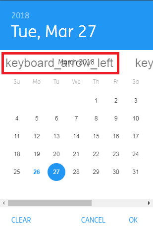
Can second the same issue happened to me: Heres an example, i might have time to create a sandbox later:

Heres app.jsx

import React, {Component} from 'react';
import red from 'material-ui/colors/red';
import Reboot from 'material-ui/Reboot';
import PropTypes from 'prop-types';
import classNames from 'classnames/bind';
import { MuiThemeProvider, createMuiTheme } from 'material-ui/styles';
import moment from 'moment';
import MomentUtils from 'material-ui-pickers/utils/moment-utils';
import MuiPickersUtilsProvider from 'material-ui-pickers/utils/MuiPickersUtilsProvider';
import Navigation from '../app/Navigation';
import Message from '../../components/Message';
import styles from '../../css/main.css';

const cx = classNames.bind(styles);
// Justifying my own MuiThemeProvider theme
const primary = {
  50: '#e4e5e8',
  100: '#babfc6',
  200: '#8d94a1',
  300: '#5f697b',
  400: '#3c495e',
  500: '#1a2942',
  600: '#17243c',
  700: '#131f33',
  800: '#0f192b',
  900: '#080f1d',
  A100: '#5d88ff',
  A200: '#2a63ff',
  A400: '#0041f6',
  A700: '#003bdc',
  contrastDefaultColor: 'light',
};

const theme = createMuiTheme({
  palette: {
    primary,
    secondary: red,
    error: red,
  },
  typography: {
    subheading: {
      color: '#667A89'
    },
  }
});

class App extends Component {
  render() {
    return (
      <MuiPickersUtilsProvider utils={MomentUtils}>
        <MuiThemeProvider theme={theme}>
          <div className={cx('app')}>
            <Reboot />
            <Navigation />
            <div className={cx('content-wrapper')}>
              {this.props.children}
            </div>
            <Message />
          </div>
        </MuiThemeProvider>
      </MuiPickersUtilsProvider>
    );
  }
}

App.propTypes = {
  children: PropTypes.object
};

export default App;

Heres where its used

import React, { Component } from 'react';
import moment from 'moment';
import { DatePicker } from 'material-ui-pickers';
import _ from 'lodash';

class DateRenderer extends Component {
  constructor(props) {
    super(props);
    this.state = {
      value: this.props.value,
      data: '',
      selectedDate: new Date(),
    };
  }

  componentDidMount() {
    this.setDefaultState();
  }

  setDefaultState() {
    const { colDef, value } = this.props;
    console.log(colDef);
    console.log(value);
    this.setState({
      value,
    });
  }

  refresh(params) {
    return false;
  }

  handleDateChange = (date) => {
   this.setState({ selectedDate: date });
 }

  render() {
    const { selectedDate } = this.state;
    const val = this.state.value || null;
    return (
      <DatePicker
          value={selectedDate}
          disableFuture
          label="DateTime"
          onChange={this.handleDateChange}
        />
    );
  }
}

export default DateRenderer;
Read more comments on GitHub >

github_iconTop Results From Across the Web

Getting Error while using DatePicker component #291 - GitHub
Steps to reproduce. I am using following code snippet. import React, { Fragment, PureComponent } from 'react'; import { DatePicker } from ...
Read more >
Error when I select date using datepicker - Stack Overflow
I'm new to react, and maybe there is some kind of error in working with the states. I would be grateful for any...
Read more >
Datepicker in Angular using mat-datepicker | Material Design
To implement date picker in Angular we can use angular material datepicker ... we will get A MatDatepicker can only be associated with...
Read more >
Problem with MDB date Picker, option error - MDBootstrap
When i initialize the date picker component, i set the formControlName to the id of the field (field.12) and I set the initial...
Read more >
React custom datepicker: Step-by-step - LogRocket Blog
datepicker : Renders a date input and presents the calendar for the user to select the date. We'll store each component in its...
Read more >

github_iconTop Related Medium Post

No results found

github_iconTop Related StackOverflow Question

No results found

github_iconTroubleshoot Live Code

Lightrun enables developers to add logs, metrics and snapshots to live code - no restarts or redeploys required.
Start Free

github_iconTop Related Reddit Thread

No results found

github_iconTop Related Hackernoon Post

No results found

github_iconTop Related Tweet

No results found

github_iconTop Related Dev.to Post

No results found

github_iconTop Related Hashnode Post

No results found