question-mark
Stuck on an issue?

Lightrun Answers was designed to reduce the constant googling that comes with debugging 3rd party libraries. It collects links to all the places you might be looking at while hunting down a tough bug.

And, if you’re still stuck at the end, we’re happy to hop on a call to see how we can help out.

RFC: material-ui-pickers v4

See original GitHub issue

Breaking changes

We are on the way to v4. It is required to make another major release independently of @material-ui/core team. Here what I am planning to release

Material design v2 update

Material design guidelines was updated with new reference for date/time pickers reference

Here is new UI sneak peek design update This looks really strange: mobile keyboard input
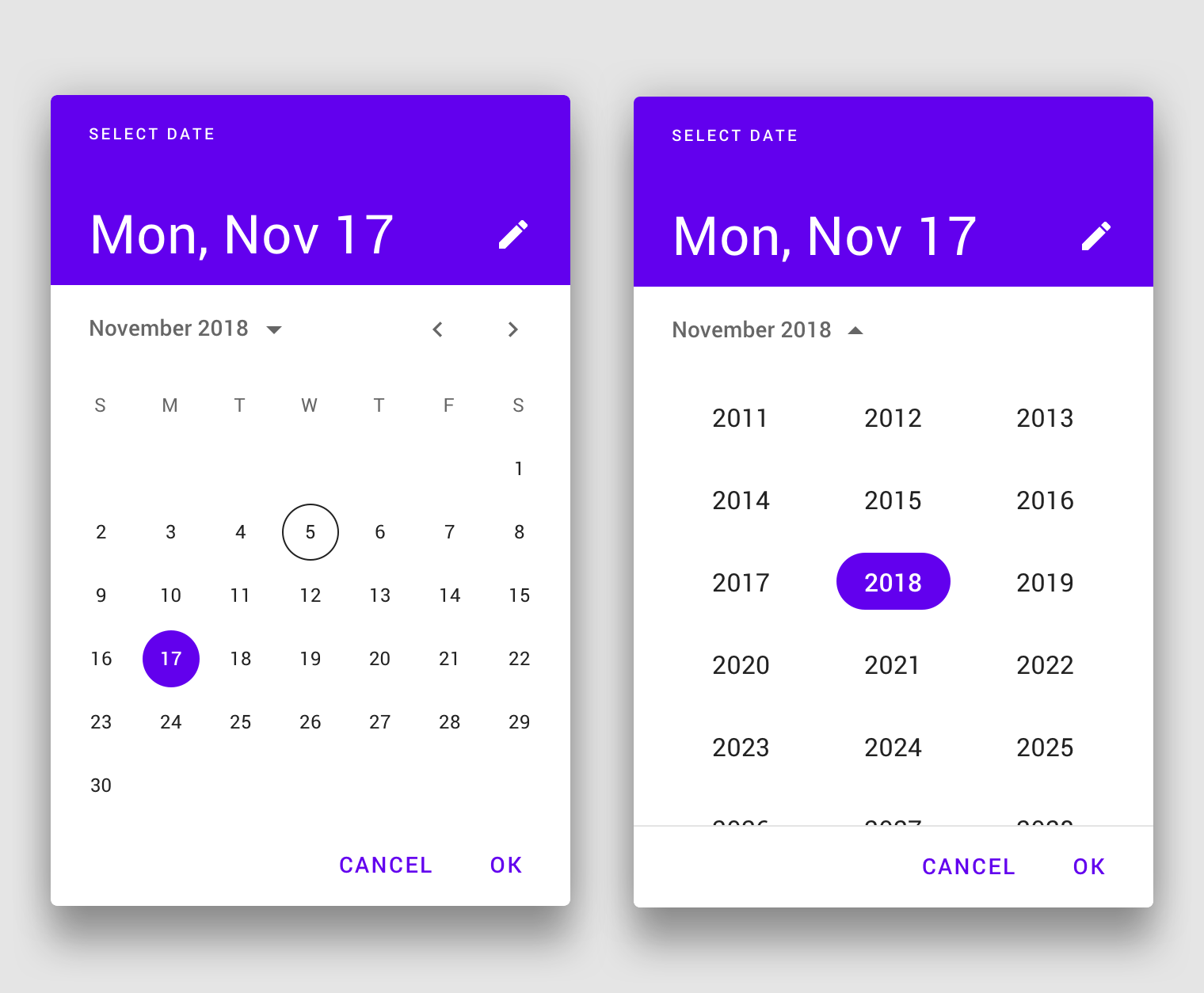
Also as you can see this spec contains a design for the date-range picker. So possible new release should also include #364

image

P.S. It looks like we need to redesign literally everything. So will need as many help as possible

Improved mask and keyboard mode

Updating to the new rifm version will allow us to resolve #1144 and #1289. And also new release will make possible to make a major update of date-io library with an automatic insert of keyboard-friendly formats

Changes for variants

Right now we have inline and dialog option. Due to changes in material design spec I propose to have variants mobile and desktop and accept them automatically, on the flight.

And also we want to make inline or desktop variant to be primarily supported instead of the mobile one.

Any discussion is appreciated 😃 @oliviertassinari

Issue Analytics

  • State:closed
  • Created 4 years ago
  • Reactions:220
  • Comments:49 (17 by maintainers)

github_iconTop GitHub Comments

57reactions
oliviertassinaricommented, Jan 4, 2020

Given the date picker was our number one requested focus on the last developer survey. Take this example, a good date picker can be an entry point for the adoption of Material-UI.

I’m determined to make sure that we allocate enough resources to this problem. Most notably, I have proposed that Material-UI financially support @dmtrKovalenko to push the concern forward.

(Notice that we evaluate a similar effort for the datatables problem, A significant difference is that Material-UI can directly monetize paid advanced features like ag-grid, dev-express, syncfusion, kendo, sencha, etc do.)

Benchmark

I have used the following sources to benchmark:

Proposal

I would recommend the following:

  1. Change react peer dependency from “^16.8.4” to “^16.8.0”.
  2. A strong focus on the desktop version. Consider the mobile version later on, for 2020 or 2021.
  3. Consider not implementing a mobile landscape mode. I hope that we can get away without.
  4. Move the project to /mui-org/material-ui/. I expect the usage of the same documentation to provide a better experience for the developers. We would rely on the same conventions. I expect hosting the effort on the main repository will consolidate the integration of the component with the others. For instance, it will help contributors.
  5. Evaluate if the pickers should be published under @material-ui/core or @material-ui/pickers. I’m not sure about this one. I’m hesitating, my preference is with @material-ui/pickers, if possible. A developer survey could help us pick the best option.
  6. Start from the ground-up leveraging the past learnings.
  7. Remove MuiPickersUtilsProvider, depend on dayjs or date-fns by default, depending on what’s smaller by default.
  8. Allow the usage of theme.props.MuiDatePicker.dateUtils to provide an adapter for moment or date-fns with @date-io.
  9. Write the sources in TypeScript.
  10. Keyboard navigation. The focus should stay on the input. If the Calendar is used, standalone, the focus should stay on the root div. Among the different solutions I have benchmarked, I have found the keyboard support of Kendo interesting for the timepicker: arrow up and down + text selection. Otherwise, when disabledKeyboard=false, I think that the Calendar should take precedence for the handling of the arrow keys over the input.
  11. Implement the code as a monolith: DatePicker. Then, consider how to break it down is reusable pieces.
  12. The supported props & features:
DatePicker.propTypes = {
  /**
   * The date engine to use, default to X.
   * You can use moment or else following https://github.com/dmtrKovalenko/date-io.
   *
   * It contains the locale.
   * Want to change the first day of the week? Change the locale.
   */
  dateUtils: PropTypes.object,
  /**
   * If `true`, a column is added to show the week numbers of the year.
   *
   * default false
   */
  showWeekNumbers: PropTypes.bool,
  /**
   * Format used to display the date in the input.
   * The format is used to parse the input string and stringify date object internally.
   * The format should match the supported behavior of the provided style engine.
   */
  inputFormat: PropTypes.string,
  /**
   * Parsable date, e.g. new Date() or moment().
   * The support value type depends on the date engine used, see the `dateUtils` prop.
   */
  value: DateIOType,
  /**
   * The default value. Use when the component is not controlled.
   */
  defaultValue: DateIOType,
  /**
   * Specify the dates that are disabled.
   *
   * @param {DateIOType} date The date to consider
   * @returns {boolean}
   */
  disabledDate: PropTypes.func
  /**
   * Specify the times that are disabled.
   *
   * @param {DateIOType} date The time to consider
   * @returns {boolean}
   */
  disabledTime: PropTypes.func
  /**
   * The minimum selectable date.
   */
  minDate: DateIOType,
  /**
   * Whether shortcuts to quickly select a range of dates are displayed or not.
   * If true, preset shortcuts will be displayed.
   * If false, no shortcuts will be displayed.
   * If an array is provided, the custom shortcuts will be displayed.
   */
  rangeShortcuts: PropTypes.oneOfType([PropTypes.bool, PropTypes.array]),
  /**
   * The maximum selectable date.
   */
  maxDate: DateIOType,
  /**
   * The maximum time the user can select.
   * The year, month, and day parts of the Date object are ignored.
   */
  maxTime: DateIOType
  /**
   * The minimum time the user can select.
   * The year, month, and day parts of the Date object are ignored.
   */
  minTime: DateIOType
  /**
   * Callback fired when the value changes.
   *
   * @param {object} event The event source of the callback
   * @param {DateIOType} value
   */
  onChange: PropTypes.func,
  /**
   * Control the popup open state.
   */
  open: PropTypes.bool,
  /**
   * Callback fired when the popup requests to be opened.
   * Use in controlled mode (see open).
   *
   * @param {object} event The event source of the callback.
   */
  onOpen: PropTypes.func,
  /**
   * Callback fired when the popup requests to be closed.
   * Use in controlled mode (see open).
   *
   * @param {object} event The event source of the callback.
   */
  onClose: PropTypes.func,
  /**
   * Date that will be initially highlighted if null was passed.
   *
   * from (initialFocusedDate)
   * default today
   */
  defaultHighlight: DateIOType,
  /**
   * Number of months to show. Supported value between 1 and 3.
   *
   * default 1
   */
  monthsShown: PropTypes.number,
  /**
   * Disable the arrow keyboard navigation.
   *
   * from (allowKeyboardControl)
   * default false
   */
  disabledKeyboard: PropTypes.bool,
  /**
   * If `true`, the current day shouldn't be highlighted in the calendar.
   *
   * default false
   */
  disableHighlightToday: PropTypes.bool,
  /**
   * If `true`, the popup won't close when a value is selected.
   *
   * from (autoOk)
   * default false
   */
  disableCloseOnSelect: PropTypes.bool,
  /**
   * Props applied to the [`TextField`](/api/text-field/) element.
   */
  TextFieldProps: PropTypes.object,
  /**
   * If `true`, the clear button is visible.
   *
   * default false
   */
  showInputClear: PropTypes.bool,
  /**
   * If `true`, the clear button is visible.
   *
   * default false
   */
  showCalendarClear: PropTypes.bool,
  /**
   * If `true`, the today button is visible.
   *
   * default false
   */
  showCalendarToday: PropTypes.bool,
  /**
   * An object containing all the translation keys.
   *
   * Default:
   *
   * - today: Today
   * - clear: Clear
   * - selectMonth: Select a month
   * - selectYear: Select a year
   */
  labels: PropTypes.object,
  /**
   * If `true`, the user needs to confirm his choice.
   *
   * default false
   */
  confirm: PropTypes.bool,
  /**
   * If `true`, the user should select a range.
   *
   * default false
   */
  range: PropTypes.bool,
  /**
   * Whether to use a 12 hour format with an AM/PM choice or a 24 hour format.
   *
   * Default to the browser preference.
   *
   * ?
   * https://stackoverflow.com/questions/27647918/detect-with-javascript-if-users-machine-is-using-12-hour-clock-am-pm-or-24-cl/27648032
   */
  useAmPm: PropTypes.bool,
  /**
   * Allow the user to pick a value between:
   *
   *  - year
   *  - month
   *  - day
   *  - week
   *  - time
   *
   * default ['year', 'month', 'day']
   */
  mode: PropTypes.array,
}

References

I have kept track of some visual clue for the above proposal. You fill find features or components that have associated link with the benchmark sources.

  • YearPicker

YearPicker material.io

YearPicker pagination antd

  • TimePicker

TimePicker kendo

TimePicker_ antd

  • switch between date and time

switch between date and time_ kendo

switch between date and time antd

  • showWeekNumbers=true

showWeekNumbers=true bootstrap

showWeekNumbers=true_ antd

  • showInputClear=true

showInputClear=true gmail

  • showCalendarToday=true

showCalendarToday=true antd

showCalendarToday=true_ blueprint

showCalendarToday=true__ syncfusion

  • showCalendarClear=true

showCalendarClear=true

blueprint

  • rangeShortcuts=true

rangeShortcuts=true blueprint

rangeShortcuts=true_ google ads

rangeShortcuts=true__ airbnb

  • range=true

range=true material.io

range=true projection less important feature

  • MonthPicker

MonthPicker

  • disableHighlightToday=false

disableHighlightToday=false bootstrap

disableHighlightToday=false_ material.io

  • DayPicker

DayPicker material.io

  • confirm=true

confirm=true antd

confirm=true_ google analytics

confirm=true__ google ads

  • Calendar

Calendar material.io

  • monthsShown=2

Calendar-monthsShown=2

material.io

  • monthsShown=3

Calendar-monthsShown=3

google analytics


This is meant as a sketch of what the next steps could look like. Feedback appreciated. cc @mui-org/core-contributors

19reactions
dmtrKovalenkocommented, Jan 17, 2020

The first prerelease is ready! https://github.com/mui-org/material-ui-pickers/releases/tag/v4.0.0-alpha.1 Would like to hear any feedback ❤️

Read more comments on GitHub >

github_iconTop Results From Across the Web

RFC: material-ui-pickers v4 · Issue #1293 - GitHub
Breaking changes We are on the way to v4. It is required to make another major release independently of @material-ui/core team.
Read more >
material-ui-pickers-v4 - npm
React components, that implements material design pickers for material-ui v4 with updated material ui. Latest version: 3.3.12, ...
Read more >
Material-UI Pickers
Accessible, customizable, delightful date & time pickers for @material-ui/core.
Read more >
@material-ui/core 5.0.0-alpha.6 on Node.js Yarn - NewReleases.io
This API allows developers to add new variants on the Material-UI's components right from the theme, without having to wrap the components.
Read more >
Migration from @material-ui/pickers - MUI
The state/value management logic for pickers was rewritten from scratch. Pickers will now call the onChange prop when each view of the date...
Read more >

github_iconTop Related Medium Post

No results found

github_iconTop Related StackOverflow Question

No results found

github_iconTroubleshoot Live Code

Lightrun enables developers to add logs, metrics and snapshots to live code - no restarts or redeploys required.
Start Free

github_iconTop Related Reddit Thread

No results found

github_iconTop Related Hackernoon Post

No results found

github_iconTop Related Tweet

No results found

github_iconTop Related Dev.to Post

No results found

github_iconTop Related Hashnode Post

No results found