
Stuck on an issue?
Lightrun Answers was designed to reduce the constant googling that comes with debugging 3rd party libraries. It collects links to all the places you might be looking at while hunting down a tough bug.
And, if you’re still stuck at the end, we’re happy to hop on a call to see how we can help out.
Select with endAdornment overlaps with arrow icon
See original GitHub issue- The issue is present in the latest release.
- I have searched the issues of this repository and believe that this is not a duplicate.
Current Behavior 😯
Adornment overlaps with the arrow icon of the Select field.
Expected Behavior 🤔
The adornment should be displayed to the left of the arrow or should push the arrow icon and clickable field to the left.
In version 3.6.1, the clickable field with the arrow icon was pushed to the left when a adornment was added.
Steps to Reproduce 🕹
Steps:
- Create a Select field.
- Add
InputAdornmentwithposition="end"to theendAdornmentprop.
<Select
    endAdornment={
        <InputAdornment position="end">
            <IconButton>
                <ClearIcon />
            </IconButton>
        </InputAdornment>
    }/>
Context 🔦
Updating material-ui from version 3.6.1 to 4.5.0 caused this issue.
Your Environment 🌎
| Tech | Version |
|---|---|
| Material-UI | v4.5.0 |
| React | 16.10.2 |
| Browser | Any |
| TypeScript | |
| etc. |
Issue Analytics
- State:

- Created 4 years ago
- Reactions:8
- Comments:21 (7 by maintainers)
 Top Results From Across the Web
Select with endAdornment overlaps with arrow icon #17799
I'd like to simply use a material-ui Icon as an endAdornment, but it overlaps with the arrow icon. In the Autocomplete this is...
Read more >Material UI - Select Menu with End Adornment - Stack Overflow
This will render the adornment with a bit of margin right to avoid overlapping with the Select arrow. Share.
Read more >InputAdornment API - Material UI - MUI
API reference docs for the React InputAdornment component. Learn about the props, CSS, and other APIs of this exported module.
Read more >material-ui/core/CHANGELOG.md - UNPKG
451, - [Tooltip] Fix arrow placement overlap (#20900) @esseswann ... 865, - [Select] Fix disabled color to the icon (#20287) @HenryLie.
Read more >@material-ui/icons | Yarn - Package Manager
Installation. Install the package in your project directory with: // with npm npm install @material-ui/icons // with yarn yarn add @ ...
Read more > Top Related Medium Post
No results found
 Top Related StackOverflow Question
No results found
 Troubleshoot Live Code
Lightrun enables developers to add logs, metrics and snapshots to live code - no restarts or redeploys required.
Start Free Top Related Reddit Thread
No results found
 Top Related Hackernoon Post
No results found
 Top Related Tweet
No results found
 Top Related Dev.to Post
No results found
 Top Related Hashnode Post
No results found
@oliviertassinari I used the code from the asynchronous demo of autocomplete and modified as per my requirement a little but still the resulting autocomplete component shows a loading icon overlapped on the cross and down icon.
here is the code:
Screenshot: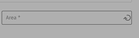
@Floriferous we have an example for it in the demos. https://material-ui.com/components/autocomplete/#asynchronous-requests