
Lightrun Answers was designed to reduce the constant googling that comes with debugging 3rd party libraries. It collects links to all the places you might be looking at while hunting down a tough bug.
And, if you’re still stuck at the end, we’re happy to hop on a call to see how we can help out.
Improve progress bar design
See original GitHub issue🚀 Feature
Following on from #2656 I wanted to document the currently outstanding design improvements suggested by @jni, @tlambert03, @goanpeca and me. I don’t know if all of these suggestions should be implemented or whether they’re the best options, so I think it would be good to get a design audit from @liaprins-czi before we go much further.
- Fix Vertical Jumping: as progress bars are added and closed, the displayed progress bars jump around to fill the available space. It would be nice to limit this and particularly for nested progress bars, reserve the rows of the child bars so that we don’t get the jumping around.
- Fix Horizontal Alignment: progress bars contract when the ETA is added, and don’t align depending on the size of the ETA label. The progress bar and ETA label should get fixed space to ensure they are aligned.
- Improve Scrolling Behaviour: the size of one scroll step is currently roughly equal to the height of a progress bar so there is a “strobing” effect when scrolling. We should consider ways to avoid this.
- Remove Text Label: Having the word
activitynext to the expand/contract arrow is not the prettiest. We could consider having a greyed out version of the in-progress indicator as a clickable button for expanding and contracting, or perhaps some other more indicative icon. The concerns here are mainly around discoverability so it would be good to get @liaprins-czi’s ideas on this - Auto-Close Dock: Consider automatically closing the activity dock when all the active progress bars have finished. Depending on the user workflow this could be pretty annoying as a new progress bar might start up pretty quickly after the last ones finished. Again, something @liaprins-czi should weigh in on imo.
- Move Progress Indicator to Own Thread: operations which block the main thread stop the progress indicator from moving smoothly and can be jarring. Having the indicator in its own thread could make for a much nicer experience.
I think I’ve covered all the current suggestions for improvement but of course any new suggestions would be welcome to make the progress bars as useful, discoverable and pretty as possible.
Issue Analytics
- State:

- Created 2 years ago
- Reactions:3
- Comments:23 (23 by maintainers)
 Top Results From Across the Web
 Top Related Medium Post
 Top Related StackOverflow Question
 Troubleshoot Live Code
 Top Related Reddit Thread
 Top Related Hackernoon Post
 Top Related Tweet
 Top Related Dev.to Post
 Top Related Hashnode Post
Based on last week’s community feedback, here’s the promised (tiny) prototype. If you click the button to collapse the pop up progress bars on the first page, the rest will progress on its own.
This is the combined UI elements discussed above in one image (the first image of the prototype):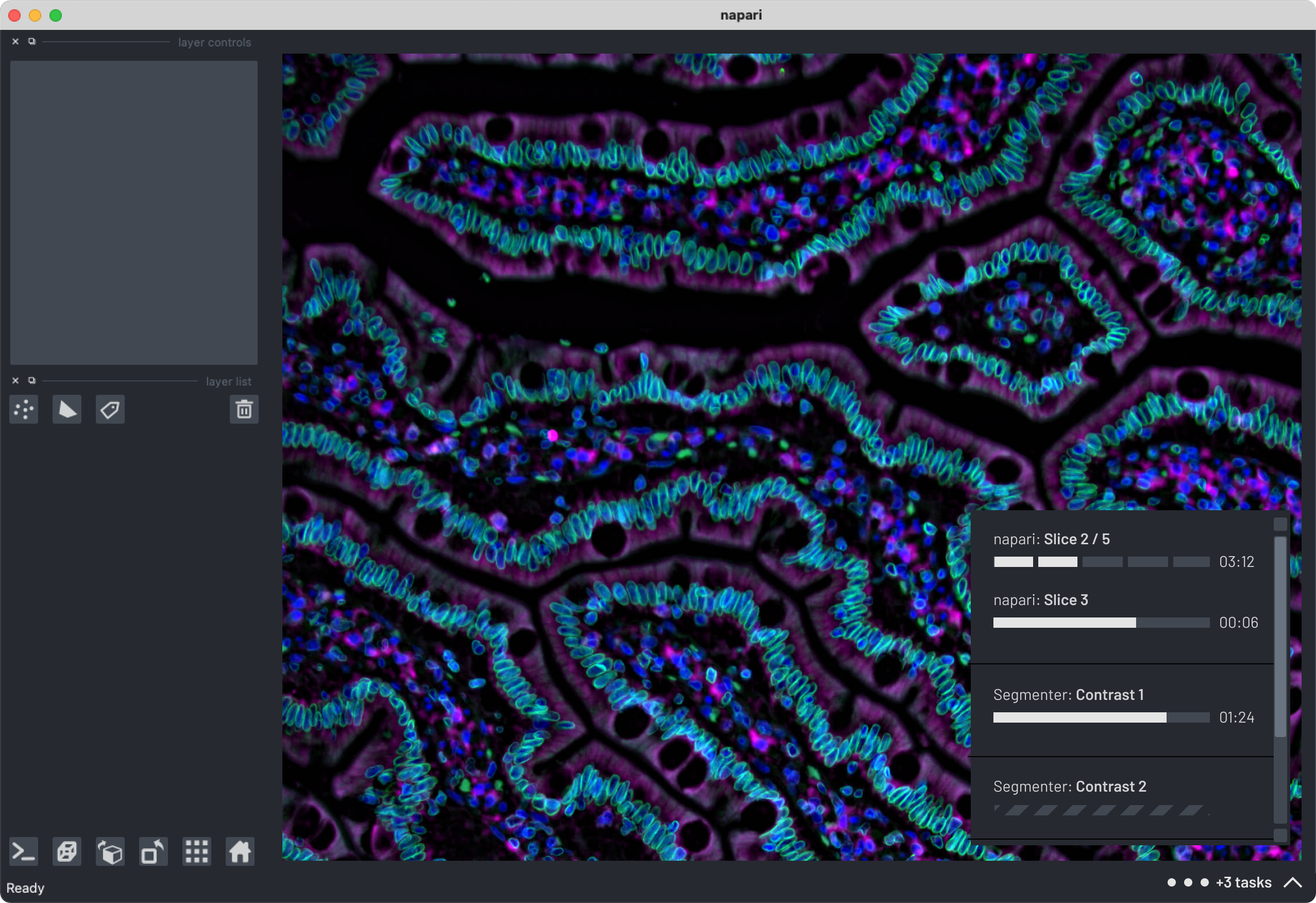
This is what it looks like in the minimum window size napari has. It’s what I based the fixed size window on the other mock ups as well.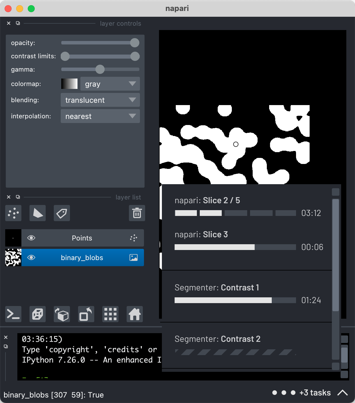
There are definitely more interactions to work through, but this should help give an idea as to how all the above decisions play together. As always, let me know what you think!
Some particular items I’m undecided on:
I love how this is shaping up! Great to be getting to consolidated feedback and decisions! 🎉