Lightrun Answers was designed to reduce the constant googling that comes with debugging 3rd party libraries. It collects links to all the places you might be looking at while hunting down a tough bug.
And, if you’re still stuck at the end, we’re happy to hop on a call to see how we can help out.
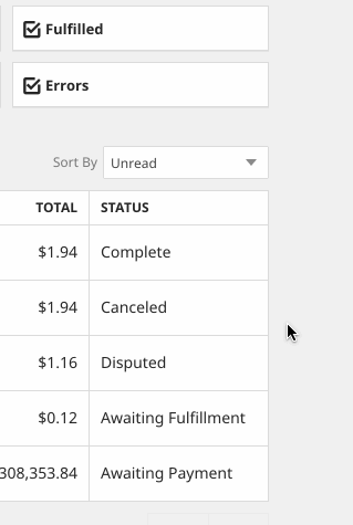
Visual bug for Cancel link in Order List; Surprising behavior from link
See original GitHub issueBrief Description: When viewing the cancel link for offline direct order, the link looks different from other links on the page. Also surprised that the “Cancel” link actually cancels the order and doesn’t show the order detail view like the other links do. This may be due to the visual bug as it’s suppose to be a button (maybe?) as that would make more sense here (like the Accept/Reject scenario on the vendor side when they get an offline order).
Operating System (OS and version): MacOS
OpenBazaar version (shown on About OpenBazaar page in menu): 2.3.0/0.13.0
Reproducible (Always / Almost Always / Sometimes / Rarely / Couldn’t Reproduce): Always
Steps to reproduce:
- Create offline direct order.
- Fund the order.
- Observe the order showing a “cancel” link in the status column.
Observed Behavior:

Expected Behavior: Expected the link to look similar to the other links.
Additional info (links, images, etc go here):
Issue Analytics
- State:

- Created 5 years ago
- Comments:7 (6 by maintainers)
 Top Related StackOverflow Question
 Troubleshoot Live Code
 Top Related Reddit Thread
 Top Related Hackernoon Post
 Top Related Tweet
 Top Related Dev.to Post
 Top Related Hashnode Post
ok, yeah, that’s probably a visual bug. I don’t think those status’s should get an underline on hover.
I get they aren’t styled as links intentionally, but they certainly give a “link”-like vibe when I hover over them. It’s not obvious that I’m clicking on a row in these cases.