
Lightrun Answers was designed to reduce the constant googling that comes with debugging 3rd party libraries. It collects links to all the places you might be looking at while hunting down a tough bug.
And, if you’re still stuck at the end, we’re happy to hop on a call to see how we can help out.
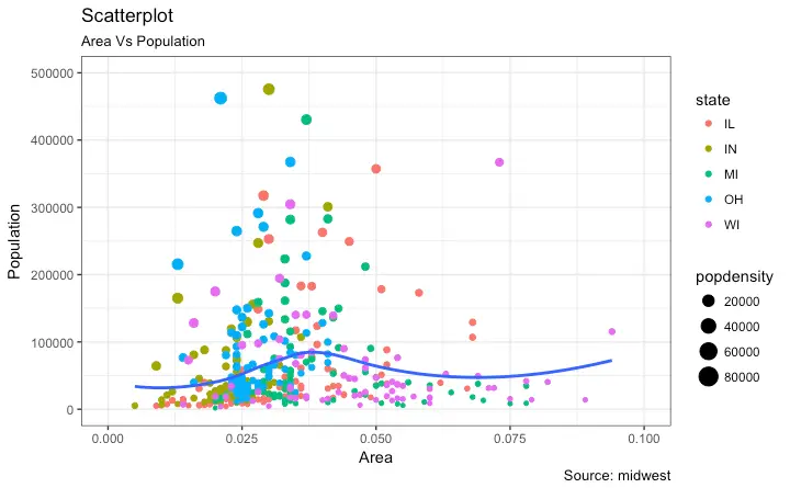
Scatter plot with colour_by and size_by variables
See original GitHub issueProblem description
Use case: Say we have a df with 4 columns- a, b, c, d. We want to make a scatter plot, with x=a, y=b, color_by=c and size_by=d. Here, if c is a categorical, we get a discrete set of colours and corresponding legend, else a continuous scale. size_by decides the size of the marker.
Such cases are often needed as evidenced by questions on Stack Overflow.
Image below shows an example.
I wrote a blog post(hand-wavy at times- marker size legend) on how to generate such a plot in Pandas. The code below shows how to make a similar plot.
Code Sample, a copy-pastable example if possible
import matplotlib.pyplot as plt
import pandas as pd
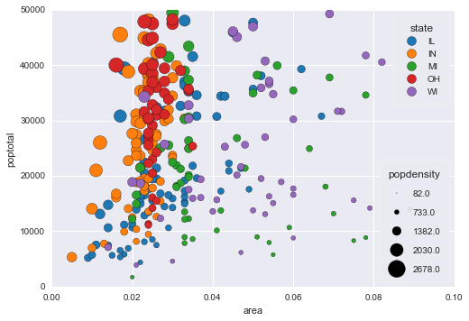
midwest= pd.read_csv("http://goo.gl/G1K41K")
# Filtering
midwest= midwest[midwest.poptotal<50000]
fig, ax = plt.subplots()
groups = midwest.groupby('state')
# Tableau 20 Colors
tableau20 = [(31, 119, 180), (174, 199, 232), (255, 127, 14), (255, 187, 120),
(44, 160, 44), (152, 223, 138), (214, 39, 40), (255, 152, 150),
(148, 103, 189), (197, 176, 213), (140, 86, 75), (196, 156, 148),
(227, 119, 194), (247, 182, 210), (127, 127, 127), (199, 199, 199),
(188, 189, 34), (219, 219, 141), (23, 190, 207), (158, 218, 229)]
# Rescale to values between 0 and 1
for i in range(len(tableau20)):
r, g, b = tableau20[i]
tableau20[i] = (r / 255., g / 255., b / 255.)
colors = tableau20[::2]
# Plotting each group
for i, (name, group) in enumerate(groups):
group.plot(kind='scatter', x='area', y='poptotal', ylim=((0, 50000)), xlim=((0., 0.1)),
s=10+group['popdensity']*0.1, # hand-wavy :(
label=name, ax=ax, color=colors[i])
# Legend for State colours
lgd = ax.legend(numpoints=1, loc=1, borderpad=1,
frameon=True, framealpha=0.9, title="state")
for handle in lgd.legendHandles:
handle.set_sizes([100.0])
# Make a legend for popdensity. Hand-wavy. Error prone!
pws = (pd.cut(midwest['popdensity'], bins=4, retbins=True)[1]).round(0)
for pw in pws:
plt.scatter([], [], s=(pw**2)/2e4, c="k",label=str(pw))
h, l = plt.gca().get_legend_handles_labels()
plt.legend(h[5:], l[5:], labelspacing=1.2, title="popdensity", borderpad=1,
frameon=True, framealpha=0.9, loc=4, numpoints=1)
plt.gca().add_artist(lgd)
This produces the following plot:
I was wondering, if the use case is important enough to introduce changes in the API for scatter plot, so that color_by and size_by arguments can be passed? I understand that the same set of arguments are used across different plots, and a size_by will not make sense for many plots.
If this will not make it into the API, it still might be useful to have a detailed example in the cookbook. Or, a function that would work out of the box for such plots.
Issue Analytics
- State:

- Created 6 years ago
- Reactions:2
- Comments:9 (5 by maintainers)
 Top Related StackOverflow Question
 Troubleshoot Live Code
 Top Related Reddit Thread
 Top Related Hackernoon Post
 Top Related Tweet
 Top Related Dev.to Post
 Top Related Hashnode Post
Hey!
I’ve made progress with the sizes, haven’t looked at colors yet. Taking the same data as @nipunbatra in his example above, this is what I have now:
And if you want to make the bubbles smaller or bigger, you can use s_grow (defaut 1) to change that:
Here is what I did so far:
Grabbing & normalizing data
Compared to what I explained in my previous post, I only slightly modified the init method of the ScatterPlot class to turn s_grow, size_title, size_data_max and bubble_points (the default bubble max size of 200 points) into attributes of ScatterPlot instances, as that makes these 4 parameters easily accessible to the other methods when building the legend for the bubble sizes.
Building the legend
Before actually building the legend, we must define the sizes and labels of the bubbles to include in the legend. For instance if we want 4 bubbles in our legend, a straighforward approach is to use data_max, 0.75 * data_max, 0.5 * data_max and 0.25 * data_max. However as you can see in the graph built by @nipunbatra this leads to values like 82, 733, 1382… which is not as nice having labels with “round” values like in the graph produced by Altair (see @nipunbatra 's blog post).
I have therefore tried to achieve this nice behaviour and to build a legend with round values. In order to make a legend with 4 bubbles, we therefore need to define 4 bubble sizes and the 4 corresponding labels, with ‘round’ values for the labels, the biggest of which is close to the maximum of the data.
For this I first need a helper function to extract the mantissa (or coefficient) and exponent of a number in decimal base.
Example: _sci_notation(782489.89247823) returns (7.8, 5.0)
Then, given a data_max, s_grow and bubble_points, this function finds 4 appropriate sizes and labels for the legend:
Example: _legend_bubbles(data_max = 2678.0588199999, s_grow = 1, bubble_points = 200) returns: ([224.04287595147829, 74.680958650492769, 37.340479325246385, 14.936191730098553], [‘3000’, ‘1000’, ‘500’, ‘200’])
The first list gives 4 bubbles sizes (in points) and the second list the 4 corresponding labels.
In our exemple with population density, the maximum of popdensity is 2678.0588199999. So what happens is:
Finally, we put all the pieces together in a _make_legend method which is specific to the ScatterPlot class. After building the legend for the bubbles, we call the _make_legend method of the parent.
I also have a few questions:
How does this look to you?
Thanks! Vincent
Is anyone still working on this? I miss this functionality. If the column contains strings the method should use distinct colors. Similar to what happens in plotly plots. Same with shapes.