
Lightrun Answers was designed to reduce the constant googling that comes with debugging 3rd party libraries. It collects links to all the places you might be looking at while hunting down a tough bug.
And, if you’re still stuck at the end, we’re happy to hop on a call to see how we can help out.
Charts: interactive legend
See original GitHub issueIs there any plan to have a built-in interactive legend as there was in pf3 / c3 charts ? Previously, clicking on legend icons would show/hide the related series in charts.
With victory chart I believe there’s no such mechanism built-in, but we can implement it through events. I’m doing something like that in Kiali: https://github.com/kiali/kiali-ui/pull/1457/commits/63d400d58c2fdcbbb4a77c087c2b76511be6801e#diff-82e26dca83e13db6b8969687fd9268cbR71-R156 . Maybe that can be part of the patternfly value-added & standard look n feel?
Also note that, currently I cannot do it using the ChartLegend component from PF4, as it seems events are not fired when targeting the legend (I believe it’s due to the wrapping component) so I need to use VictoryLegend directly instead of ChartLegend.
Issue Analytics
- State:

- Created 4 years ago
- Comments:11 (11 by maintainers)
 Top Related StackOverflow Question
 Troubleshoot Live Code
 Top Related Reddit Thread
 Top Related Hackernoon Post
 Top Related Tweet
 Top Related Dev.to Post
 Top Related Hashnode Post
FYI @jotak, I created a POC with you’re implementation. The POC relies on the theme to coordinate colors between
ChartArea,ChartScatter, and the customChartLegend– not necessary to use custom colors.I also fixed
ChartLegendso that you won’t need to rely on VictoryLegend. That change will be added via https://github.com/patternfly/patternfly-react/pull/3067I like your use of the
onMouseOverandonMouseOutevents. While the user hovers over a legend label, the line representing the data series is highlighted by making it 2x wider. Although, that is the opposite behavior I see with PF3.Kiali UI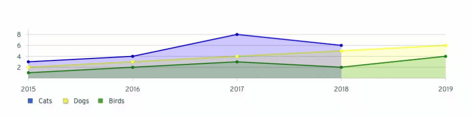
In PF3, the opacity is lowered for all other data while hovering over a legend label. That is, we blur everything, but the data series the user is currently viewing.
Considering the Cost Management UI may have up to 8 lines of historical data, we also need a way to hide / show each data series individually. PF3 never implemented that type of behavior.
That said, I took the implementation a little further and was able to mimic some of the PF3 behavior below.
PF3 blur functionality: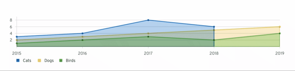
I was also able to use
onClickevents to hide / show each data series individually. Although, I wasn’t able to use events to demo both features at the same time – difficult to ensure events don’t clash and reset the styles of each other.Hide / Show functionality: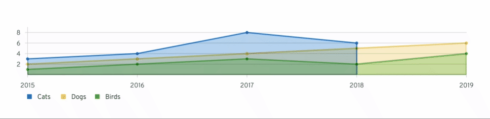
Unfortunately, maintaining state via events doesn’t work very well. When the cursor moves outside the SVG or a tooltip is shown, the hidden data series is redrawn.
This leads me to believe that the hide / show state must be maintained outside the events, similar to my Cost Management example. Charts are stateless and use composition, so I’m not certain we could build that feature internally – may create an example, instead?
That said, I’ve put out the request to our design team to get this prioritized. I’m hoping to use all this as a POC to show what features may be possible.
I’m going to get some design feedback regarding what we want to implement for react-charts. That is, should we strive to implement the C3 features in PF3 or something completely different, like what Analytics has recently implemented with their legend toggle button?