
Lightrun Answers was designed to reduce the constant googling that comes with debugging 3rd party libraries. It collects links to all the places you might be looking at while hunting down a tough bug.
And, if you’re still stuck at the end, we’re happy to hop on a call to see how we can help out.
Dropdown-panel size issue
See original GitHub issueWhen using the generic Dropdown panel pattern (https://www.patternfly.org/v4/documentation/react/components/dropdown/#dropdown-panel), it is possible to place arbitrary content in the panel:
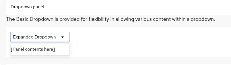
At some point, the generated markup of Dropdown changed to remove ul DOM nodes, which is fine. However, there is an issue that is causing the panel of the dropdown to limit it’s size to the width of the dropdown. Previously, the width of the panel increased as needed (similarly the other patterns). This generates issues when the panel’s content needs a larger width:
For now, to workaround the issue I’m adding an additional layer with a className="pf-c-dropdown__menu-item" like the following (which I formed by looking at the markup of older react-core versions):
<Dropdown
    onSelect={this.onSelect}
    toggle={<DropdownToggle onToggle={this.onToggle}>Expanded Dropdown</DropdownToggle>}
    isOpen={isOpen}
    >
    <div className="pf-c-dropdown__menu-item">
        [Panel contents here]
    </div>
</Dropdown>
and this workaround fixes the sizing issue:
But I think the “generic Dropdown” pattern should generate the required markup to avoid this workaround and to behave the same as the other patterns.
Issue Analytics
- State:

- Created 4 years ago
- Comments:14 (10 by maintainers)
 Top Results From Across the Web
 Top Related Medium Post
 Top Related StackOverflow Question
 Troubleshoot Live Code
 Top Related Reddit Thread
 Top Related Hackernoon Post
 Top Related Tweet
 Top Related Dev.to Post
 Top Related Hashnode Post
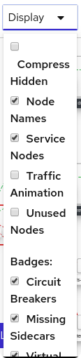
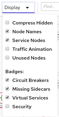
@israel-hdez it looks like this use case might be better as an OptionsMenu or Select component? The dropdown should only handle links or actions.
Even with a custom menu, it’s still advised to use the
.pf-c-[select/options-menu/dropdown]--menu-itemclass on your items so that you retain the PF styles (layout, spacing, hover/focus states). You can see an example of your general layout using the select component here - https://www.patternfly.org/v4/documentation/react/components/select/#grouped-checkbox-select-input@israel-hdez I’ve opened a new issue here to track the request to make the badge optional: https://github.com/patternfly/patternfly-next/issues/2519 Will close this one out,