
Stuck on an issue?
Lightrun Answers was designed to reduce the constant googling that comes with debugging 3rd party libraries. It collects links to all the places you might be looking at while hunting down a tough bug.
And, if you’re still stuck at the end, we’re happy to hop on a call to see how we can help out.
Feature Request: Remove Side Symbols in Legend (like ⅃) for Single Data Set
See original GitHub issueHi!
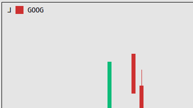
Have this symbol on plot before label: ⅃ Looks it should not print, i did not saw it on screens
import yfinance as yf
import plotext as plt

plt.date_form('d/m/Y')
start = plt.string_to_datetime('11/06/2022')
end = plt.string_to_datetime('10/10/2022')
data = yf.download('goog', start, end)
# data.reset_index(drop=True)
dates = plt.datetimes_to_string(data.index)
plt.xlim("10/06/2022", "15/10/2022")
plt.candlestick(dates, data,label='GOOG',yside = 2)
plt.hline(100,'red',yside=2)
plt.text(' 100 ',x='12/10/2022',y=100,background='red',color='black',yside=2)
plt.show()
Issue Analytics
- State:

- Created a year ago
- Comments:5 (3 by maintainers)
 Top Results From Across the Web
How To: Hide a map item in the ArcMap map legend but ...
A map item can be hidden from the map legend while maintaining the symbol on the map. Procedure. Use one of the following...
Read more >Working with legends—ArcMap | Documentation
Legends consist of examples of the symbols on the map with labels containing explanatory text. When you use a single symbol for the...
Read more >Option to disable offset of symbols in legend #47519 - GitHub
It seems there are scenarios were a layer (i.e. a line one) needs an offset, eventually applied to different symbology classes/categories. if ...
Read more >Showing one feature with two unique values as one symbol in ...
I need to show the 2 values in the map but would like to only show the solid hatch in the legend. I...
Read more >How to customize legend symbols and add user-defined ...
Tutorial to show how to customize a legend in Origin 2018 by changing the symbol size and adding desired syntax to the legend...
Read more > Top Related Medium Post
No results found
 Top Related StackOverflow Question
No results found
 Troubleshoot Live Code
Lightrun enables developers to add logs, metrics and snapshots to live code - no restarts or redeploys required.
Start Free Top Related Reddit Thread
No results found
 Top Related Hackernoon Post
No results found
 Top Related Tweet
No results found
 Top Related Dev.to Post
No results found
 Top Related Hashnode Post
No results found
No, unless you revert to normal axes plot. I will update neverthless
Hi @ineteye,
issue solved in new github version.
Now this code: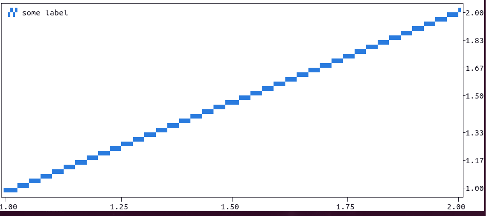 while this, normally outputs:
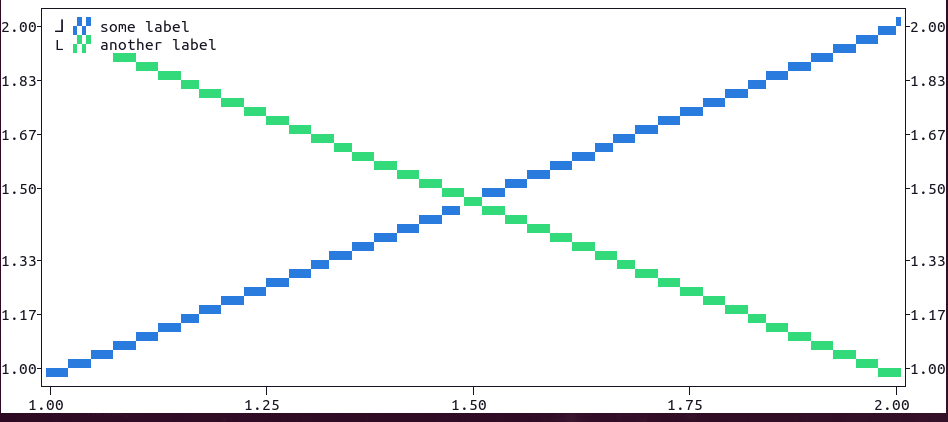
import plotext as plt; plt.clf(); plt.plot([1,2], yside=2, label="some label"); plt.show()outputsThanks for reporting! 😃 Does it help?