question-mark
Stuck on an issue?

Lightrun Answers was designed to reduce the constant googling that comes with debugging 3rd party libraries. It collects links to all the places you might be looking at while hunting down a tough bug.

And, if you’re still stuck at the end, we’re happy to hop on a call to see how we can help out.

How to: Plot Time Series

See original GitHub issue

In my activity-tracker project I have simple a list of timestamps. If there is a timestamp, then there is activity.

I would like to create a plot for one day of recorded activity. It should be a a 1440 pixel graphic (24 hours * 60 minutes / hour) x e.g. 20 pixel. Hence x = h * 24 + m (for any y) just indicates if that time is in my timeseries.

Doing it with PIL:

from datetime import datetime, date
from typing import List

def create_day_plot(timestamps: List[datetime], day: date) -> None:
    print(f"{day.strftime('%Y-%m-%d')} -- {len(timestamps)}")
    from PIL import Image
    img = Image.new(mode="RGB", size=(24*60, 20), color='white')

    pixels = img.load() # create the pixel map

    for timestamp in timestamps:
        if timestamp.strftime("%Y-%m-%d") != day.strftime("%Y-%m-%d"):
            continue
        x = timestamp.hour * 60 + timestamp.minute

        for y in range(img.size[1]):
            pixels[x, y] = (255, 0, 0)

    img.save("plot.png")

# Just a tiny sample:
create_day_plot([datetime(2022, 3, 27, 12, 0, 0), datetime(2022, 3, 27, 12, 1, 0), datetime(2022, 3, 27, 12, 2, 0)], date(2022, 3, 27))

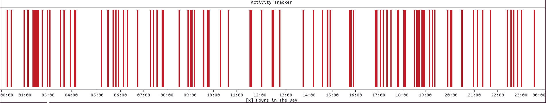
With a bit more relaistic data it looks like this:

foo

Is this possible with plotext? (If the answer is “try to make it work with matplotlib first”, then I’ll ask this on StackOverflow, but maybe there is a way to control the output on pixel-level? 😃 )

Issue Analytics

  • State:closed
  • Created a year ago
  • Reactions:1
  • Comments:7 (4 by maintainers)

github_iconTop GitHub Comments

2reactions
piccolomocommented, Jun 12, 2022

Hi @MartinThoma,

Thanks to your request, I have added the function eventplot(), in the new version 5.1, available only on GitHub for now, using:

pip install git+https://github.com/piccolomo/plotext

The function is described here and you have been credited here.

Any feedback or double test is appreciated 😃.

Thanks and all the best, Savino

2reactions
piccolomocommented, Mar 29, 2022

Hi @MartinThoma,

it occurred to me that you could improve the pixel resolution (double it!) using this other way:

import plotext as plt
from random import randint
from datetime import datetime, timedelta

plt.clf(); 
plt.clt(); # to optionally clean the terminal
plt.datetime.set_datetime_form(date_form="", time_form="%H:%M") # Try also time_form="%H" for clearer x ticks !  

times = [datetime(2022, 3, 27, randint(0, 23), randint(0, 59), randint(0, 59)) for i in range(100)] # A random list of times during the day
times = [plt.datetime.datetime_to_timestamp(el) for el in times] # I will need to fix this; datetime_to_string should have worked.

plt.scatter(times, [1] * len(times), fillx = 1, marker = 'hd', color = 'red')
xticks = [datetime(2022, 3, 27) + timedelta(hours=i) for i in range(25)] 
xticks, xlabels = list(map(plt.datetime.datetime_to_timestamp, xticks)), list(map(plt.datetime.datetime_to_string, xticks))
plt.xticks(xticks, xlabels); plt.yticks();
plt.xlim(xticks[0], xticks[-1]); plt.ylim(0, 1);
plt.frame(0)
plt.xaxis(1, "lower"); plt.xaxis(1, "upper")
plt.xlabel("Hours in The Day")
plt.title("Activity Tracker")
plt.plotsize(None, 20) # Set the height you prefer or comment for maximum size 
plt.show()

with this result: image

Read more comments on GitHub >

github_iconTop Results From Across the Web

5 types of plots that will help you with time series analysis
A time plot is basically a line plot showing the evolution of the time series over time. We can use it as the...
Read more >
Time Series Data Visualization with Python
In this tutorial, you will discover 6 different types of plots that you can use to visualize time series data with Python.
Read more >
Create and use a time series graph—ArcGIS Insights
Time series graphs are created by plotting an aggregated value (either a count or a statistic, such as sum or average) on a...
Read more >
Plotting Time Series Data
The plotting of time series object is most likely one of the steps of the analysis of time-series data. The \code{ is a...
Read more >
Plot timeseries - MATLAB plot - MathWorks
Plot Time Series Object with Specified Start Date ... Create a time series object, set the start date, and then plot the time...
Read more >

github_iconTop Related Medium Post

No results found

github_iconTop Related StackOverflow Question

No results found

github_iconTroubleshoot Live Code

Lightrun enables developers to add logs, metrics and snapshots to live code - no restarts or redeploys required.
Start Free

github_iconTop Related Reddit Thread

No results found

github_iconTop Related Hackernoon Post

No results found

github_iconTop Related Tweet

No results found

github_iconTop Related Dev.to Post

No results found

github_iconTop Related Hashnode Post

No results found