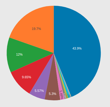
An option to hide 0% text on pie charts
See original GitHub issuePlease look at this example:

Here, the two 0% texts make no sense. It’s getting even worse if there are many options. They just get stacked vertically and take a lot of space and look ugly.
An option to switch off showing zero-percent texts on pie charts would be very hepful.
Please note it’s not the same as toggling pie slices when clicking on legend items, in which a case the opacity of those hidden legend items become 0.5 instead of 1 (default).
Issue Analytics
- State:
- Created 7 years ago
- Reactions:13
- Comments:10 (1 by maintainers)
 Top Results From Across the Web
Excel: How to not display labels in pie chart that are 0%
The easiest is in menu File > Options, Advanced tab, section "Display options for this worksheet", to uncheck the option of "Show a...
Read more >How to hide Zero data label values in pie chart ssrs - TechNet
In order to hide the 0 values, we can right click the pie chart >> Series Properties >> Series Data >> in the...
Read more >How to hide zero data labels in chart in Excel? - ExtendOffice
Tip: If you want to show the zero data labels, please go back to Format Data Labels dialog, and click Number > Custom,...
Read more >Hide category names from pie chart if value is zero - Mr. Excel
I can hide the zero percentages by using custom number format 0,0 %;-0,0 %;"" but it still leaves the category name and the...
Read more >How to hide the 0% label in zingchart pie charts - Stack Overflow
This would display a pie chart where a 60% Label would be displayed over the option B and a 40% label would be...
Read more > Top Related Medium Post
No results found
 Top Related StackOverflow Question
No results found
 Troubleshoot Live Code
Lightrun enables developers to add logs, metrics and snapshots to live code - no restarts or redeploys required.
Start Free Top Related Reddit Thread
No results found
 Top Related Hackernoon Post
No results found
 Top Related Tweet
No results found
 Top Related Dev.to Post
No results found
 Top Related Hashnode Post
No results found

I wonder if that’s still relevant, but I’ve found this while struggled with the same problem, so maybe someone else will find this, too. The solution is actually very simple - all you need is to set {“textposition”} to “inside”.
textposition: 'inside'If you are using React-plotly, then it is<Plot layout={{ textposition: 'inside', }} />The only difference is that now all the values are placed inside pie slices. I had a number (5 or 6) of very small slices, which were behaving as you explained, and now they’re still ugly inside those little slices, but I think this looks less ugly 😃It’s unlikely that the maintainers will implement this in the near future. The main target for plotly.js is scientific plotting and as such, it’s generally preferred to preserve the results of data - a data field with a value of
0is still significant in the eyes of science.A workaround for this however is to either apply custom text labels to your data, setting the values corresponding to
0asnulllike in the code below, or alternatively, you may remove the0data from your initial plot-data before plotting.As always, we are open to pull requests from the community for the feature, but it is not high on our list of priorities at the moment.