
Lightrun Answers was designed to reduce the constant googling that comes with debugging 3rd party libraries. It collects links to all the places you might be looking at while hunting down a tough bug.
And, if you’re still stuck at the end, we’re happy to hop on a call to see how we can help out.
qSelect with use-input UX issues
See original GitHub issueThere are three issues with qSelect when using use-input:
1, pressing backspace on empty input(filter) should clear the model
2. typing in the input doesn’t highlight the first filtered result
3. The input(filter) should be visually separated from the selected value to avoid confusion
Example: https://codepen.io/dandcode/pen/jOENMGx?&editable=true&editors=101
To Reproduce Case 1 (backspace): Open the codepen and click on the select. Press backspace (nothing happens)
Case 2(filtering): Open the codepen, click on the select and type ora in the input. Tab or press Enter (nothing happens). Most users would expect that the first available option is highlighted, because that’s how most of the autocomplete and other select inputs work.
Case 3(UI design): Open the codepen, click on the select and type app. Look at the input (Google app), it looks very confusing.
Expected behavior Case 1: The currently selected value should be cleared Case 2: the first available option should be highlighted Case 3: the input(filter) should be visually separate from the selected option. Best case is to be in the dropdown as every other select plugin and component from other libraries.
Platform (please complete the following information): OS: Win, Mac Node: Any NPM: Any Yarn: Any Browsers: All iOS: N/A Android: N/A Electron: Any
Additional context
I am aware of the clearable prop. The problem with it is that the user has to use the mouse to clear the value. In fact, if clearable is not selected, there is no way the user can clear the value.
I am aware of the hide-selected and fill-input props. The issue with them is that they hide the currently selected value while the user is filtering for a new selection. Also in order to start filtering they user have to first clear the current value. Finally, if the user doesn’t find what they were trying to select it’s confusing to figure out what the original value is. These props doesn’t solve the first (backspace) issue.
I am interested in contributing for resolving this issue, but I am not sure where to start, I read the contribution guide and went through the component code and I have some ideas how to solve this. The next step should be to get someone to look into the issue and determine, if it’s something worth doing.
Issue Analytics
- State:

- Created 4 years ago
- Reactions:2
- Comments:11 (1 by maintainers)
 Top Results From Across the Web
 Top Related Medium Post
 Top Related StackOverflow Question
 Troubleshoot Live Code
 Top Related Reddit Thread
 Top Related Hackernoon Post
 Top Related Tweet
 Top Related Dev.to Post
 Top Related Hashnode Post
@Cmacu if you make your update method
asyncandawait this.$nextTick()beforesetOptionIndexit seems to highlight the menu option: https://codepen.io/gordonblahut/pen/KKwpRPd?editors=1011 (only tested in Firefox).@pdanpdan 1 is expected mainly because of 3. The input is mixed with the selection and makes it look like you can delete the selection by pressing backspace. Not being able to do it is at the same time confusing and frustrating for our users. Providing an empty slot option is a good idea and, if 3 is resolved than this problem would be solved.
Here are a bunch of examples for 2 (note how the first available result is always highlighted):
https://select2.org/getting-started/basic-usage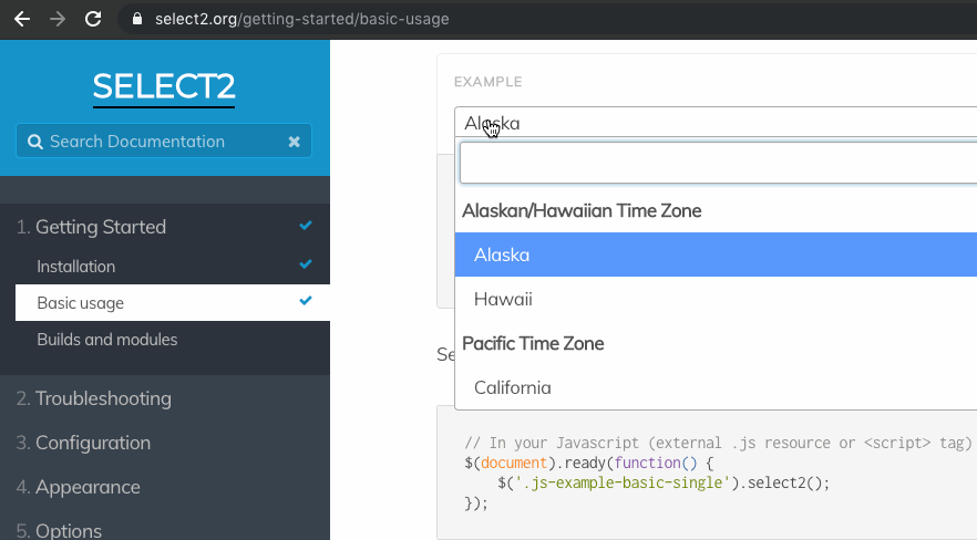
https://vue-select.org/
https://vuetifyjs.com/en/components/autocompletes
I think you would be hard pressed to find example with different behavior. Even
qSelecthighlights the first result before filtering. I would definitely consider this a bug. And, if you want to go down the UX rabbit whole, a nice feature is to have the term (the filter string) styled (underlined) in the list of available options.For 3, I don’t understand why the user would need to click 2 times and this would be unacceptable. None of the examples above required that the user clicks 2 times to start filtering, even if most of them provide an option for separate filter input.