
Lightrun Answers was designed to reduce the constant googling that comes with debugging 3rd party libraries. It collects links to all the places you might be looking at while hunting down a tough bug.
And, if you’re still stuck at the end, we’re happy to hop on a call to see how we can help out.
[FR]: CSS Tweaks to match new Obsidian Theme
See original GitHub issueContact Details
cesarpereira904@gmail.com
Present your request
Hi Rafael,
As always, amazing work with the latest update.
I was making a few tweaks on the plugin using the CSS snippets.
Wanted to share with you the final result in case this could be considered for a future update, or if anyone wants to tweak CSS like me.
For the new Obsidian theme it currently looks like this:
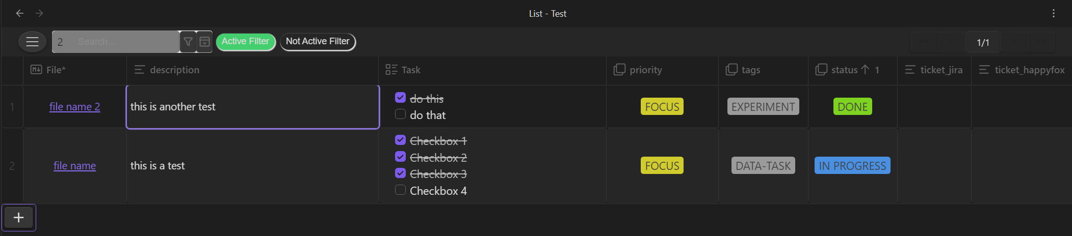
Here is the CSS snippet (please take into consideration I’m not a CSS expert so these might be 100% correct but it seems to work perfectly)
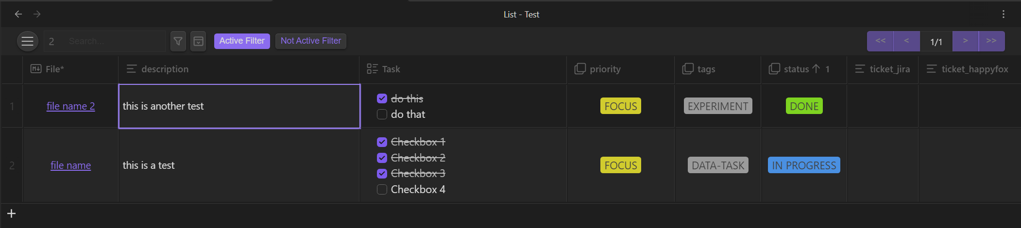
Here the changes
- Menu button
- Search box to match main search box design
- Apply filter and create filter buttons background color removed
- Changed the filter button’s shape and color to match accent colors.
- Hide the scroll bar when there’s not enough length to show all filter buttons (scroll still works)
- Align the check box in the list with the text
- Page navigation with the same color as the selected accent color
- Removed the border of the add row button and made it simpler
`/* highlight border problem under top column */ .database-plugin__table { border-spacing: 2px; }
/* Align checkbox to text */ .database-plugin__table input[type=checkbox] { margin: 0px 6px -2px 0px; }
/* Remove table border radius in input fields */ .data-input { border-radius: 0px !important; }
/* Menu button padding adjust */ .css-13tqcfd { padding:4px !important; }
/* Remove radius because there was a white background color */ .database-plugin__table textarea, input[type=‘text’], input[type=‘search’], input[type=‘email’], input[type=‘password’], input[type=‘number’] { border-radius: 0px; }
/* Give same space between apply filters button and input box to match space between menu button and search bar*/ .css-1rtnrqa { margin:0px 7px 0px 0px !important; }
/* Remove the background color to have same style as rest of the theme*/ .css-11crkov { background-color: transparent !important; }
/* Number of rows text color*/ .css-z7t6pi { color: var(–nav-item-color); }
/* Give more space between filter buttons*/ .css-1xfmoej { margin-right: 7px !important; }
/* Remove add row - padding and border color*/ .css-1nz4p9c { padding: 0px !important; border: 0px solid !important; }
/* Add new row - smaller button same size as row number*/ .css-1nz4p9c .MuiButtonGroup-grouped { min-width: 30px !important; }
/* add new row - smaller font for the “+” */ .css-vubbuv { font-size: 1.35rem !important; }
/* add new row - remove radius */ .css-vx2idv { border-radius: 0px !important; }
/* remove shadow and background color for active and not active button */
.css-1nz4p9c button(.clickable-icon) { background-color: transparent !important; box-shadow: none !important; } .css-1nz4p9c button:not(.clickable-icon) { background-color: transparent !important; box-shadow: none !important; }
/* filter button - active */
.css-a8ylvy { border-radius: 4px !important; box-shadow: 0px 0px 0px 0px !important; background-color: var(–link-color) !important; }
/* filter button - not active */ .css-1scb6rm { border-radius: 4px !important; box-shadow: var(–input-shadow) !important; border-color: var(–link-color) !important; color: var(–link-color) !important; background-color: var(–interactive-normal) !important;
}
/* pagination redo */
.css-kz17yb { border: var(–text-normal)!important; color: var(–text-normal)!important; background-color: var(–text-accent)!important; }
/* filter button - remove shcroll but keep funcinality */ .css-ark3t6::-webkit-scrollbar { display: none; }
`
thank you,
For which platform do you request this request??
Cross
Issue Analytics
- State:

- Created a year ago
- Reactions:2
- Comments:8 (4 by maintainers)
 Top Results From Across the Web
 Top Related Medium Post
 Top Related StackOverflow Question
 Troubleshoot Live Code
 Top Related Reddit Thread
 Top Related Hackernoon Post
 Top Related Tweet
 Top Related Dev.to Post
 Top Related Hashnode Post
Adapted Commit bc0eb083
I have not included all the changes in favor of mobile support, but keep your design
I will generate a new version. We can iterate de design as long as is neccesary =)