ResponsiveReactGridLayout breakpoint resizing doesn't pop back when growing to original size
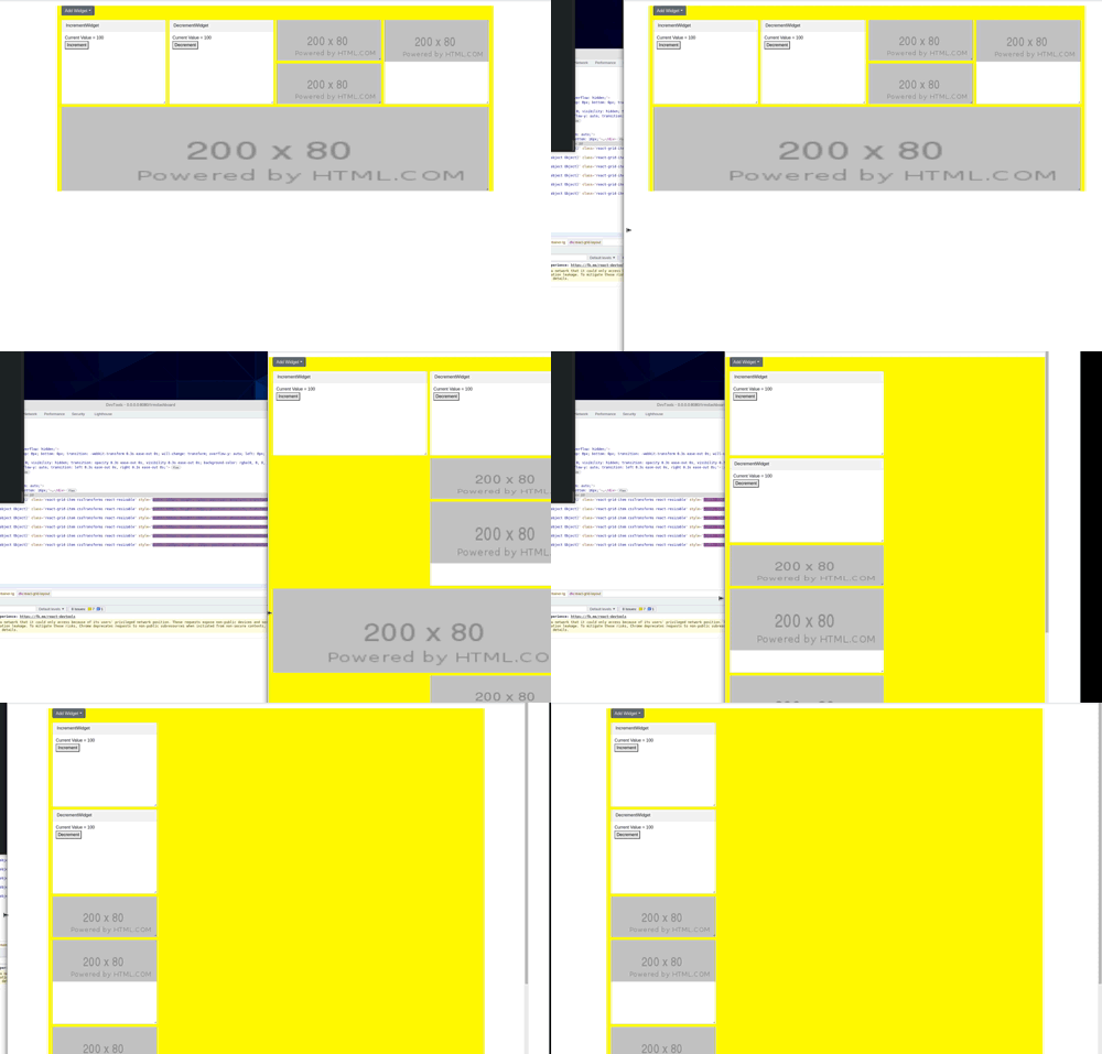
See original GitHub issueHi. When using ResponsiveReactGridLayout it appears as if when I shrink the viewport the breakpoints are enforced and the grid layout pops down accordingly, but when I grow it back through larger breakpoints, I see the items resize but then shrink down again. This could be some misuse of the breakpoint sizes in relation to the item sizes. I’m not sure. Any guidance would be awesome.
I was using RGL 1.0.0 but I updated to 1.3.3 just now and the problem still persists.
Here’s a captured video of the problem

Here’s some bits from my code, hopefully its enough to spot if this is a bug or a user error:
const widgets = [
  {
    id: 'IncrementWidget',
    layout: { i: 'IncrementWidget', x: 0, y: 0, w: 1, h: 2, isDraggable: false },
  },
  {
    id: 'DecrementWidget',
    layout: { i: 'DecrementWidget', x: 1, y: 0, w: 1, h: 2, isDraggable: false },
  },
  {
    id: 'ImageWidget',
    layout: { i: 'ImageWidget', x: 2, y: 0, w: 1, h: 1, isDraggable: false },
  },
  {
    id: 'ImageWidget',
    layout: { i: 'ImageWidget', x: 2, y: 1, w: 1, h: 1, isDraggable: false },
  },
  {
    id: 'ImageWidget',
    layout: { i: 'ImageWidget', x: 3, y: 0, w: 1, h: 2, isDraggable: false },
  },
  {
    id: 'ImageWidget',
    layout: { i: 'ImageWidget', x: 0, y: 1, w: 4, h: 2, isDraggable: false },
  },
];

...

        <ResponsiveReactGridLayout
            autoSize
            cols={4} // 3 chunky cols
            breakpoints={{lg: 1200, md: 996, sm: 768}}
            cols={{lg: 4, md: 2, sm: 1}}
            preventCollision
            useCSSTransforms
            isDroppable
            compactType={null}
            rowHeight={150}
            onDrop={onDrop}
            onDragStop={onLayoutChange}
            onResizeStop={onLayoutChange}
        >
          {widgets.map((x, idx) => (
            <DashboardWidget key={'widget_'+idx} widget={x} data-grid={x.layout} />
          ))}
        </ResponsiveReactGridLayout>
Any tips would be great. Thanks for making this awesome project available.
Issue Analytics
- State:
- Created 2 years ago
- Reactions:2
- Comments:11
 Top Results From Across the Web
Does not always load correct width on refresh #1338 - GitHub
It will resize correctly when I adjust the window after mount. How can I make sure it gets the initial size right? The...
Read more >React grid layout custom resize handle is not working
Note: If I remove resizeHandle={<BottomRightHandle />} grid items will get default resize handler, Which is working fine. CustomResizeHandle.js
Read more >react-grid-layout-with-better-breakpoints - npm
A draggable and resizable grid layout with responsive breakpoints, for React with added optional param for getting width from viewport ...
Read more >React Grid: A Grid Layout System Like Packery Or Gridster, for ...
Calls back with (currentLayout) after every drag or resize stop. ... your mins and maxes overlap incorrectly, or your initial dimensions are out...
Read more >react-grid-layout | Yarn - Package Manager
A draggable and resizable grid layout with responsive breakpoints, for React. ... RGL is React-only and does not require jQuery. BitMEX UI.
Read more > Top Related Medium Post
No results found
 Top Related StackOverflow Question
No results found
 Troubleshoot Live Code
Lightrun enables developers to add logs, metrics and snapshots to live code - no restarts or redeploys required.
Start Free Top Related Reddit Thread
No results found
 Top Related Hackernoon Post
No results found
 Top Related Tweet
No results found
 Top Related Dev.to Post
No results found
 Top Related Hashnode Post
No results found

FYI I’ve solved this by providing a
onLayoutChangecallback and passing thelayoutsprop:This is essentially what the Responsive With Local Storage example does, but without persisting the layout data to local storage.
@duhmojo Hi, working on this same issue myself. Debugging it, shows it’s definitely a bug within the library itself. The code looks like it’s attempting to cache the different layouts at the different breakpoints but then somehow it seems like it’s disposing of the cache as you switch between breaks or something like that. In fact, in onLayoutChange the value listed as “all layouts” only ever returns the current and previous. But, heres my workaround. I’m only storing the lg and medium layouts when they are updated because I have both of those set to 12 columns so in my case I dont care when the widgets are changed at smaller widths because I’m just going to re-lay them out but if you need those smaller ones you may need a little extra storage logic.
since onLayoutChanged is also called when the screen resizes and since it’s “allLayouts” prop isnt complete anyway, I’ll use the onDragStop and onResize directly.
Storing the breakpoint and using it as the key, then, forces the Grid to relay out using the provided layouts whether it really thinks it should or not ensure it goes ahead and re-lays itself out.
then, in the component return