
Lightrun Answers was designed to reduce the constant googling that comes with debugging 3rd party libraries. It collects links to all the places you might be looking at while hunting down a tough bug.
And, if you’re still stuck at the end, we’re happy to hop on a call to see how we can help out.
Add option to display confusion matrix with fixed range colormap
See original GitHub issueEnhancement
Description
When using ConfusionMatrixDisplay or plot_confusion_matrix to compare the performance of different classifiers or experiments, it might be useful to have a consistently scaled colormap to compare the plots, in the case where the confusion matrix is normalised.
Currently the colormap scales the entries of the matrix to [0, 1] before applying the colormap, so that the largest and smallest values always have the colors at the boundary of the colormap. This means that a classifier with ‘bad’ performance may appear to have similar performance to a ‘good’ classifier based on the colours (see below).
An optional argument could be added to ConfusionMatrixDisplay.plot() and plot_confusion_matrix() that fixed the colorbar and colormap to the range [0, 1] in the cases where the confusion matrix is normalised.
Steps/Code to Reproduce
Example code to produce the first two plots:
import numpy as np
from matplotlib import pyplot as plt
from matplotlib.colors import Normalize
from sklearn.metrics import ConfusionMatrixDisplay

good_cm = np.array([[0.9, 0.1], [0.15, 0.85]])
bad_cm = np.array([[0.56, 0.44], [0.45, 0.55]])

disp = ConfusionMatrixDisplay(good_cm, ['0', '1'])
disp.plot()

disp = ConfusionMatrixDisplay(bad_cm, ['0', '1'])
disp.plot()
The colormap can be fixed to the range [0, 1] by passing the norm=Normalize(0, 1)) argument to imshow or matshow.
Actual Results
The following is the current output using sklearn.metrics.ConfusionMatrixDisplay.plot():
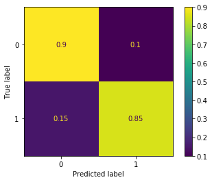

Even though the second confusion matrix has different values, the colormap shows it as being similar to the first one. We can also see the colorbars have different limits.
Proposed Change
The following is what would appear with a colormap fixed to the range [0, 1]:
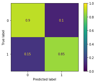

In this case the second confusion matrix is clearly different from the first from looking at the colours alone.
Versions
python: 3.8.1 sklearn: 0.22 matplotlib: 3.1.2
Issue Analytics
- State:

- Created 4 years ago
- Reactions:13
- Comments:11 (7 by maintainers)
 Top Related StackOverflow Question
 Troubleshoot Live Code
 Top Related Reddit Thread
 Top Related Hackernoon Post
 Top Related Tweet
 Top Related Dev.to Post
 Top Related Hashnode Post
Do we want to add the parameter or rely on people to use matplotlib for these fine-tunings?
What I mean is that you can get the expected results by:
I am just worried about starting adding a keyword after another to finish with an infinite list which will not be really user-friendly as well (or as demanding as using matplotlib).
I just want to mention something that wasn’t discussed - the text color. Using the workarounds mentioned here, e.g.
disp.im_.set_clim(...), you can get the shading to change, but the text colour stays the same. So squares that become quite dark based on the clim change may still have unchanged dark text, leading to bad contrast. I think this can only be remedied by having vmax as a direct parameter? Or does someone have a workaround for that too?