
Lightrun Answers was designed to reduce the constant googling that comes with debugging 3rd party libraries. It collects links to all the places you might be looking at while hunting down a tough bug.
And, if you’re still stuck at the end, we’re happy to hop on a call to see how we can help out.
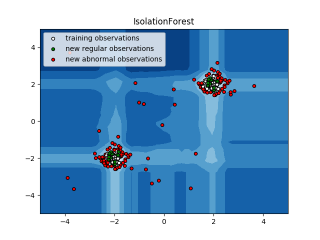
Misleading plot example for Isolation Forest method
See original GitHub issueDescribe the issue linked to the documentation
I have observed that the plotted feature receive the color of the expected label, i.e., train, test, and outlier. https://github.com/scikit-learn/scikit-learn/blob/778b11904e8ec0286e977582d37e7ca495947ee5/examples/ensemble/plot_isolation_forest.py#L57-L62
Instead, I would expect to plot the predicted labels, i.e., the color of the plotted features according to the prediction of the method. In the published example, the variables defined below are not used for the plot. https://github.com/scikit-learn/scikit-learn/blob/778b11904e8ec0286e977582d37e7ca495947ee5/examples/ensemble/plot_isolation_forest.py#L45-L47
Suggest a potential alternative/fix
The expected plot would be something like this:
b1 = plt.scatter(X_train[:, 0], X_train[:, 1], c=['white' if x > 0 else 'red' for x in y_pred_train],
                 s=20, edgecolor='k')
b2 = plt.scatter(X_test[:, 0], X_test[:, 1], c=['green' if x > 0 else 'red' for x in y_pred_test],
                 s=20, edgecolor='k')
c = plt.scatter(X_outliers[:, 0], X_outliers[:, 1], c=['yellow' if x > 0 else 'red' for x in y_pred_outliers],
                s=20, edgecolor='k')
And the result in this case would vary:
Link to the online example: https://scikit-learn.org/stable/auto_examples/ensemble/plot_isolation_forest.html
Issue Analytics
- State:

- Created 4 years ago
- Comments:5 (4 by maintainers)
 Top Related StackOverflow Question
 Troubleshoot Live Code
 Top Related Reddit Thread
 Top Related Hackernoon Post
 Top Related Tweet
 Top Related Dev.to Post
 Top Related Hashnode Post
I agree with you guys, to plot a discrete decision boundary would be nice!
Related to #22406.