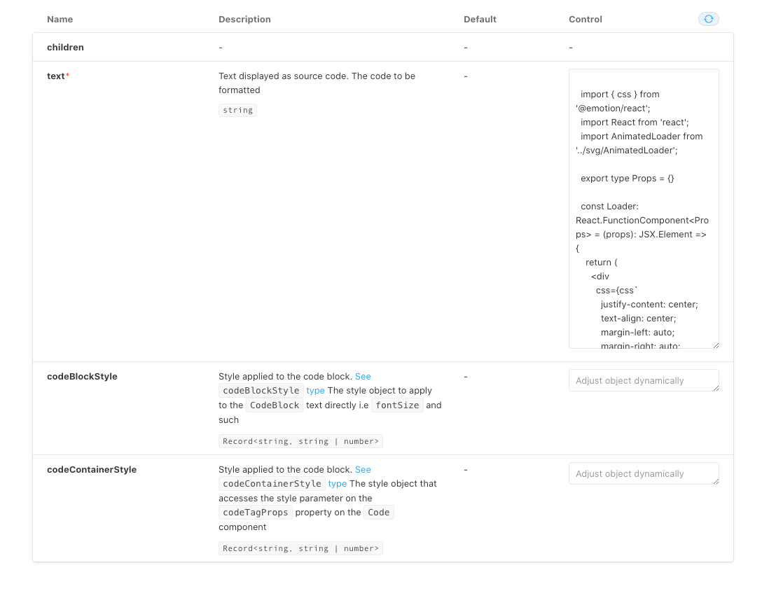
How to add docs for TypeScript extended types?
See original GitHub issueI use the following type:
export type Props = {
  /**
   * Style applied to the code block. [See `codeBlockStyle` type](https://github.com/rajinwonderland/react-code-blocks/blob/31e391b30a1f2835aaad4275f542329239761182/packages/react-code-blocks/src/components/CodeBlock.tsx#L19)
   */
  codeBlockStyle?: CSSStyles;

  /**
   * Style applied to the code block. [See `codeContainerStyle` type](https://github.com/rajinwonderland/react-code-blocks/blob/31e391b30a1f2835aaad4275f542329239761182/packages/react-code-blocks/src/components/CodeBlock.tsx#L19)
   */
  codeContainerStyle?: CSSStyles;

  /**
   * Text displayed as source code.
   */
  text: string;
} & Partial<CodeBlockProps>;
The extended type is
import React, { PureComponent } from 'react';
import { applyTheme } from '../utils/themeBuilder';
import { Theme } from '../types';
import Code from './Code';

export interface CodeBlockProps {
  /** The code to be formatted */
  text: string;
  /** The language in which the code is written. [See LANGUAGES.md](https://github.com/rajinwonderland/react-code-blocks/blob/master/LANGUAGES.md) */
  language: string;
  /** Indicates whether or not to show line numbers */
  showLineNumbers?: boolean;
  /** A custom theme to be applied, implements the `CodeBlockTheme` interface. You can also pass pass a precomposed theme into here. For available themes. [See THEMES.md](https://github.com/rajinwonderland/react-code-blocks/blob/master/THEMES.md) */
  theme?: Theme;
  /** The element or custom react component to use in place of the default `span` tag */
  lineNumberContainerStyle?: {};
  /** The style object to apply to the `CodeBlock` text directly i.e `fontSize` and such */

  codeBlockStyle?: {};
  /** The style object that accesses the style parameter on the `codeTagProps` property on the `Code` component */
  codeContainerStyle?: {};

  /** The style object that will be combined with the top level style on the pre tag, styles here will overwrite earlier styles. */
  customStyle?: {};

  /**
   * Lines to highlight comma delimited.
   * Example uses:

   * - To highlight one line `highlight="3"`
   * - To highlight a group of lines `highlight="1-5"`
   * - To highlight multiple groups `highlight="1-5,7,10,15-20"`
   */
  highlight?: string;
}

const LANGUAGE_FALLBACK = 'text';

export default class CodeBlock extends PureComponent<CodeBlockProps, {}> {
  _isMounted = false;

  static displayName = 'CodeBlock';

  static defaultProps = {
    showLineNumbers: true,
    language: LANGUAGE_FALLBACK,
    theme: {},
    highlight: '',
    lineNumberContainerStyle: {},
    customStyle: {},
    codeBlockStyle: {},
  };

  componentDidMount() {
    this._isMounted = true;
  }
  componentWillUnmount() {
    this._isMounted = false;
  }
  handleCopy = (event: any) => {
    /**
     * We don't want to copy the markup after highlighting, but rather the preformatted text in the selection
     */
    const data = event.nativeEvent.clipboardData;
    if (data) {
      event.preventDefault();
      const selection = window.getSelection();
      if (selection === null) {
        return;
      }
      const selectedText = selection.toString();
      const document = `<!doctype html><html><head></head><body><pre>${selectedText}</pre></body></html>`;
      data.clearData();
      data.setData('text/html', document);
      data.setData('text/plain', selectedText);
    }
  };

  render() {
    const {
      lineNumberContainerStyle,
      codeBlockStyle,
      codeContainerStyle,
    } = applyTheme(this.props.theme);

    const props = {
      language: this.props.language || LANGUAGE_FALLBACK,
      codeStyle: {
        ...codeBlockStyle,
        ...this.props?.codeBlockStyle,
      },
      customStyle: this.props?.customStyle,
      showLineNumbers: this.props.showLineNumbers,
      codeTagProps: {
        style: {
          ...codeContainerStyle,
          ...this.props?.codeContainerStyle,
        },
      },
      lineNumberContainerStyle: {
        ...lineNumberContainerStyle,
        ...this.props?.lineNumberContainerStyle,
      },
      text: this.props.text.toString(),
      highlight: this.props.highlight,
    };

    return <Code {...props} />;
  }
}
But Storybook renders only the props defined in Props, not those in CodeBlockProps.

Is it the expected behaviour? I’m still new to storybook, I had seen something about TS types extending somewhere but can’t find it again.
Issue Analytics
- State:
- Created 3 years ago
- Reactions:4
- Comments:10 (1 by maintainers)
 Top Results From Across the Web
Documentation - Advanced Types - TypeScript
This page lists some of the more advanced ways in which you can model types, it works in tandem with the Utility Types...
Read more >JSDoc Reference - TypeScript: Documentation
Documentation tags work in both TypeScript and JavaScript. ... This lets you cast types to other types by adding a @type tag before...
Read more >Documentation - Type Compatibility - TypeScript
So far, we've used “compatible”, which is not a term defined in the language spec. In TypeScript, there are two kinds of compatibility:...
Read more >Handbook - Interfaces - TypeScript
In TypeScript, interfaces fill the role of naming these types, ... This means that when you create an interface that extends a class...
Read more >Documentation - Utility Types - TypeScript
Types which are globally included in TypeScript. ... type T3 = ReturnType << T extends U , U extends number[]>() => T >;....
Read more > Top Related Medium Post
No results found
 Top Related StackOverflow Question
No results found
 Troubleshoot Live Code
Lightrun enables developers to add logs, metrics and snapshots to live code - no restarts or redeploys required.
Start Free Top Related Reddit Thread
No results found
 Top Related Hackernoon Post
No results found
 Top Related Tweet
No results found
 Top Related Dev.to Post
No results found
 Top Related Hashnode Post
No results found

Here is what we can do with TypeScript: Build our own interface without the need to redefine known props.
Example
My component: Autocomplete Library component: MultiInput (extends
HTMLAttributes<HTMLElement>which is huge in regards to props)The Magis TS helper function
Result
The docs now only show the following props:
Conclusion
@texttechne There’s an open issue for that here. I’ve been meaning to fix it for months but other things have taken priority. https://github.com/storybookjs/storybook/issues/7943