
Stuck on an issue?
Lightrun Answers was designed to reduce the constant googling that comes with debugging 3rd party libraries. It collects links to all the places you might be looking at while hunting down a tough bug.
And, if you’re still stuck at the end, we’re happy to hop on a call to see how we can help out.
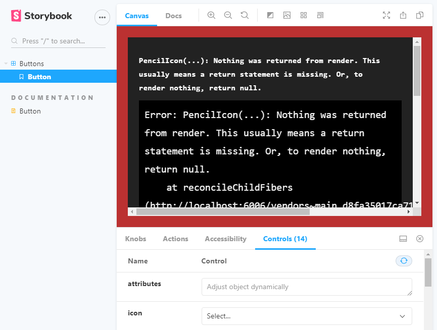
I can't pass icons to controls (type: select) as React Component
See original GitHub issueDescribe the bug I want to pass React Components with the controls via the select control type. But it doesn’t render. The error I get is:
PencilIcon(…): Nothing was returned from render. This usually means a return statement is missing. Or, to render nothing, return null.
Expected behavior I want to see the icons when I select the belonging icon on the control
Screenshots
Code snippets
button.stories.js
import React from "react";
import { Button } from "../src/";
import {
    PencilIcon,
    TrashcanIcon,
    DownloadIcon,
    ArrowIcon,
} from "../../icons/src";

export default {
    title: "Buttons",
    component: Button,
};

export const button = (args) => {
    return <Button {...args} />;
};

button.argTypes = {
    text: {
        name: "text",
        type: { name: "string", required: true },
        defaultValue: "Button",
        description:
            "You can either pass children or text as a string, not both.",
        control: "text",
    },
    children: {
        description:
            "You can either pass children or text as a string, not both",
    },
    icon: {
        control: {
            type: "select",
            options: {
                PencilIcon: PencilIcon,
                TrashcanIcon: TrashcanIcon,
                DownloadIcon: DownloadIcon,
                ArrowIcon: ArrowIcon,
            },
        },
    },
};
button.js
import React from "react";
import { string, node, bool, func, oneOf, object } from "prop-types";

import classNames from "classnames";

function Button({
    attributes = {},
    children,
    icon = null,
    className = null,
    id = null,
    isDisabled = false,
    isLink = false,
    href = null,
    name = null,
    onClick,
    target = null,
    text = null,
    type = "button",
    variant = "primary",
    size = null,
}) {
    console.log(typeof icon);
    const buttonSize = size ? `Trinity-Button--${size}` : null;

    const classes = classNames(
        "Trinity-Button",
        `Trinity-Button--${variant}`,
        buttonSize,
        { "Trinity-Button--is-disabled": isDisabled },
        className
    );

    const Icon = icon;

    const buttonIcon = () =>
        icon && (
            <span className="Trinity-Button__icon">
                <Icon
                    width={size !== "small" ? "24" : "16"}
                    height={size !== "small" ? "24" : "16"}
                />
            </span>
        );

    if (isLink)
        return (
            <a
                aria-disabled={isDisabled}
                className={classes}
                disabled={isDisabled}
                href={href}
                id={id}
                tabIndex={0}
                target={target}
            >
                {buttonIcon()}
                {text || children}
            </a>
        );

    if (isLink)
        return (
            <a
                aria-disabled={isDisabled}
                className={classes}
                disabled={isDisabled}
                href={href}
                id={id}
                tabIndex={0}
                target={target}
            >
                {icon && (
                    <span className="Trinity-Button__icon">{buttonIcon}</span>
                )}
                {text || children}
            </a>
        );

    return (
        <button
            type={type}
            name={name}
            id={id}
            disabled={isDisabled}
            aria-disabled={isDisabled}
            className={classes}
            tabIndex={0}
            onClick={onClick}
            {...attributes}
        >
            {buttonIcon()}
            {text || children}
        </button>
    );
}

Button.propTypes = {
    attributes: object,
    children: node,
    className: string,
    href: (props, propName) =>
        props.isLink
            ? new Error(`${propName} is required if Button is used as a href`)
            : null,
    icon: func,
    id: string,
    isDisabled: bool,
    isLink: bool,
    name: string,
    onClick: func.isRequired,
    size: oneOf(["small"]),
    target: string,
    text: (props, propName) => {
        if (!props.children && !props.text) {
            return new Error(`${propName} is required if not passing children`);
        }
        if (props.children && props.text) {
            return new Error(
                `${propName} can not be combined with children, either specify ${propName} or pass children, but not both`
            );
        }
        return null;
    },
    type: oneOf(["button", "submit", "reset"]),
    variant: oneOf(["primary", "secondary"]),
};

export default Button;
Issue Analytics
- State:

- Created 3 years ago
- Comments:13 (6 by maintainers)
 Top Results From Across the Web
Controls - Storybook - JS.ORG
Auto-generate controls based on React/Vue/Angular/etc. components. Portable. Reuse your interactive stories in documentation, tests, and even in designs. Rich.
Read more >React component as prop: the right way™️
First: icon as React Element. We just need to pass an element to the icon prop of the button and then render that...
Read more >Components - React Select
The following components are customisable and switchable: ClearIndicator; Control; DropdownIndicator; DownChevron; CrossIcon; Group; GroupHeading ...
Read more >change color arrow icon react-select - Stack Overflow
Just use customStyles and declare a new colour for dropdownIndicator element: const customStyles = { dropdownIndicator: base => ({ ...base, ...
Read more >Next-level component showcasing with Storybook controls
Learn about controls, a new Storybook addon that lets you dynamically interact with your React components for demo and testing purposes.
Read more > Top Related Medium Post
No results found
 Top Related StackOverflow Question
No results found
 Troubleshoot Live Code
Lightrun enables developers to add logs, metrics and snapshots to live code - no restarts or redeploys required.
Start Free Top Related Reddit Thread
No results found
 Top Related Hackernoon Post
No results found
 Top Related Tweet
No results found
 Top Related Dev.to Post
No results found
 Top Related Hashnode Post
No results found
Currently args must be JSON serializable (ish), but you can workaround as follows:
Then in your story you can do whatever you want with it:
More info: https://storybook.js.org/docs/react/essentials/controls#fully-custom-args
From my understanding of what it going on, it seems like the argTypes are getting serialized by
telejsonwhen sent to the controls, which is losing parts of the React object during that serialization/deserialization. I have noticed this with various other object types in Angular as well.If I am correctly understanding what is going on, these questions may help direct this issue at the problem that needs solving.
telejsonsupports classes and functions, there are things that can’t be serialized, but is there a way that it could predict when a serialization will not be able to deserialize correctly?After looking into what is happening, it seemed obvious why it would fail, but I don’t see a clear solution. If telejson can recognize properties that will not revive correctly, then maybe those could be mapped to a reference and back to the object instance when returning from controls to the story. Deciding what unserializable props are actually an error, since their whole value is need by the control, could be difficult to determine though. I implemented a custom control that could toggle features of a FormControl in Angular, but the FormControl instance couldn’t survive the serialization, so I had to use of sort of hacky solution to make sure the changes were reflected on the FormControl instance in the story’s iframe. That was just to see if I could make controls work for a component input like that, but I don’t know if it is a valid feature that it should support.
@inginging If you just want a workaround, you can keep the React components from being serialized by using a reference in the control. It doesn’t look as good, but should at least work. Example:
I was helping someone with this same problem on Discord the other day, which had also been asked in a closed issue, https://github.com/storybookjs/storybook/issues/10954#issuecomment-681975347. That issue has a solution that says it was fixed, but from what I can tell it wasn’t fixed. It’s solution didn’t throw an error, but also didn’t look fixed, because it doesn’t look like it is even trying to use the selected value in the solution.