
Lightrun Answers was designed to reduce the constant googling that comes with debugging 3rd party libraries. It collects links to all the places you might be looking at while hunting down a tough bug.
And, if you’re still stuck at the end, we’re happy to hop on a call to see how we can help out.
UI: Option to collapse single-story components
See original GitHub issueHi,
currently I migrate to Storybook 5.2 and update all stories to the new CSF. I recognised that it isn’t possible to reuse a story title for grouping simple stories as you could before with storiesOf.
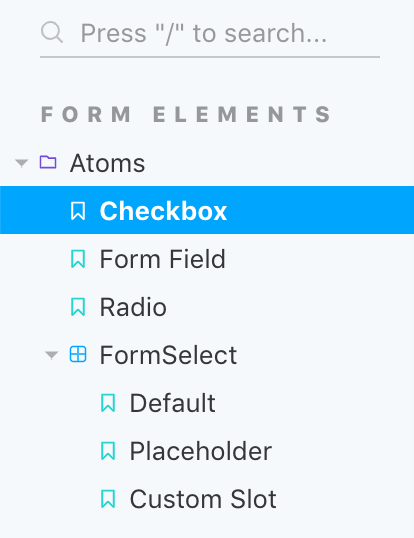
For example: If you have a group atoms and some simple components belonging to that group, e.g. a checkbox and a radio button with one story for each component, you must specify a unique name as a title since the stories are located in different source files. This leads to unnecessary and ugly folder structures with only one entry inside:

Instead what I would like to have is this:
This behaviour currently can only be achieved with some index.stories.js file with transient exports of all stories from the sub-stories and one default export:
export default {
  title: "Form Elements|Atoms"
};

export * from "./Checkbox.stories";
export * from "./FormField.stories";
export * from "./Radio.stories";
While FormSelect has multiple stories exported and therefore a default export like
export default {
  title: "Form Elements|Atoms/FormSelect"
}

export const defaultStory = ...
export const placeholder = ...
export const customSlot = ...
My suggestion would be to create folders in the component tree only, if there are multiple stories exported. Otherwise the title from the default export should be used as the story title:
export default {
  title: "Form Elements|Atoms/CheckBox"
}

export const onlyOneStory = ...
Here the visible story would have the name CheckBox instead of Only One Story. If we add another story to the file, the UI creates the folder CheckBox containing both stories. The benefit would be that you still can group stories from different simple components and keep the requirement to have a unique title in a default export in each story-file.
Best regards, Chris
Issue Analytics
- State:

- Created 4 years ago
- Reactions:18
- Comments:9 (6 by maintainers)
 Top Results From Across the Web
 Top Related Medium Post
 Top Related StackOverflow Question
 Troubleshoot Live Code
 Top Related Reddit Thread
 Top Related Hackernoon Post
 Top Related Tweet
 Top Related Dev.to Post
 Top Related Hashnode Post
I discussed this with @shilman today. We’re inclined to implement the following:
We think this should be the built-in behavior, without any opt-in/opt-out configuration.
This behavior is similar to docs-only mode, except that docs-only hides the stories and applies to all components. It also changes the icon. Naturally the above therefore does not apply to docs-only mode because the two behaviors are incompatible.
The feature from https://github.com/storybookjs/storybook/pull/8133 can provide a possible solution, but you end up with all your stories having the same title
export const myComponent => () => <MyComponent />
from the maintainability perspective seems not great to repeat the title in every story