
Stuck on an issue?
Lightrun Answers was designed to reduce the constant googling that comes with debugging 3rd party libraries. It collects links to all the places you might be looking at while hunting down a tough bug.
And, if you’re still stuck at the end, we’re happy to hop on a call to see how we can help out.
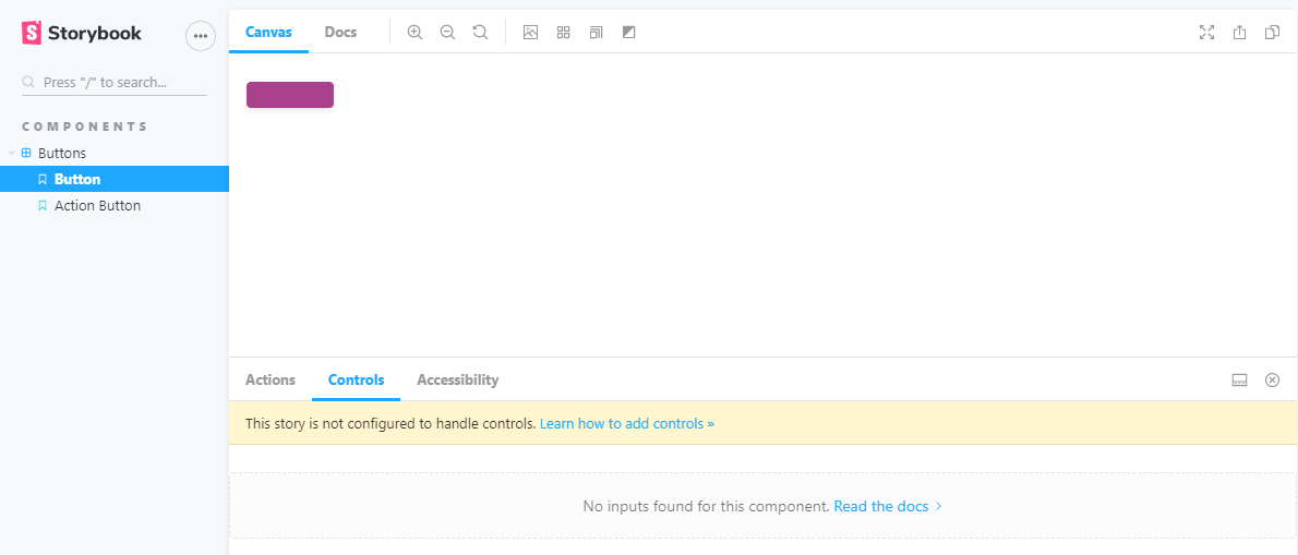
When splitting component's stories in multiple files, control args are not autogenerated
See original GitHub issueDescribe the bug When splitting the component’s stories based on: https://github.com/storybookjs/storybook/blob/next/MIGRATION.md#deprecated-support-for-duplicate-kinds The args are not auto generated in the controls
Expected behavior I would expect that the controls in the splitted stories are autogenerated
Screenshots
Code snippets
Button.stories.js
import React from "react";
import { Button } from "../src/";
import mdx from "../docs/Button.mdx";
import {
    PencilIcon,
    TrashcanIcon,
    DownloadIcon,
    ArrowIcon,
} from "../../icons/src";

const iconMap = { PencilIcon, TrashcanIcon, DownloadIcon, ArrowIcon };

export const button = (args) => {
    const icon = iconMap[args.icon];
    const argsWithIcon = { ...args, icon };
    return <Button {...argsWithIcon} />;
};

button.parameters = {
    docs: {
        page: mdx,
    },
};
Button.js
import React from "react";
import { string, node, bool, func, oneOf, object } from "prop-types";

import classNames from "classnames";

const Button = ({
    attributes = {},
    children,
    className = null,
    href = null,
    icon = null,
    id = null,
    isDisabled = false,
    isLink = false,
    name = null,
    onClick,
    size = null,
    target = null,
    text = null,
    type = "button",
    variant = "primary",
}) => {
    const buttonSize = size ? `Trinity-Button--${size}` : null;

    const classes = classNames(
        "Trinity-Button",
        `Trinity-Button--${variant}`,
        buttonSize,
        { "Trinity-Button--is-disabled": isDisabled },
        className
    );

    const Icon = icon;

    const buttonIcon = () =>
        icon && (
            <span className="Trinity-Button__icon">
                <Icon
                    width={size !== "small" ? "24" : "16"}
                    height={size !== "small" ? "24" : "16"}
                />
            </span>
        );

    if (isLink)
        return (
            <a
                aria-disabled={isDisabled}
                className={classes}
                disabled={isDisabled}
                href={href}
                id={id}
                tabIndex={0}
                target={target}
            >
                {buttonIcon()}
                {text || children}
            </a>
        );

    if (isLink)
        return (
            <a
                aria-disabled={isDisabled}
                className={classes}
                disabled={isDisabled}
                href={href}
                id={id}
                tabIndex={0}
                target={target}
            >
                {icon && (
                    <span className="Trinity-Button__icon">{buttonIcon}</span>
                )}
                {text || children}
            </a>
        );

    return (
        <button
            type={type}
            name={name}
            id={id}
            disabled={isDisabled}
            aria-disabled={isDisabled}
            className={classes}
            tabIndex={0}
            onClick={onClick}
            {...attributes}
        >
            {buttonIcon()}
            {text || children}
        </button>
    );
};

Button.propTypes = {
    attributes: object,
    children: node,
    className: string,
    href: (props, propName) =>
        props.isLink
            ? new Error(`${propName} is required if Button is used as a href`)
            : null,
    icon: func,
    id: string,
    isDisabled: bool,
    isLink: bool,
    name: string,
    onClick: func.isRequired,
    size: oneOf(["small"]),
    target: string,
    text: (props, propName) => {
        if (!props.children && !props.text) {
            return new Error(`${propName} is required if not passing children`);
        }
        if (props.children && props.text) {
            return new Error(
                `${propName} can not be combined with children, either specify ${propName} or pass children, but not both`
            );
        }
        return null;
    },
    type: oneOf(["button", "submit", "reset"]),
    variant: oneOf(["primary", "secondary"]),
};

export default Button;
ActionButton.stories.js
import React from "react";
import { ActionButton } from "../src/";
import mdx from "../docs/ActionButton.mdx";

import {
    InfoCircleIcon,
    PdfIcon,
    PlusCircleIcon,
    TrashcanIcon,
} from "../../icons/src/index";

const iconMap = { InfoCircleIcon, PdfIcon, PlusCircleIcon, TrashcanIcon };

export const actionButton = (args) => {
    const icon = iconMap[args.icon];
    const argsWithIcon = { ...args, icon };
    return <ActionButton {...argsWithIcon} />;
};

actionButton.parameters = {
    docs: {
        page: mdx,
    },
};
index.stories.js
export default { title: "components/Buttons" };

export * from "./Button.stories";
export * from "./ActionButton.stories";
Issue Analytics
- State:

- Created 3 years ago
- Reactions:1
- Comments:7 (4 by maintainers)
 Top Results From Across the Web
Stories for multiple components - Storybook - JS.ORG
There is no args reuse possible, which makes the stories harder to maintain. Let's talk about some techniques you can use to mitigate...
Read more >Automated stories with Storybook and StencilJS
Get insights into StencilJS & learn how to save time to create all your stories in an automatic way.
Read more >Configuration - Sphinx documentation
This file (containing Python code) is called the “build configuration file” and contains (almost) all configuration needed to customize Sphinx input and output ......
Read more >Sqoop Import- Importing Data From RDBMS to HDFS - DataFlair
Here, we will learn how to Sqoop import multiple tables from RDBMS database to Hadoop HDFS. ... Table 3. Sqoop Import – Import...
Read more >How can hide storybook control per story arg - Stack Overflow
You can disable controls for individual properties of a story including the prop table documentation, or you can disable only the control and...
Read more > Top Related Medium Post
No results found
 Top Related StackOverflow Question
No results found
 Troubleshoot Live Code
Lightrun enables developers to add logs, metrics and snapshots to live code - no restarts or redeploys required.
Start Free Top Related Reddit Thread
No results found
 Top Related Hackernoon Post
No results found
 Top Related Tweet
No results found
 Top Related Dev.to Post
No results found
 Top Related Hashnode Post
No results found
@kubijo we might make the navigation more configurable in the future https://github.com/storybookjs/storybook/issues/8255
cc @ghengeveld
I’m hitting this as well and the reasoning is the same as @inginging described. Were we able to assign the “component” parameter to the named export, it would solve this.