
Stuck on an issue?
Lightrun Answers was designed to reduce the constant googling that comes with debugging 3rd party libraries. It collects links to all the places you might be looking at while hunting down a tough bug.
And, if you’re still stuck at the end, we’re happy to hop on a call to see how we can help out.
Allow a better visualisation of the axis labels instead of the raw value
See original GitHub issueI’m submitting a … (check one with “x”)
- bug report - search github for a similar issue or PR before submitting
- feature request
- support request - use StackOverflow (add the
ngx-chartstag) or the gitter chat for support questions
Current behavior
Expected behavior
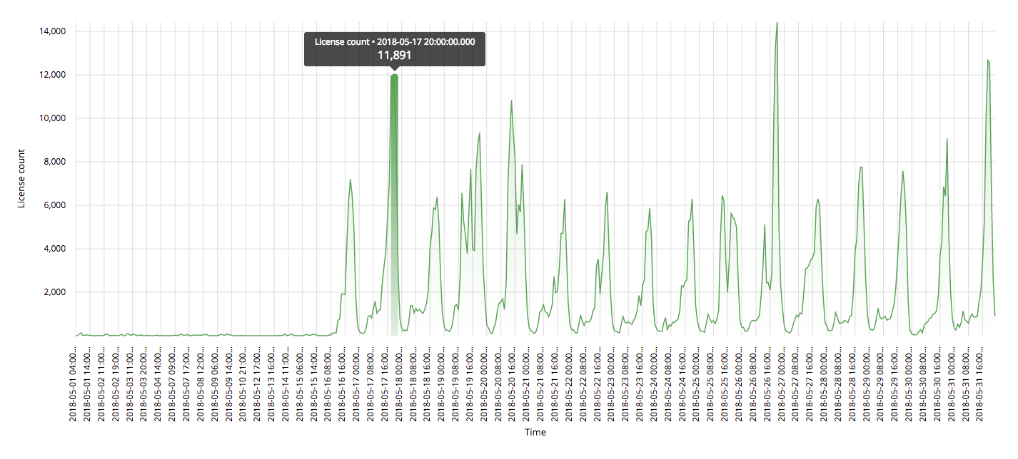
It would be nice to have a way to customise the way we show labels. For example in my line chart I have labels like 2018-05-01 04:00:00.000 and while I want to show the full value when the mouse is over the chart, I don’t want to show the full value below the chart for obvious reasons.
Issue Analytics
- State:

- Created 5 years ago
- Comments:9 (4 by maintainers)
 Top Results From Across the Web
Change axis labels in a chart - Microsoft Support
Right-click the value axis labels you want to format. · Click Format Axis. · In the Format Axis pane, click Number. · Choose...
Read more >Should we remove axis and use direct label on scientific chart?
I'd say that, in this kind of plot, the number labels are fine and the axis label is probably unnecessary. That's because there...
Read more >Customizing Visualizations — Altair 4.2.0 documentation
First, every chart type has a "config" property at the top level that acts as a sort of theme for the whole chart...
Read more >How to prevent overlapping x-axis labels in sns.countplot
there are several options to make the axis labels more readable. Change figure size. plt.figure(figsize=(8,4)) # this creates a figure 8 inch wide ......
Read more >Essential Chart Types for Data Visualization | Tutorial by Chartio
A scatter plot displays values on two numeric variables using points positioned on two axes: one for each variable. Scatter plots are a...
Read more > Top Related Medium Post
No results found
 Top Related StackOverflow Question
No results found
 Troubleshoot Live Code
Lightrun enables developers to add logs, metrics and snapshots to live code - no restarts or redeploys required.
Start Free Top Related Reddit Thread
No results found
 Top Related Hackernoon Post
No results found
 Top Related Tweet
No results found
 Top Related Dev.to Post
No results found
 Top Related Hashnode Post
No results found
@marjan-georgiev thanks a lot, that worked.
I would like to edit or hide the generic tooltip that appears when you mouse over the line (not the single dot).
I see from the documentation that there is the option
tooltipDisabledbut it will disable ALL tooltips. But I would like to disable the generic line tooltip and keep the single dot tooltip. How can I accomplish that ?Hide (or edit):
But keep:
We already have ways to do that. Look at the
xAxisTickFormattinginput that allows you to format the values however you want.Also, in your case, it looks like you might want a time scale on the x Axis. To do that, your data needs to have actual
Dateobjects rather than strings.