
Lightrun Answers was designed to reduce the constant googling that comes with debugging 3rd party libraries. It collects links to all the places you might be looking at while hunting down a tough bug.
And, if you’re still stuck at the end, we’re happy to hop on a call to see how we can help out.
[Feature] Compound Charts
See original GitHub issueI’m submitting a … (check one with “x”)
[ ] bug report => search github for a similar issue or PR before submitting
[x] feature request
[ ] support request => Please do not submit support request here
Current behavior Line charts, area charts, and bar charts are all mutually exclusive plots.
Desired behavior I’d like to do compound charts which stack two (or more) charts in the same/similar index space. This could be both X and Y axes… or just the X axis, resulting in double Y axes on left and right. Also, the subsequent charts would need a predictable z-ordering, and independent color schemes. This would enable trend lines on bar charts, rolling averages, etc.
What is the motivation / use case for changing the behavior? This is a fairly common feature. There are many examples of this to be found on the web. I list a few here for your convenience.
- Sliding average as a line above an area plot http://www.ta-guru.com/Images/TechnicalAnalysis/TechnicalIndicators/Moving Average.jpg
- Linear fit over scatterplot data http://www.ta-guru.com/Images/TechnicalAnalysis/TechnicalIndicators/Moving Average.jpg
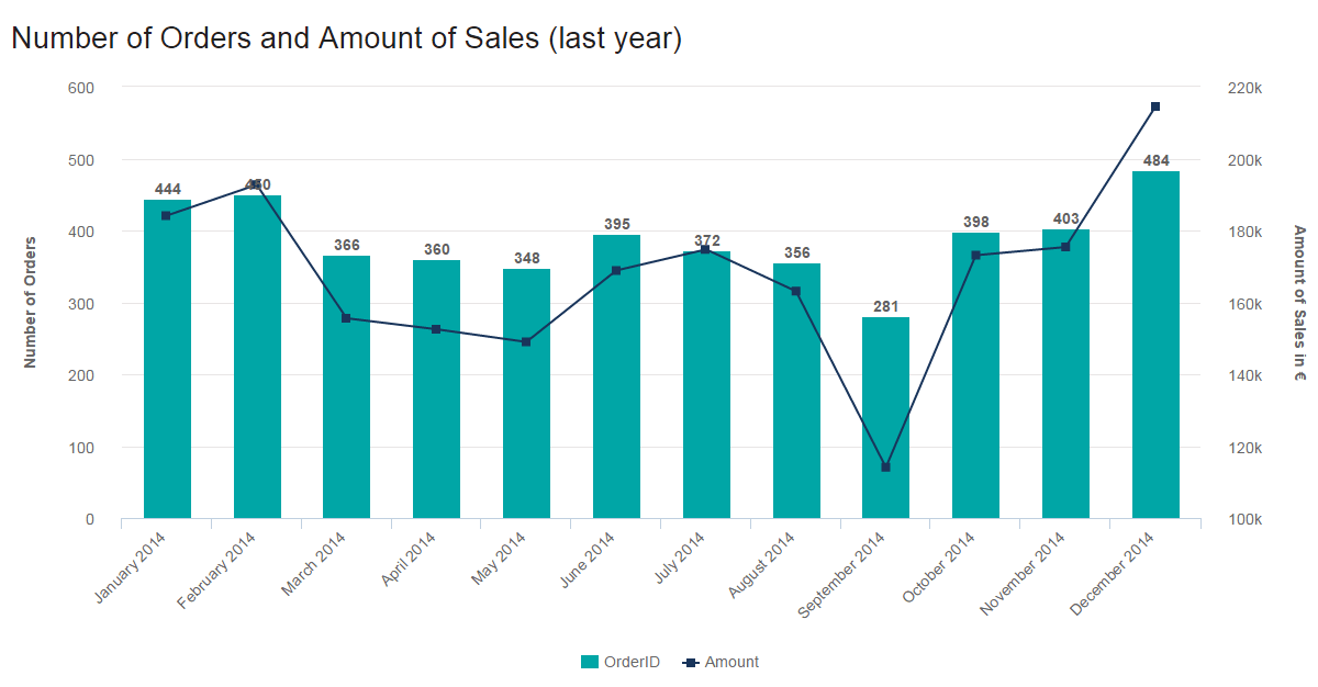
- Plotting strongly correlated data: (# of sales & revenue) in bars and lines on a chart with independent Y axes. http://www.datapine.com/blog/wp-content/uploads/2015/05/combined-line-chart-and-column-chart.png
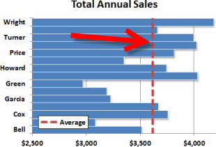
- Here’s an example of a vertical line atop a horizontal bar chart so everyone can see who’s above or below average in sales http://www.exceltactics.com/wp-content/uploads/2014/03/VerticalLineHorizontalBarChartLead.png
- Here’s an example where averages are applied to groups within a bar chart (note the lines are disjoint) . https://i.stack.imgur.com/pAh1k.png
- Sometimes the overlaid lines are essential for understanding deviance from ideal, such as this burn-rate chart. https://www.visualstudio.com/en-us/docs/report/sql-reports/_img/procguid_healthyburndown.png
References I realize this is a big ask, but its also a very useful and widespread feature. The way most technologies accomplish this is to separate the axes as a distinct component that can hold multiple plots. Examples from open source and industry include TeX/LaTeX, Python’s Matplotlib, Matlab, and Microsoft Excel.
Please tell us about your environment: Not entirely relevant, since it’s a feature request, not a bug, but FWIW…
-
ngx-charts version: 5.3.1
-
Angular version: 4.2.5
-
Browser: all
-
Language: all
Issue Analytics
- State:

- Created 6 years ago
- Comments:8 (2 by maintainers)
 Top Related StackOverflow Question
 Troubleshoot Live Code
 Top Related Reddit Thread
 Top Related Hackernoon Post
 Top Related Tweet
 Top Related Dev.to Post
 Top Related Hashnode Post
Please provide an example for implementing Combo Charts. You have a demo for this. But how to implement this is no where provided in any documentation. Please dont mislead the developers. If you cant provide any doc remove it from your demo.
Yep, a tutorial on how to recreate the demo combo chart step by step would be much appreciated.