
Stuck on an issue?
Lightrun Answers was designed to reduce the constant googling that comes with debugging 3rd party libraries. It collects links to all the places you might be looking at while hunting down a tough bug.
And, if you’re still stuck at the end, we’re happy to hop on a call to see how we can help out.
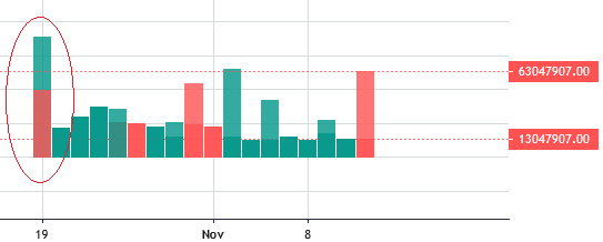
Two Histogram series as overlay with different scale overlaps.
See original GitHub issueLightweight Charts Version: 3.7.0
Steps/code to reproduce:
var chart = LightweightCharts.createChart(document.body, {
	width: 600,
        height: 300,
	rightPriceScale: {
		scaleMargins: {
			top: 0.0,
			bottom: 0.0,
		},
		borderVisible: false,
	}
});


var series1 = chart.addHistogramSeries({
  overlay:true,
	scaleMargins: {
		top: 0.2,
		bottom: 0.8,
	},
});

var series2 = chart.addHistogramSeries({
  overlay:true,
	scaleMargins: {
		top: 0.4,
		bottom: 0.2,
	},
});
Actual behavior:
Last histogram overlaps to first.
Expected behavior:
Both histogram series should be drawn at different scaled area, provided as series options.
Screenshots:
Issue Analytics
- State:

- Created 2 years ago
- Comments:5 (3 by maintainers)
 Top Results From Across the Web
How To... Create an Overlapping Histogram in Excel - YouTube
If you want to plot two histograms on the same diagram, there currently is no option in Excel to do so. However, this...
Read more >Plot two (overlapping) histograms on one chart in R
Plot two R histograms on one graph. If you use transparent colours you can see overlapping bars more easily.
Read more >How can I overlay two histograms? | Stata FAQ - OARC Stats
This sounds like it should be pretty easy. Let's load the hsbdemo dataset and overlay histograms for males and female for the variable...
Read more >Plot two overlay Histograms on single chart with Pandas and ...
To compare two scale variables, one option is to overlay two histograms on each other. The example will use as a binary field...
Read more >Comparative histograms: Panel and overlay histograms in SAS
This article shows how to create comparative histograms in SAS: you ... The purple region shows the overlap between the two distributions.
Read more > Top Related Medium Post
No results found
 Top Related StackOverflow Question
No results found
 Troubleshoot Live Code
Lightrun enables developers to add logs, metrics and snapshots to live code - no restarts or redeploys required.
Start Free Top Related Reddit Thread
No results found
 Top Related Hackernoon Post
No results found
 Top Related Tweet
No results found
 Top Related Dev.to Post
No results found
 Top Related Hashnode Post
No results found
Ok, it seems that there is some misunderstanding. The issue is that when you set
overlay: trueit will be converted topriceScaleId: ''automatically (see https://tradingview.github.io/lightweight-charts/docs/migrations/from-v2-to-v3#creating-overlay) thus your scaleMargings are applied to the same price scale and it uses the latest value only. If you want to split them to different price scale, usepriceScaleIdoption instead.For example, for the first series you can use
priceScaleId: 'overlay1'and for the second onepriceScaleId: 'overlay2'and I think it should work as expected.Exactly, what I missed is need to use priceScaleId.