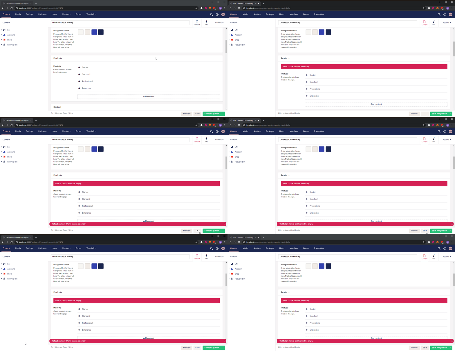
Make Backoffice validation less "aggressive" when saving content
See original GitHub issueAs a general rule people are using red validation message when submitting a form/whatever to show the user that an error occurred and that no action was performed.
However, when you Save a content node in Umbraco without filling out mandatory properties, we’re showing red validation messages (and turning the Save button into an X!) even though the content was actually saved.
Since I’ve been using Umbraco for quite a while now I know that the content was saved… but if you’re new to the CMS you might not be aware of this.
But why didn’t you just fill it out? It’s mandatory! Because sometimes when I create/set up a page I don’t have all the info right now… So I save the node so I can return to it later.
I’m confident that we can avoid confusing editors by making the validation more friendly when you’re “just” saving a node. 🙂

Issue Analytics
- State:
- Created 4 years ago
- Reactions:2
- Comments:7 (7 by maintainers)

 Top Related StackOverflow Question
What @Shazwazza said 😛
@nielslyngsoe I believe you should put on your UX glasses and come up with a grand plan to aim for with this. Then based on that we could identify the correct course of action.
Great feedback!
The first and maybe most important change would be to change the Save-button response to a checkmark so you can see that the save was successful. Then we should display a notification, in green, saying “Content was saved but it contains invalid content”.
A quick thought could be to use our yellow color for the feedback messages, this could be an easy way to make the errors appear less aggressive, but still visible.