
Stuck on an issue?
Lightrun Answers was designed to reduce the constant googling that comes with debugging 3rd party libraries. It collects links to all the places you might be looking at while hunting down a tough bug.
And, if you’re still stuck at the end, we’re happy to hop on a call to see how we can help out.
v8: Adjust new styles of checkboxes/radiobuttons
See original GitHub issueIn noticed the updated/custom styles of checkboxes/radiobuttons in latest v8.
I think the umb-form-check should use display: inline-flex or similar fix, so the checkbox/radiobutton labels isn’t stretched to full width.
.umb-form-check {
    display: flex;
    flex-wrap: wrap;
    align-items: center;
    position: relative;
    padding: 0;
    margin: 0;
    min-height: 22px;
    cursor: pointer!important;
}
Furthermore it seems to top position can just be set to 0 and add margin-top: 1px; for umb-form-check__state.
.umb-form-check__state {
    height: 17px;
    position: absolute;
    top: 2px;
    left: 0;
}
.umb-form-check__text {
    margin: 0 0 0 26px;
    position: relative;
    top: -1px;
    line-height: 20px;
}
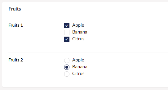
Chrome
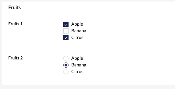
IE11
With this change it also looks nicer in IE with this change + line-height: 22px; .
.umb-form-check {
    display: flex;
    flex-wrap: wrap;
    align-items: center;
    position: relative;
    padding: 0;
    margin: 0;
    min-height: 22px;
    line-height: 22px;
    cursor: pointer!important;
}
.umb-form-check__state {
    height: 17px;
    position: absolute;
    top: 0;
    left: 0;
}
.umb-form-check__text {
    margin: 0 0 0 26px;
    position: relative;
    top: 0;
    line-height: 20px;
}
.umb-form-check__icon:before {
    position: absolute;
    top: 0;
    right: 0;
    left: 0;
    bottom: 0;
    margin: auto;
    display: flex;
    justify-content: center;
    align-items: center;
}
IE
Issue Analytics
- State:

- Created 5 years ago
- Reactions:1
- Comments:11 (11 by maintainers)
 Top Results From Across the Web
Radio buttons and Checkboxes to change appearance
I want my check boxes and radio buttons when selected to change color from black to "0,64,128", size from 12 to 14 and...
Read more >Styling Radio Buttons with CSS (59 Custom Examples)
Radio buttons are website elements that allow a user to select one out of a series of options. They are very similar to...
Read more >Can you style an html radio button to look like a checkbox?
Yes it can be done using this css, i've hidden the default radio button and made a custom radio button that looks like...
Read more >How to Customize Checkboxes and Radio Buttons With CSS
To begin with, adjust the dimensions of checkboxes and radio buttons by manipulating their width and height properties. This allows you to make ......
Read more >CheckBoxGroup and RadioButtonGroup - Vaadin 8 Docs
RadioButtonGroup is a single selection component that allows selection from a group of radio buttons. CheckBoxGroup is a multiselection ...
Read more > Top Related Medium Post
No results found
 Top Related StackOverflow Question
No results found
 Troubleshoot Live Code
Lightrun enables developers to add logs, metrics and snapshots to live code - no restarts or redeploys required.
Start Free Top Related Reddit Thread
No results found
 Top Related Hackernoon Post
No results found
 Top Related Tweet
No results found
 Top Related Dev.to Post
No results found
 Top Related Hashnode Post
No results found
Furtermore I don’t think it is valid to have
<div>nested inside<label>and should therefore be changed to<span>instead.Maybe the checkbox/radiobutton should also have a background color (e.g. white), so they don’t seem to be disabled in e.g. Nested Content.
Maybe also consider how the disable style look. At the moment it doesn’t seem to directives support this, but they probably should using
ng-disabled.Pro Tip: To make to directives support disabled status more or less the same logic from
umb-togglecan be copied. https://github.com/umbraco/Umbraco-CMS/blob/91c52cffc8b7c70dc956f6c6610460be2d1adc51/src/Umbraco.Web.UI.Client/src/common/directives/components/buttons/umbtoggle.directive.js#L120